All About The New Dark Academia Design Style
Dark Academia has been around a while, but I feel like it has been really gaining traction in the last few years; let’s dive in and discuss all the details that make it so intriguing!
*Feature Photo Credit : Wild Wedding Festival
Last week in my 2023 Interior Design Trends post I mentioned that I wanted to dive deep in another design style, and I wasn’t at all surprised that Dark Academia was the most highly requested.
I also wasn’t sad about it at all. I had been wanting to look into it more and share my thoughts!
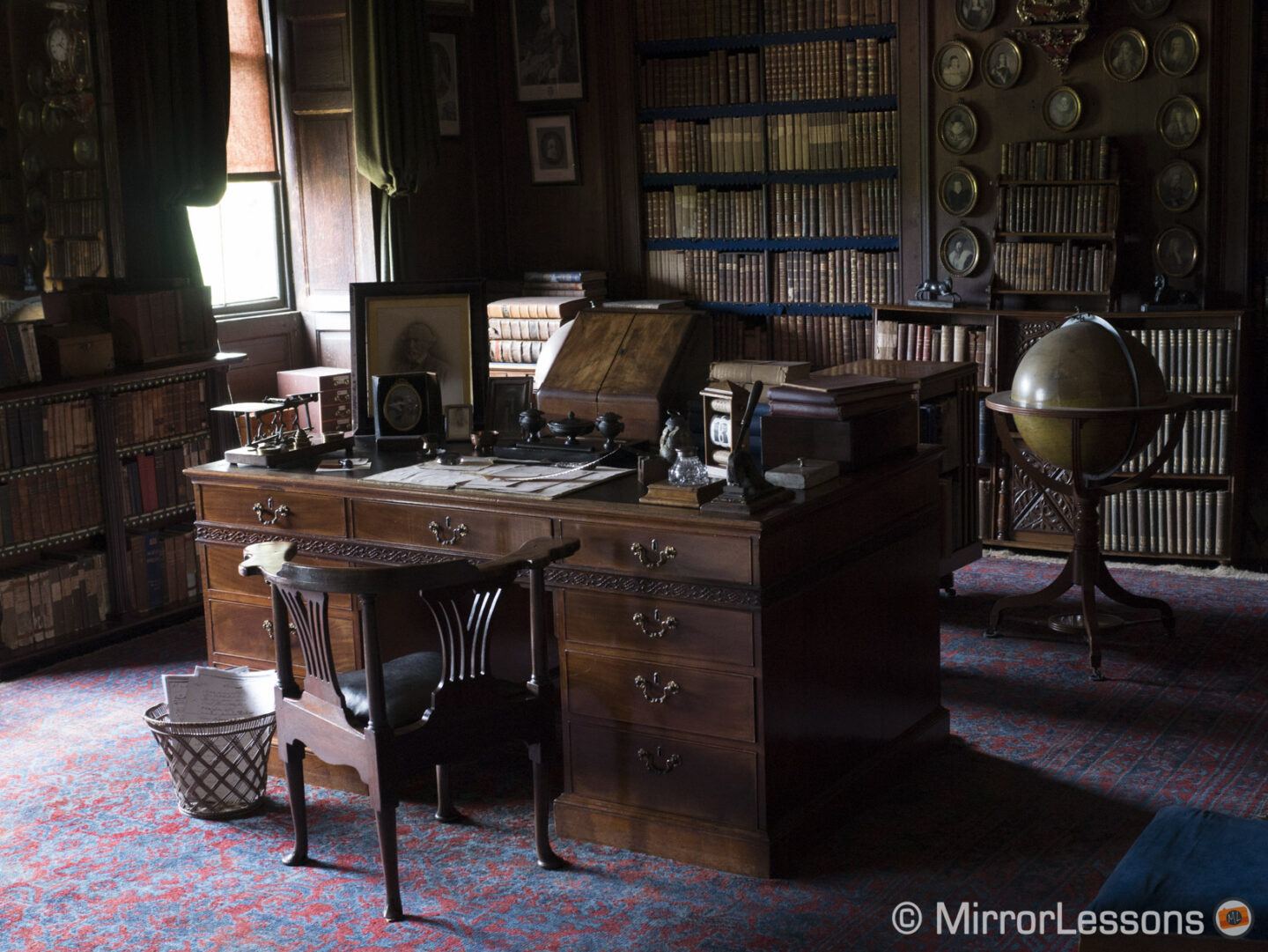
Photo Credit: Mirror Lessons – Erddig House
One quick caveat before I begin – if this look is too dark for you, you’ll be glad to know that Light Academia is also it’s own style, and I share about that HERE!
All About Dark Academia
I mentioned above that this style has been gaining traction in recent years, and I think that is at least partially due to some emotional Covid fall out that I’ve mentioned before in other design videos. It seems to have brought us back around to enjoying a more maximalist and colorful view, rather than the light/white, more streamlined looks that had been popular prior to 2020.
Academia can be thought of as very elegant maximalism; it’s much more formal than the “anything goes” look you might find more in Cottagecore, for example.
It’s roots go back to the upper class European culture of the 19th century, and the architectural elements are very much those gothic looks mixed with a more modern American prep look.
There’s a romanticization of the collegiate and boarding school lifestyle, or some might even call them “Harry Potter vibes”. One of my favorite explanations that I’ve heard is that it is “Anne of Green Gables all grown up.”
The moody and mysterious elements also give off a look that reminds me of Sherlock Holmes or an old European library.

Photo Credit: Red Bubble
Color Options & Usage
Paint vendors are picking up on the upward climb of this trend and are sharing whole collections with the muted earthy tones necessary to create this look.
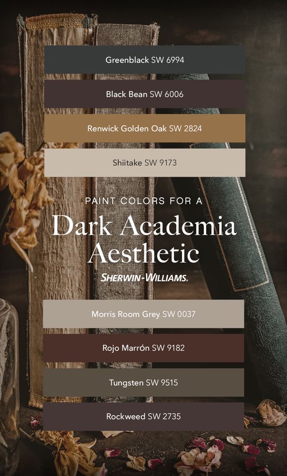
Photo Credit: Sherwin Williams Facebook
I think one of the most striking parts of this look is that dark colors are used not just in accents, furniture pieces or textiles, but they’re covering entire walls and ceilings.
If you’re wanting to try this look out, darken your walls and your 1/2 way there!
If You enjoy This Kind of Design Teaching…
You’ll LOVE the Elite Decorating Academy! 28 hours of comprehensive and practical interior design teaching broken down into 160+ classes that are an average of 10 minutes each.
Click HERE to get started now!
Dark Academia Design Elements
In addition to their moody colors, walls & ceilings are also highly adorned with molding, paneling, layering and texture.
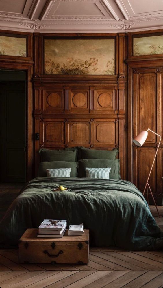
Photo Credit: Merci-Merci
Wallpaper is accepted with arms wide open, especially in deep elaborate patterns.
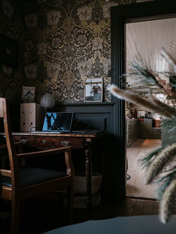
Photo Credit : The Nord Room
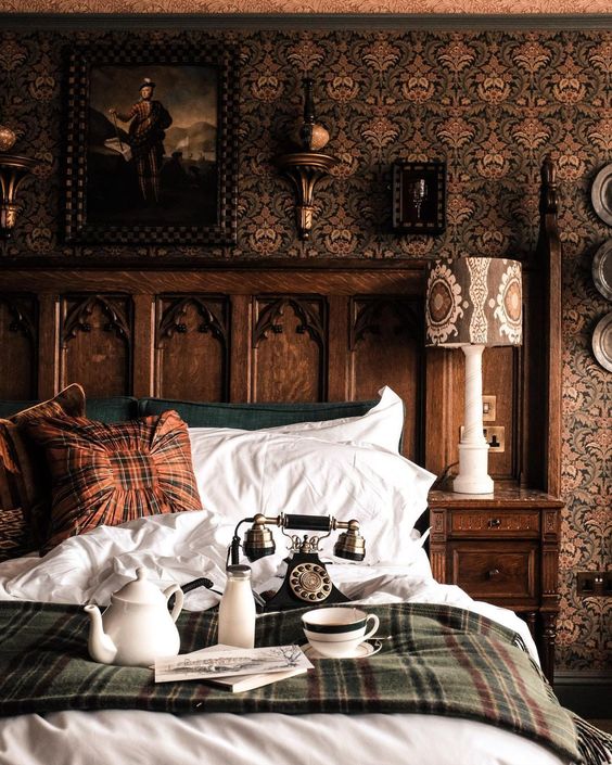
Photo Credit: Through Winter Fields | Matilde Espirito Santo
Gallery walls are often used as statement pieces with lots of layering, sketches, oil paintings, and collected portraits of striking characters from the past.
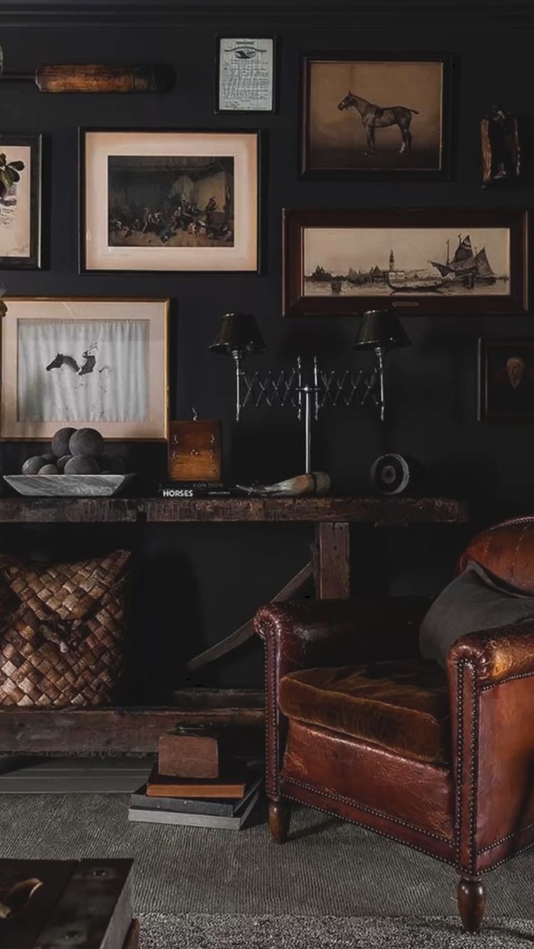
Photo Credit: Desire To Inspire
Printer’s trays are added as a 3D element and double as a spot to highlight tiny Dark Academia details.
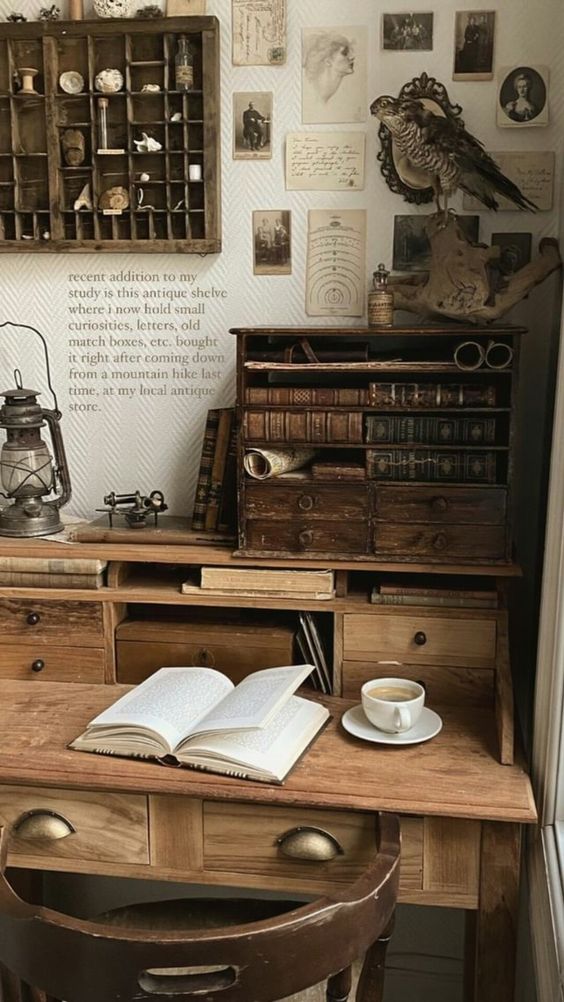
Photo Credit: The Diary of a Historian
Other elements drawn from botany or nature studies (like taxidermy) show up often as well.
Some More Decorative Options:
- Vintage Books
- Trophies
- Dried Flowers
- Chess Set(s)
- Magnifying Glass
- Etched crystal glasses & decanters
- Globe
- Quill Pen
- Styled hand-written letters and papers
- Wooden Pencils
- Terrariums
- Layered & antiqued mirrors (mercury glass)
Furniture and Textiles
Dark antique furniture is of course featured in this look.
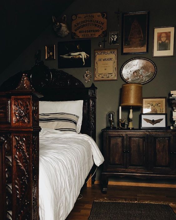
Photo Credit: Hoellenrose
Lawyers cabinets with glass doors elevate the standard bookcase (but there are plenty of those as well). Secretary desks are both functional and beautifully styled in this look.
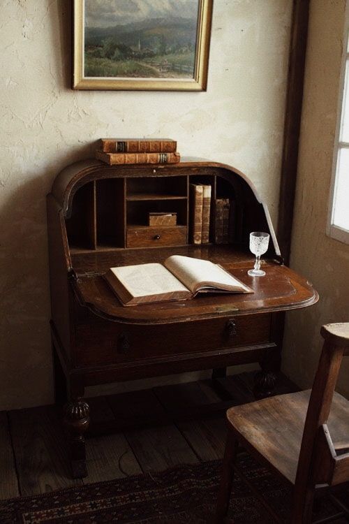
Photo Credit: Unknown (please contact us HERE if this is your image to be credited).
Mantles are often an integral part in adding the warmth and charm of the look – even when they’re faux! We DIY’d a faux fireplace with an electric insert, but many of the ones I’ve seen in this look are actually empty, but still so beautiful.
Velvet is probably one of the most popular textile options for this look! You can add it as a smaller element like on an accent chair, or drapes, or you can go all out with a velvet couch.
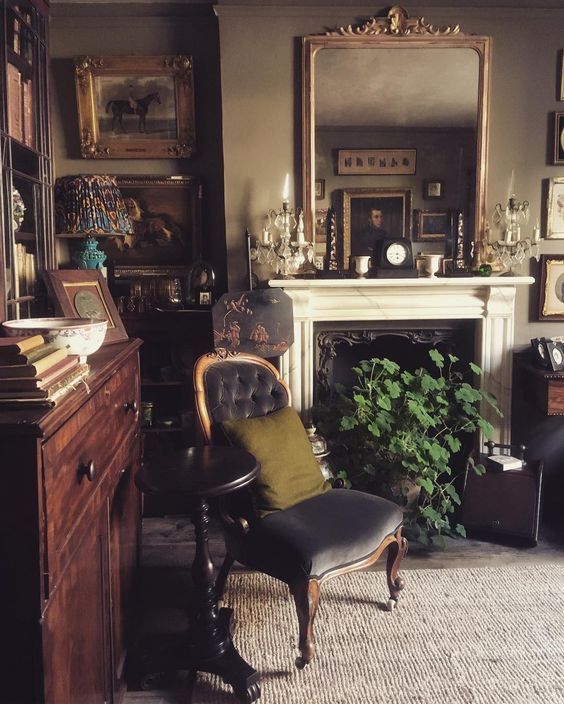
Photo Credit: Habitually Chic
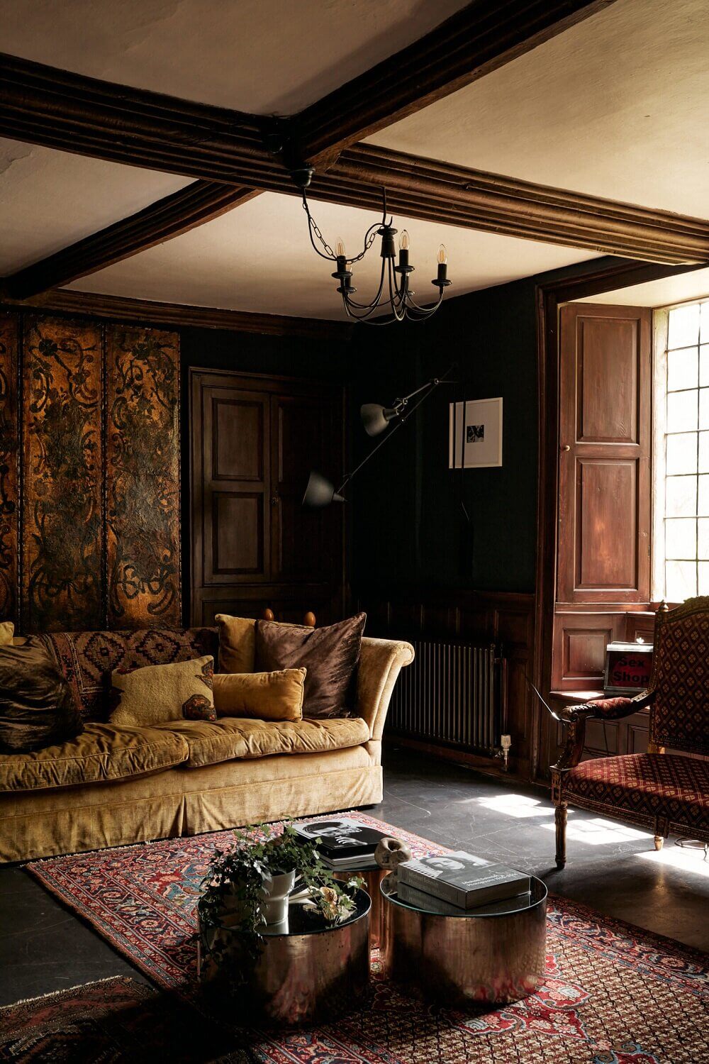
Photo Credit: The Nord Room
The window treatments are opulent and embellished. I just love these sheers with tassel trim on the edges. I did a similar DIY with a set of IKEA curtains.
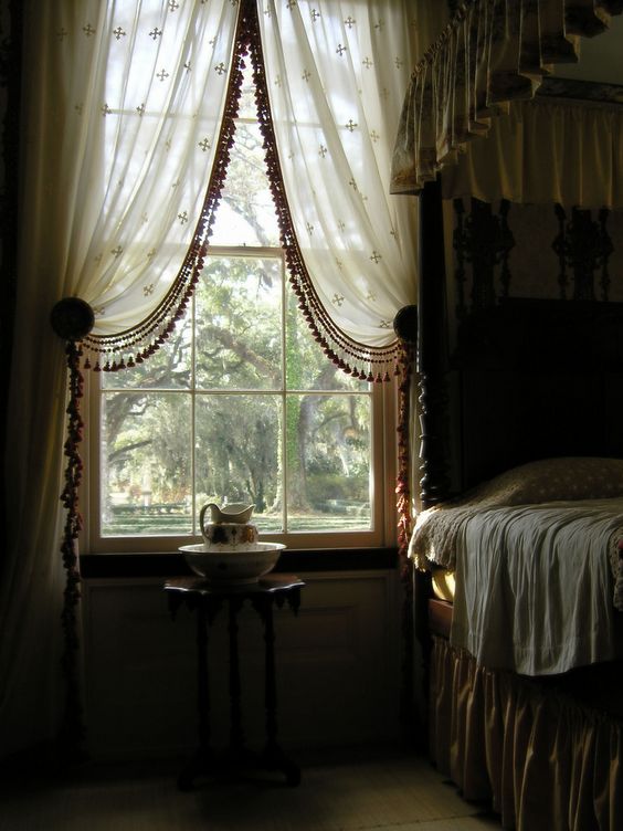
Photo Credit : Reddit
I hope you’ve enjoyed this summary! Like I mentioned above, I will be doing a look through Light Academia next! In the meantime, if you’re looking for more style inspiration, I’ve got related blog posts and a few other resources I’ll share below for you.
Also, if learning about design is something you’re passionate about, you’re going to want to make sure you’re on the Waitlist for my Elite Design Academy opening this Spring!
Related Blog Posts
- All About Grand Millennial Design Style
- All About Modern Farmhouse
- All About Cottage Style, Michigan English Cottage Home Tour
- All About Mid-Century Modern Design Style
- All About Bohemian Design Style
- All About The New CottageCore Design Style
- Full Home Tour | Nautical Decorating
- Mixing Design Styles
Other Resources
- Youtube Playlist | Design Style Videos
- Pinterest – I add new design styles & posts often!
Pin This Dark Academia Style Overview for Later
Until next time,
