Ways to Decorate for Summer with Thrifted finds
Do you enjoy decorating with your thrift store finds? I think it’s one of the most fun parts of the process!
This series has been so much fun to put together, and I’m really glad that you’re all enjoying it as much as I am!
This post is number EIGHT in our Styling Thrifted Finds Series! I’ll include a list of all of the earlier posts at the end of this post if you’ve missed any!
The basic premise is that I thrift shop weekly, and I gather up all my thrift store finds and share my best decorating tips with you in the first post & video of each month!
In this post I’ll spend even a little bit more time talking about not only what I found and how I styled it, but also the WHY! There’s usually specific reasoning that helps me get to my end result, and it’s really important to me that I let you in on the thought process behind why designers do some of what we do!
*This post contains affiliate links to products I know &/or love.
This Month’s Thrift Store Finds:
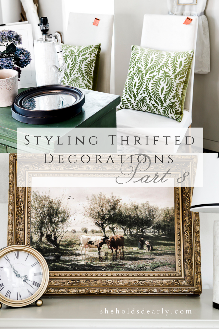
I found a set of 2 pillows from Pier 1 with a really pretty velvety fern texture on the fronts. The pillows inside are not feather pillows, (which is my preference when decorating because of how they hold their shape) but because they are a common size I can easily swap the pillow covers out for feather pillows I already have. These were $6.99 each.
I also think it’s worth noting that in a previous post I mentioned that Pier 1 had gone out of business, and I have since been notified that they are still open online! So that’s great news for anyone who enjoys their products
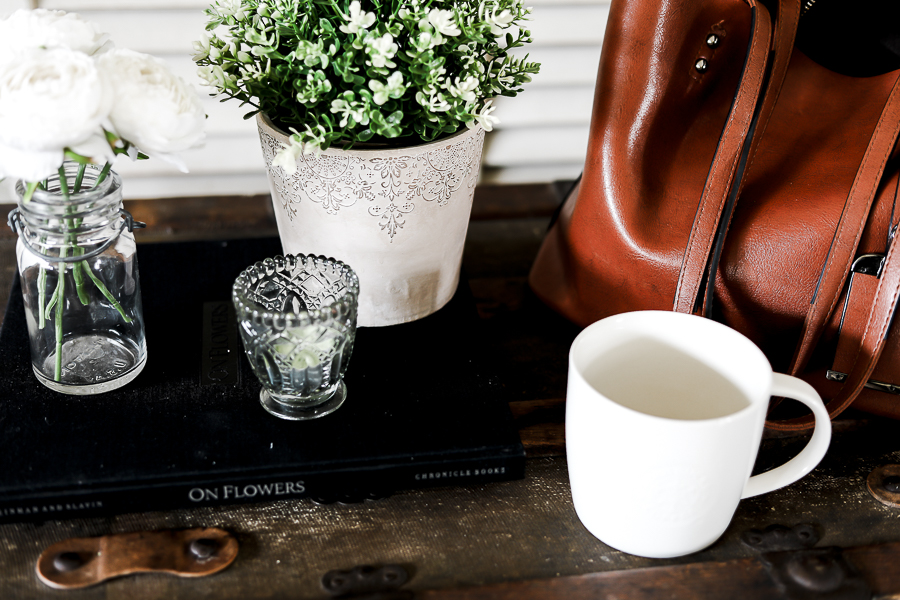
I found this great big book “On Flowers” for $3. (And I’ll talk a bit more about thrifted books below!)
This Threshold brand lamp from Target still had the tag on it and was only $9.80!
I’ve mentioned this before, but often my Goodwill location will receive Target’s clearance merchandise – which is really wonderful as far as I’m concerned! Let me know in the comments below if you’ve noticed the same from your local Goodwill locations!
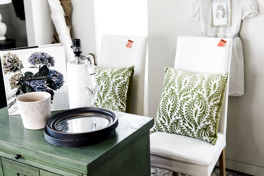
This planter pot had the most beautiful detailing that caught my eye! It reminds me both of delicate lace and mehndi or henna artwork. I was drawn to it and it inspired me with other ideas that could easily be used to dress up plain pots like stamping on similar designs or using a piece of lace as a stencil. This one was only $4.99.
These two round mirrors were $3.99 each, and actually have plastic frames, but they look like they’re made out of wood! I actually just answered a question about this from one of my Behind the Scenes gals this past week who had a plastic mirror she was thinking to use, but her husband was unsure due to it not being real wood. My thought is that if it LOOKS nice, and it’s not going to be handled often, you can absolutely get away with plastic!
To me it’s the difference between something hanging on the wall and something like pillow linens that people will be touching often. I wouldn’t skimp and use an uncomfortable material for a blanket or cloth napkin, but a plastic clock or picture frame on the wall is fine by me!
One of my favorite finds from this month were these two parsons chairs! They’re exact matches to a set of 4 I bought 19 years ago for $125 each. But these, they were only $6.99 a piece! They were in great shape, and once I add slip-covers to match my set, you honestly won’t be able to tell them apart!
The slipcovers I made for my original four were really easy No Pattern Slipcovers, and I made a post a few years back detailing exactly how you can do it as well! I used Linen from Joann’s (In the shade “Natural” or “White”) for my previous chairs, and will absolutely be using it again! It’s the perfect creamy linen. I keep buying it over and over again for new projects.
Some Other Exciting News!
Before I jump into telling you all about the behind the scenes tips on decorating with these thrift store finds, I want to share some exciting news!
This past week in the excitement of having my Behind the Scenes Decor Group open for new enrollment, we also hit a big milestone over on YouTube.
50,000 subscribers!
Talk about a dream come true!
I’m so thankful for all of you here on the blog, and all of the community on YouTube and everywhere else online. It’s an honor to get to share my life and design knowledge with you, and I appreciate you all so much!
In celebration, I’m holding another giveaway similar to what we did when we reached the 40k mark a few months back: I’m giving away another 1 hour zoom consultation!
**Giveaway is NOW CLOSED**
There you’ll have a chance to tell me about your space, send pictures, and share your inspiration for the space (like a link to your Pinterest board). I’ll be selecting one winner who will be featured on the blog & YouTube video in a few weeks!
If you’re not sure what a consultation like this entails, you can see how the last ones went here:
Don’t forget to enter before the giveaway closes!
Decorating With These New Thrift Store Finds
Ok, back to the task at hand!
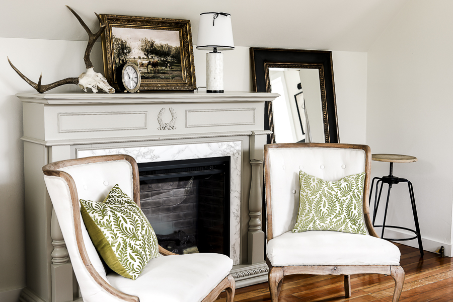
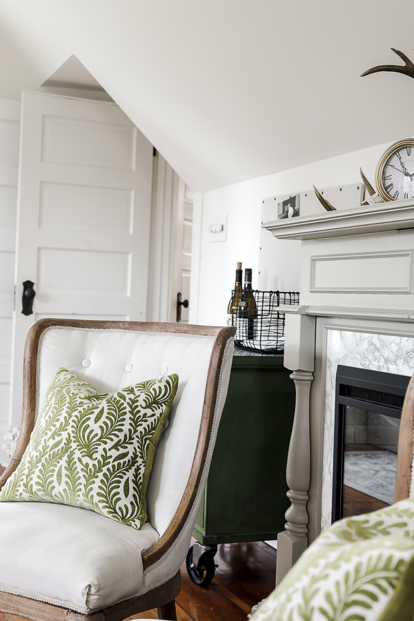
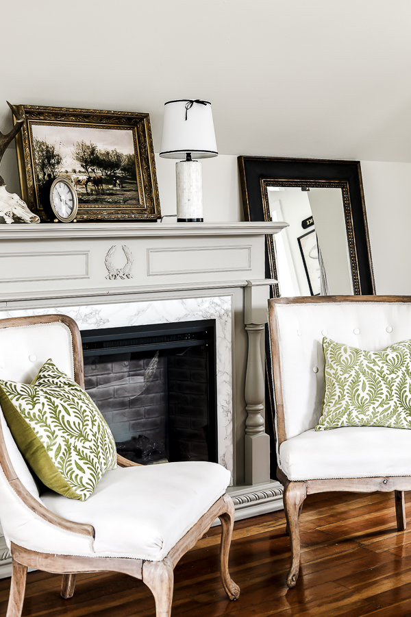
I decided to put my new pillows on the two antique chairs we have in the seating area by our fireplace.
Putting them there, however, brought up something that I wanted to share with you about! Undertones!
Undertones are actually something that I’ve only been learning about now for the past few years! I did not learn about them at all in design school, and when I think back on some of the projects I did before these past few years, I can see where my work could have even been better if I had this knowledge at those times!
Understanding how undertones work, and more importantly how they can work together is such a vital design concept!
The basics:
Each color except pure primary red, blue and yellow has other colors mixed into it, which gives it an undertone of the color mixed in with the highest quantity.
So when you look at my bedroom space, you can see two shades of green. A darker one on my faux card catalog (which is painted Miss Mustard Seed’s Boxwood Green) and the lighter one on my new fern pillows.
We know that green is created by mixing blue and yellow, but not all greens are created equal, and not all greens will coordinate just because they’re green!
In this example in my bedroom you can see that the card catalog has a higher concentration of blue, giving it a blue undertone and a darker color, while the fern pillows have a higher concentration of yellow, giving them a lighter color and a yellow undertone.
Once you start to notice undertones in color, you’ll be positively RUINED to ever ignore undertones again, trust me!
So the thing about undertones is that depending on their shades, they can either highlight other colors, or they can downplay them. They can make designs look cluttered or they can help them click and look coordinated.
The good news is that if you pay attention to your undertones, you can make them work for you, even if they don’t necessarily match right away!
In my room, I accomplish this by repeating both shades of green to make them look intentional. In this case I was able to do that using one single picture that happened to have both shades of green in it already!
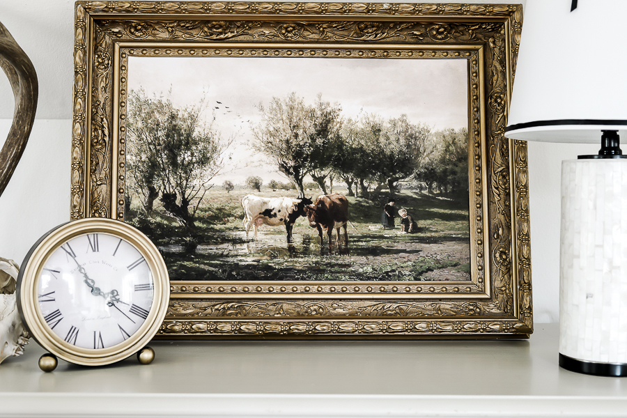
I grew up on a cattle ranch, so pictures of cows always speak to me, especially when they’re beautiful and bucolic. I got this one as a digital file from Etsy and had it printed locally!
The repetition of both of the 2 shades of green I was working with helps to make them both look intentional, like truly designed elements instead of two things haphazardly thrown together. If I choose to keep these as part of my decor for the rest of this spring, I’ll most likely find 1-2 other places to pull in more of these color accents to add to the deliberate feel.
And that’s today’s over-simplified crash course on undertones! In my Behind the Scenes class we’ve been digging into this concept in order to enhance all of our future design decisions!
Lamp Styling
The threshold lamp base I found did not have a shade, so I had to make a decision about which shade I wanted to use! I had a simple white option from Walmart and a grey shade that both could have worked. The first thing I did, though was decide to spray paint over the silver base and hardware on the lamp itself.
I like to have no more than two metals in a given space, and in my bedroom I already have black metal (in our fireplace and our iron bed frame), and gold metals (in our dresser and desk hardware), so the silver was out of place. Spray painting it black helped it have a much more cohesive feel.
I tried the grey shade on, and I liked that it matched and repeated the grey marbling in our fireplace insert, but realized it introduced another color in a place that was already feeling like it had plenty.
When I tried the white shade on, it felt a little flat, but I did like that it was calmer and didn’t detract from the other more interesting design items in the space.
In the end, I decided to stick with the white and to give it a little bit more interest, I used hot glue to attach a simple black ribbon along the bottom and again along the top, with the addition of a delicate bow that gave me a bit of a French feel.
Those details finished off this space nicely!
Then I moved downstairs to finish decorating with the rest of my thrift store finds!
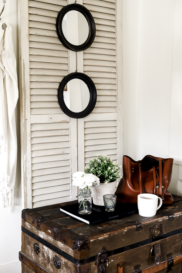
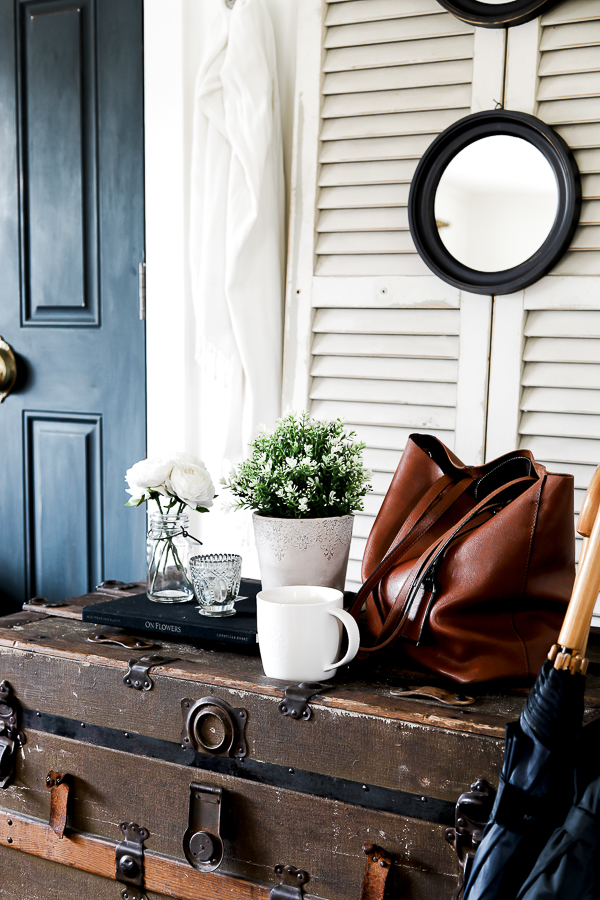
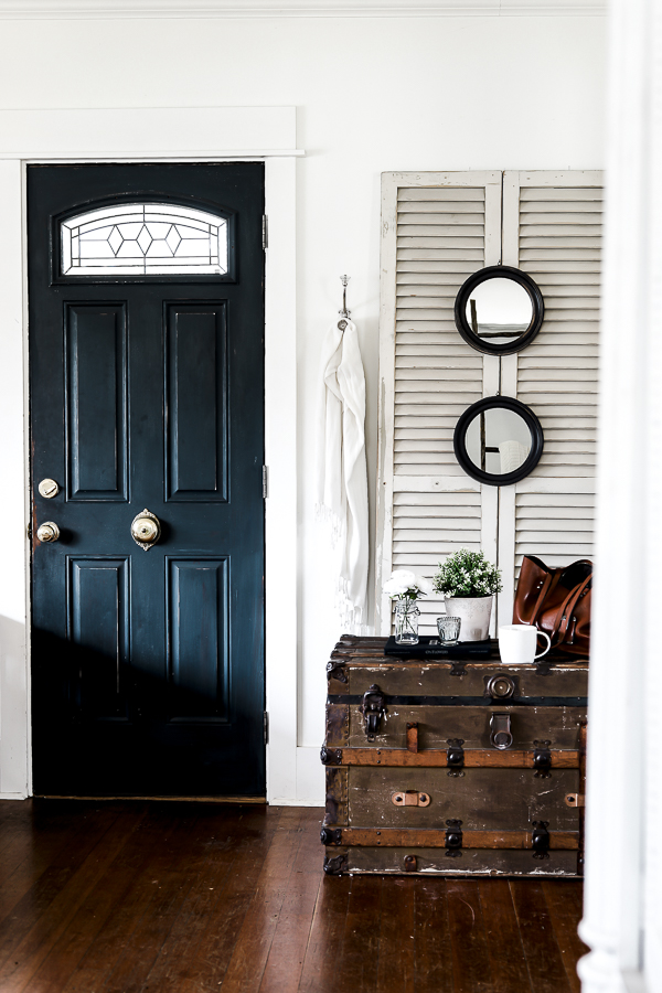
I’ve always wanted a true hall tree area near our front door, and have some ideas in the back of my mind about maybe making our own someday… but in the meantime, I added my two new circular mirrors on this wall to help create a temporary hall tree feel.
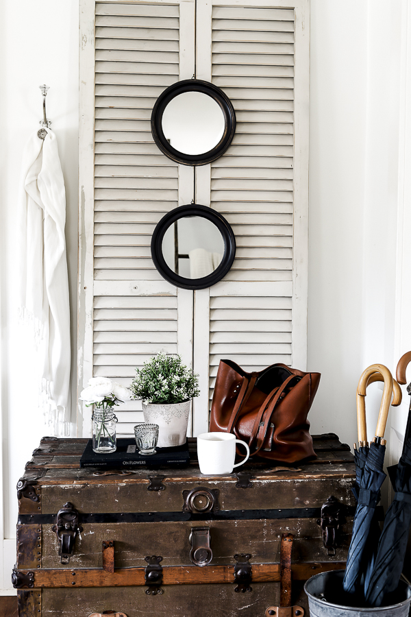
I think small mirrors like this look great stacked vertically or offset in a zig-zag pattern!
Down below on my steamer trunk, I added a cute faux plant to my new planter, and do you see that beautiful black linen book underneath…
Yep! That’s the $3 book from earlier in the post!
Whenever you’re looking at books at thrift stores and garage sales, I always suggest peaking under the dust jacket if they have one! Often times you’ll find beautiful linen covers hiding there just waiting to spend some time in the spotlight in your decor!
More Posts In This Series:
- Tips for Styling Thrifted Decor
- Styling Your Thrifted Finds, Part 2
- Styling Thrifted Decorations, Part 3
- Styling Thrifted Decorations, Part 4 (Christmas Edition)
- Styling Thrifted Decorations, Part 5
- Styling Thrifted Decorations, Part 6 (Spring Edition)
- Styling Thrifted Decorations, Part 7
You can also grab a copy of my Thrifting Checklist HERE if you’d like to see some of my thrifting tips and priorities!
Pin This For Later:
xoxo,


