How to Incorporate Mid-Century Modern Design Style
Are you ready to take a closer look at the Mid Century Modern Design Style? Let’s jump in!
This is my third post in the “All About” series where I get to share some of the details about styles that you’re probably familiar with, even if you maybe don’t know much about them (yet)!
Featured photo is thanks to Insider.com .
My first post was All About Cottage Core, and boy, can I tell you, there are some BIG fans of this style in our community! It’s been so fun to see so many women saying “Now I finally know the name of the style I’ve always loved!”. You’re not alone!
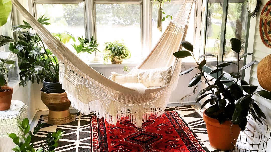
Then I followed that up with a post All About Bohemian Design Style which is another fan favorite, and was especially rewarding to do on the heels of two different design projects both with boho elements.
And today, we’re going to learn All About Mid Century Modern!
Why Do We Need to Look So Closely?
I think it’s important to be able to dive deep into a design style by breaking it all down into the different elements to be able to understanding the details, so that you can ultimately piece it back together again.
This also gives us the ability to break two styles down and merge the two styles into one design.
The nursing room project I did was exactly that! The surrounding design throughout the rest of our church building was very Mid Century Modern, which I think gives it a more masculine feel. I wanted to make sure the nursing room matched the style around it, but added in bohemian elements to bring some feminine flare.

Just last week I heard a well known and respected designer who I love spend a whole video talking about how you should only mix design styles that are VERY similar – nearly identical. One example she gave of good styles to mix were Scandinavian and Minimalism.
I whole-heartedly disagree!
I think mixing styles can be done, and it can be done well. But it is a more advanced skill that can be difficult IF you don’t understand the elements and the details in the two styles.
Once you are familiar with both styles, you can strategically weave them back together.
This is a skill I love teaching in my Behind the Scenes class. I have the opportunity to dive even deeper into these ideas and processes during our classes and in our private community group.
What is Mid Century Modern?
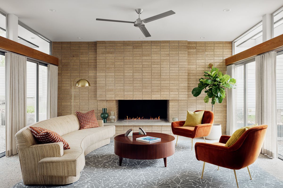
I would say Mid Century Modern (or MCM for short) is defined by the following attributes:
- Functional
- Minimal
- Modern
- Airy/Open
- Un-cluttered
- No Embellishment
*This post contains affiliate links to products I know &/or love.
If You Enjoy Learning About Design…
Come join me in my Elite Decorating Academy! Click HERE to learn more & to sign up!
The History of MCM:
This is also a style that’s been going strong for almost 70 years!
It came about after WW2 ended. Husbands and wives were reunited, there was a baby boom, and people were thinking about their growing families and wanting lots of functionality.
There was also a shortage of some of the materials that would have commonly been used for furniture and building materials prior to that time. So designers went to work and reinvented what you could use to make furniture with, and how to purchase it with less money than before.
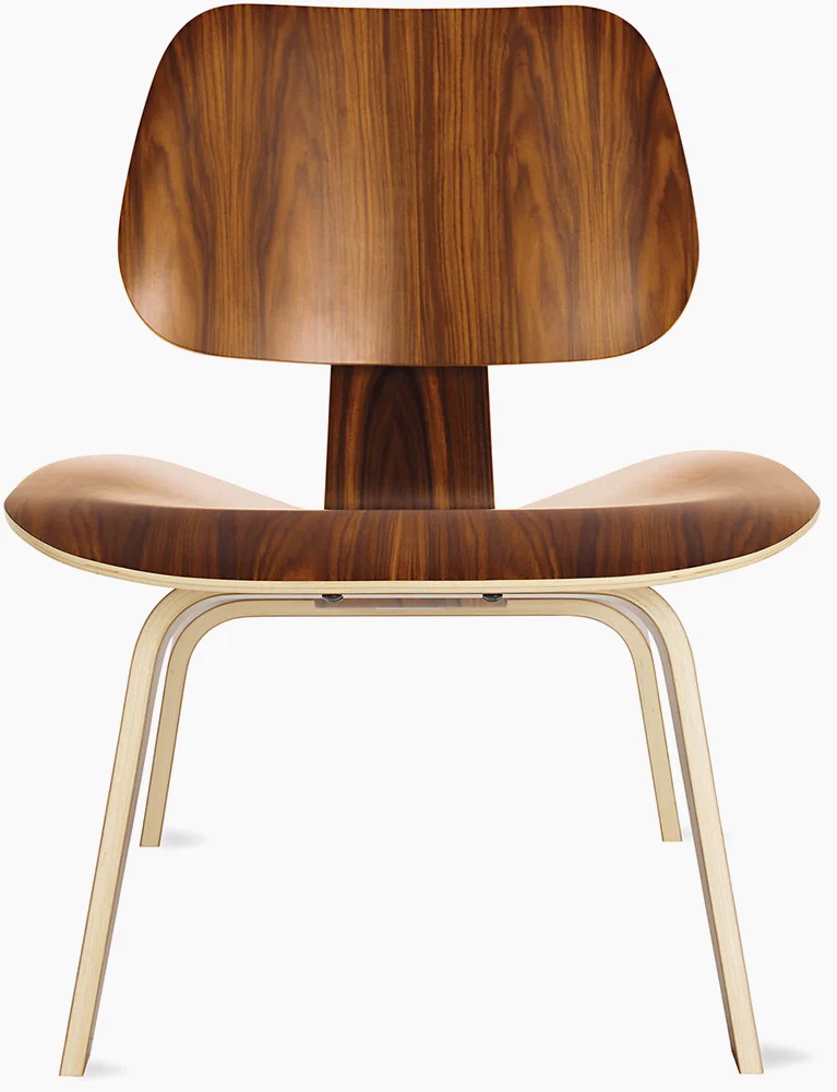
This was the advent of things like plywood chairs, metal frames, and the incorporation of materials like fiberglass, wood veneers, plastic and vinyl in the furniture making process.
It’s so interesting to me that even now, design is still influenced by world events. Take 2020 for example!
With all of the covid changes that occurred, people were home much more, and honestly it seems like they wanted to be surrounded by comfort. Mid Century Modern as a style did not have a very popular year last year, and you’ll understand a bit more about why that was when we dive deeper into the furniture down below.
I think it’s the opposite reason as to why Cottage Core as a style grew by leaps and bounds in 2020. People wanted their homes to feel inviting and soft and cozy. Mid Century Modern is great at a lot of things, but perhaps not the strongest in those three.
Things MCM Does Well:
I love that MCM is great for masculine spaces. It was my go-to when I was working with male clients.
I also think it’s one of the easiest styles to do well!
Because of the similar ideologies with the minimalistic design style, you use about 60% of the product you would typically purchase in a more full design genre like farmhouse or cottage core. And that leads to savings!
One of the unspoken ideas in MCM is all about the open and negative space. There’s lots of air flow and empty shelves. It’s easy and edited.
But, as with any style, there’s a two-edged sword. The edited look can easily slip into “hotel room” territory if taken too far.
I think it’s important to add some of the things that make a designed room feel like the home it is part of. Adding blankets, pillows, vintage books, texture, personal touches, and elements from nature can all help keep a MCM design style from becoming too sterilized.
Now let’s dive into some of the Furniture Elements:
I think MCM furniture is some of the easiest to spot compared to the other styles thanks to their VERY specific choices regarding fabric, shape, leg usage and more! Let’s look at some of the most popular pieces:
Chairs:
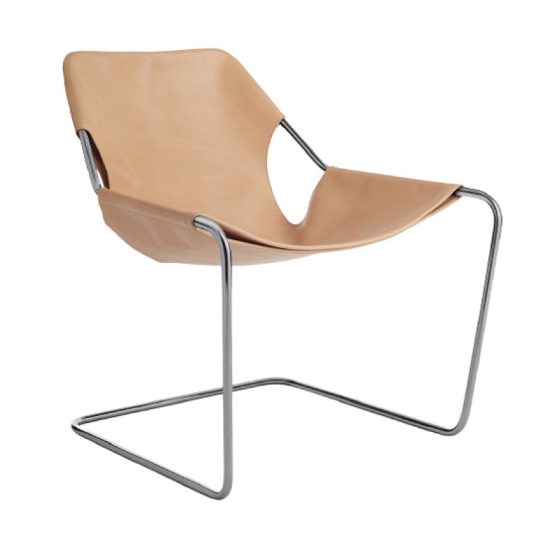
MCM does funky chairs like no other!
I shared above about the plywood chairs, but there are many other MCM specific styles.
The Eames chairs are very iconic to MCM, along with Tulip chairs, wishbone chairs, egg chairs and on and on!
Think lots of geometric shapes and boxy angles.
Remember what I said about MCM furniture taking a backseat last year: This is one of the reasons why! This chair is such a neat design, but can you imagine trying to feel cozy or falling asleep in one?
Credenzas:
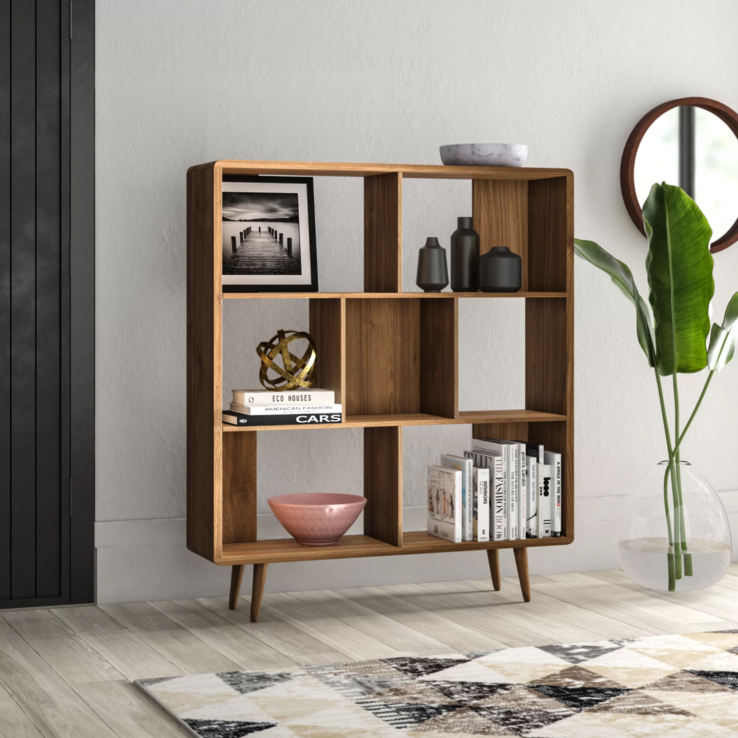
Credenzas or “low boys” are another furniture piece that MCM does really really well! Lots of straight lines, very little embellishment, and of course, the absolute MCM essential: peg legs.
They make lovely entertainment center consoles in our day and age.
Dressers:
Dressers or “high boys” are also easily identifiable by their legs (that’s a given), their “water fall” features, and usually gorgeous wood veneers. I’ve come across some MCM pieces that had such beautiful walnut veneers that I couldn’t bring myself to paint them.
I love that MCM designed furniture is readily available on places like the Facebook Marketplace – though as more and more people are coming back around to the idea, the prices do seem to get a little higher and higher.
They’re still quite a bit lower than retail prices, though, so I can’t be too upset.
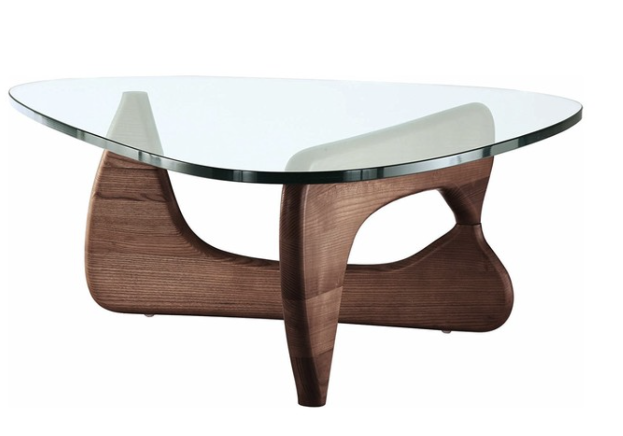
Tables:
MCM tables have some beautiful character of their own.
In addition to the peg legs on most MCM furniture, hairpin legs have also proven to be very popular.

Another specific table design is called the Noguchi table that has some really awesome structural shapes.
I don’t typically work in this style to this extent, but I can appreciate the thought that went into the design.
Sofas:
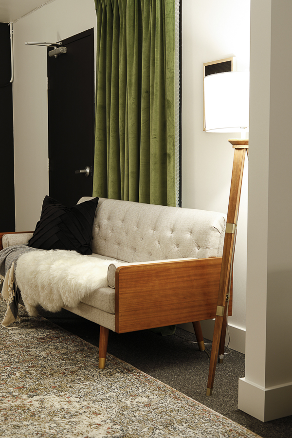
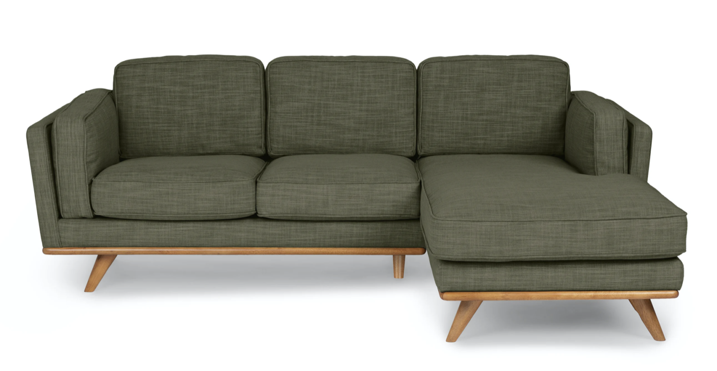
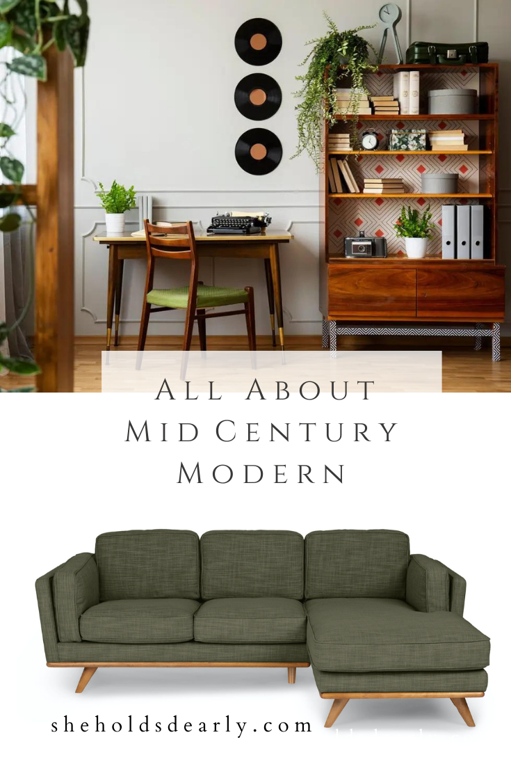
MCM sofas can easily be picked out of a lineup by paying attention to their boxy arm rests, straight lines, and peg legs
This Christopher Knight sofa that I used in our church’s Nursing Mother’s Room is a perfect example.
Also, as a side note, please tell me I’m not the only one who might not have realized that Christopher Knight was Peter Brady on the Brady bunch? That was a fun realization when his design company re-shared one of our story posts on Instagram.
Here’s another lovely MCM sofa example.
Beds:
Simple is the name of the game when it comes to MCM beds! Typically they have very rectangular headboards with no embellishment. No footboard, and they’re built in platform style with low peg legs.
Accent Pieces:
Here you get to have even more fun! MCM does accents well where they chose to use them!
Fun Plant stands, lovely rolling bar carts, geometric wallpaper and large modern artwork, etc!
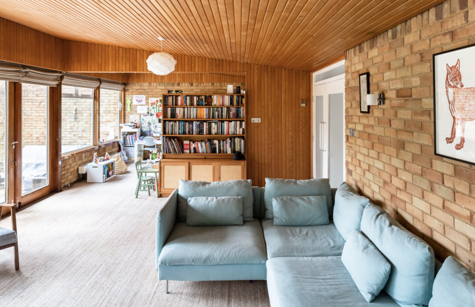
Wood paneling on either/or both the walls and ceiling also shows up often in this style.
It’s always in a mid-wood tone since the darker colors lean more towards a traditional design sense, and the lighter woods head off in a Scandinavian direction.
Wanting to Incorporate Some MCM in your Style?
Here are my top 5 tips for adding MCM touches in your home:
Number One | You can’t fake MCM furniture lines. If you want MCM, you have to stick with simple clean lines, boxy arms, and legs for days.
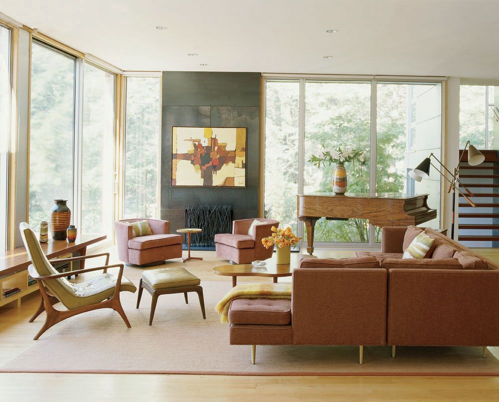
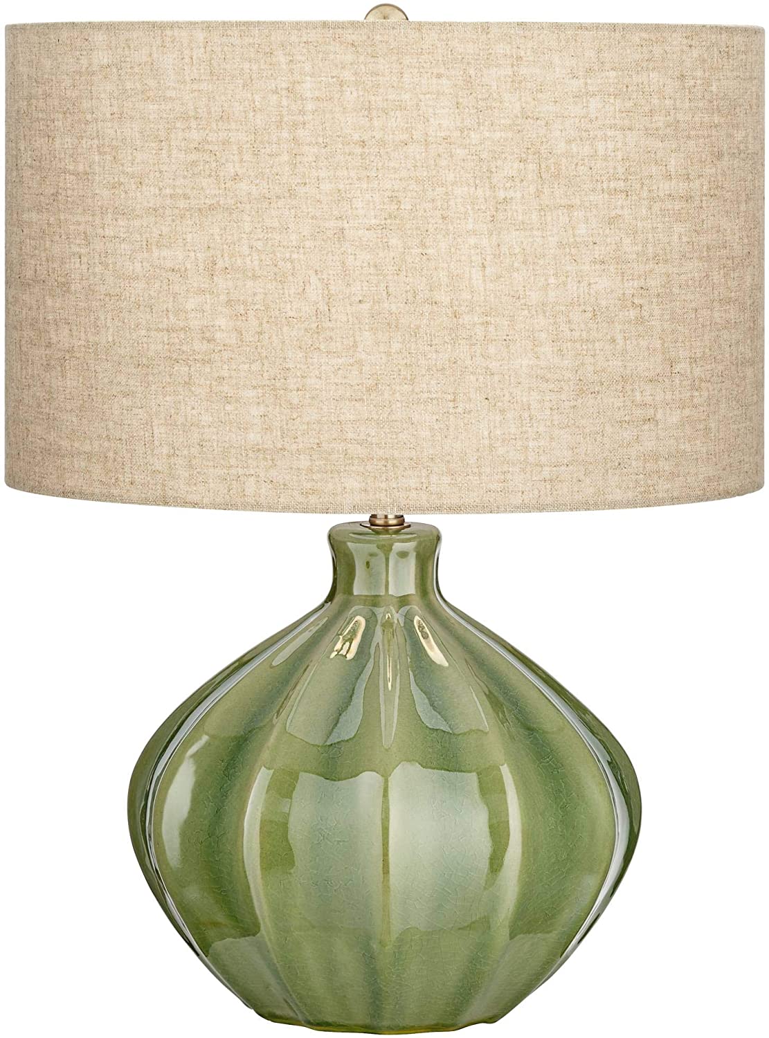
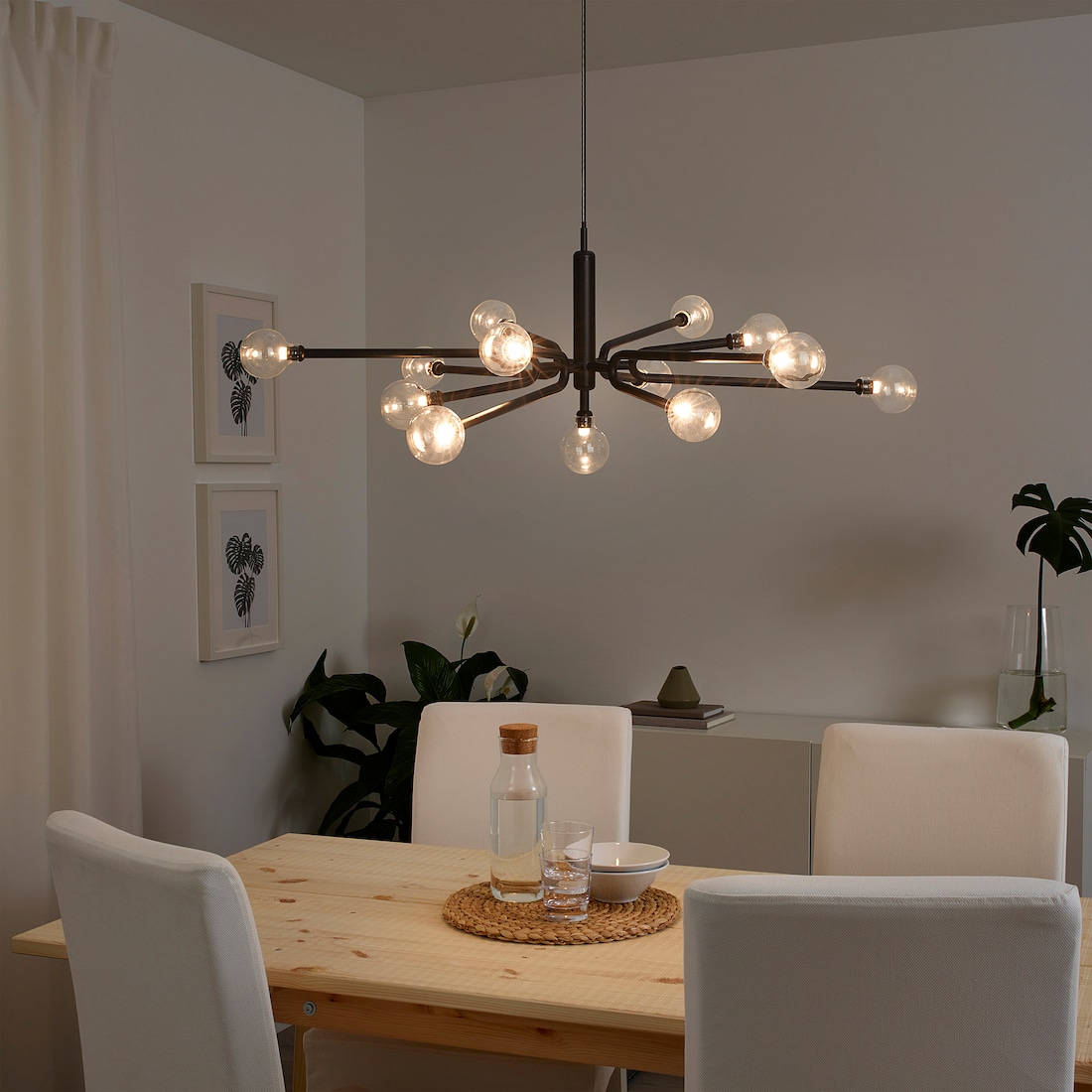
Number Two | Get some fun lighting!
Smaller lamps with gourd and “blob” shapes are perfect.
And for overhead lighting, think funky, modern statement pieces. IKEA is a great source for some neat options!
Number Three | Try out a mid-tone wood accent wall.
Number Four | Add some fun modern art and definitely look into DIYing your own!
Number Five | No curtains! This is worth noting because it’s so different than some of the more common design styles a lot of us might be drawn to.
If you have privacy concerns and need window coverings, I’d recommend trying to create some pinch-pleat curtains of your own.
This is also a circumstance where I’d release my “hang your curtains to the floor” rule and say that curtains that hit at the bottom of the window or slightly below are right on trend.
And that’s it! My summary All About Mid Century Modern design style!
If you’re in the market for MCM products, here are my best suggestions:
High End/Designer Prices:
Mid Range:
Lower Budget:
- IKEA
- Target – Specifically Project 62 (Which was named after Target becoming a company in 1962!)
- Amazon
- Ebay
- Etsy
Let me know in the comments below what you feel about MCM! What are some of your favorite elements? And some you can do without?
Until next time,
