English Cottage Wallpaper Choices – Made Easy for You
If you’re looking for some Wallpaper choices to match your English Cottage Style home – I’ve got a selection of my favorite 20 here to share with you!
As I was brainstorming and designing our bathroom makeover (part 1 & part 2) I ordered quite a few samples, and while I ended up not using any of them in our bathroom due to feeling like it was too small to take on extra patterns, I wanted to share my top favorites with you as inspiration for your own spaces!
You can watch here to see how the bathroom is turning out:
My Top 20 English Cottage Wallpapers:
If you’re new to the idea of English Cottage Style decorating, I have a whole journal post dedicated to the main parts of the style & how to incorporate it into your home.
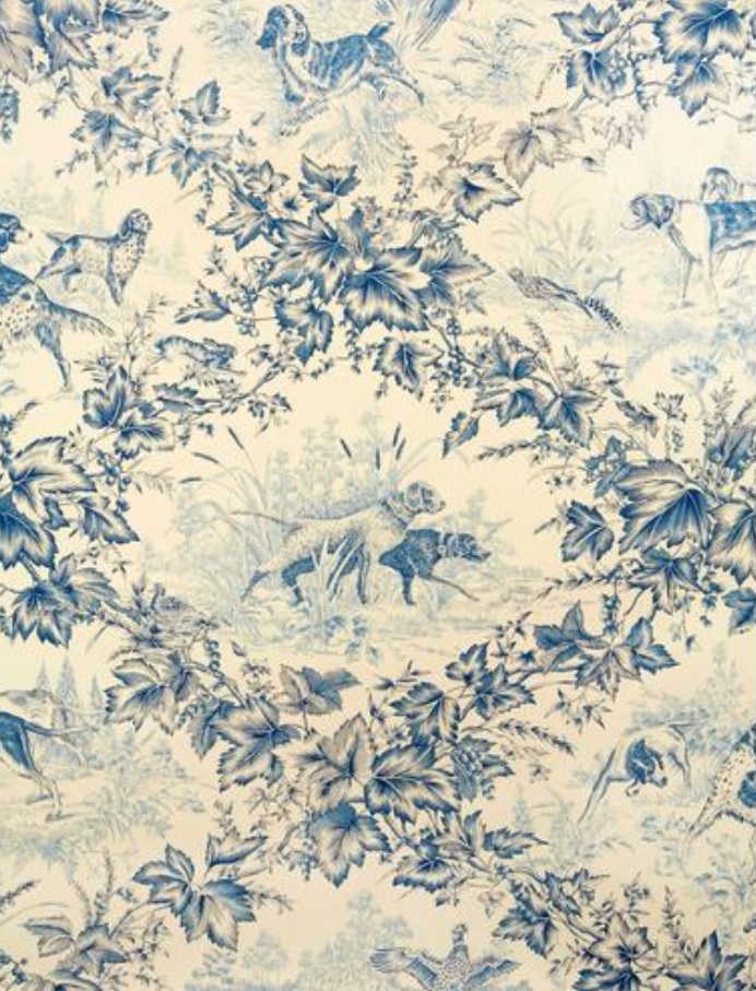
Number One | Brunschwig & Fils “On Point”
This first wallpaper fits right in with idea of incorporating animals and especially hunting or “hounds” into your decor.
Ivy is also one of the quintessential types of greenery used in this style.
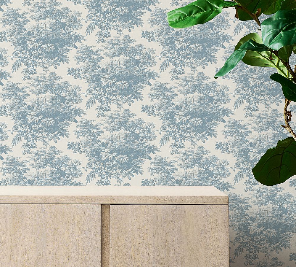
Number Two | Matine Toile
Toile is a specific type of pattern that incorporates a repeating decorative scene on a background of white or off-white – I love that this one makes it feel like you’re looking through the woods onto an old beautiful estate.
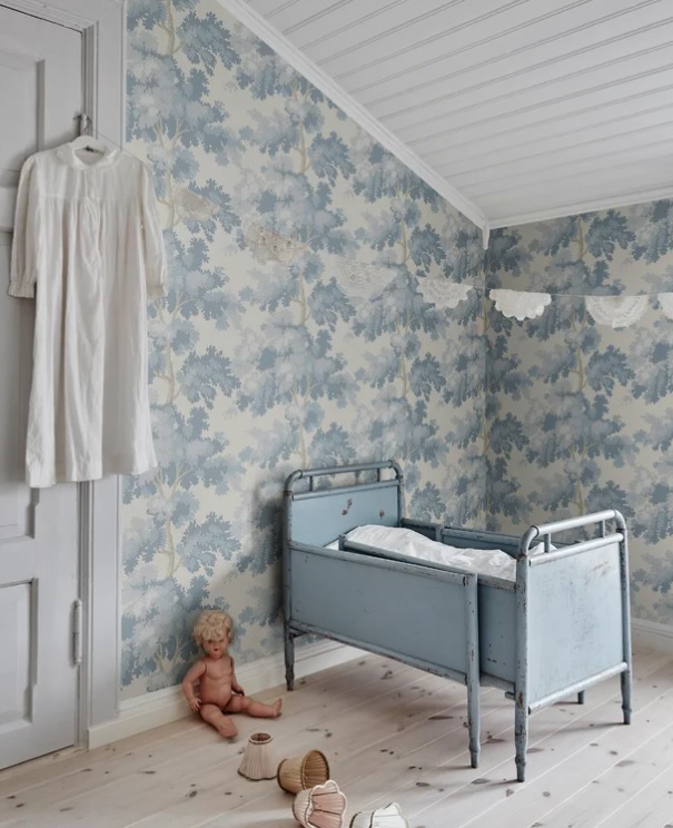
Number Three | Raphael Floral
It’s no wonder this is one of Wayfair’s most popular printed wallpapers! Such lovely colors & a large, impactful repeating pattern that can work in a variety of spaces.
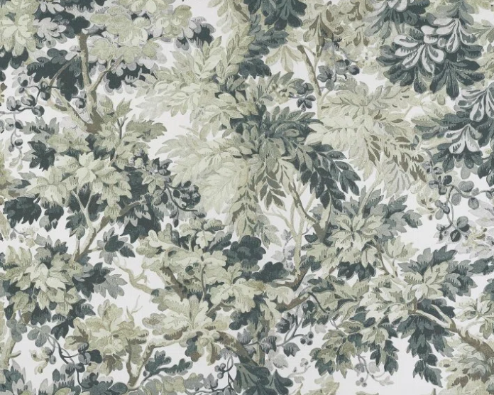
Number Four | Fountainebleau – Amande
This pattern is another beautiful repeating print with various colors of leaves on branches.
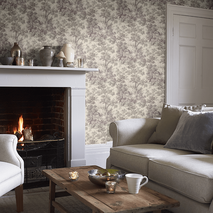
Number Five | Stag Toile – Chocolat
Another toile, this time in chocolate brown and with a more simple scene.
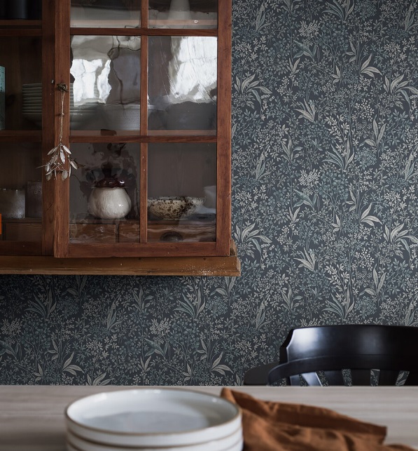
Number Six | Nocturne by Boråstapeter – Blue
This moody print is darker and higher in contrast than the ones we’ve seen so far. It’s fashioned after the intaglio printing process which gives extra depth and dimension in the foliage.
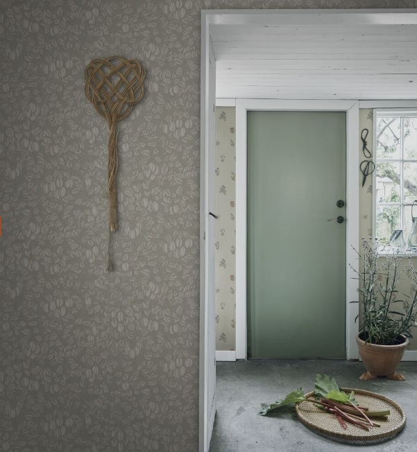
Number Seven | Emrick by Sandberg – Sage Green
This option is much more neutral and has fruits mixed in with the vining leaves.
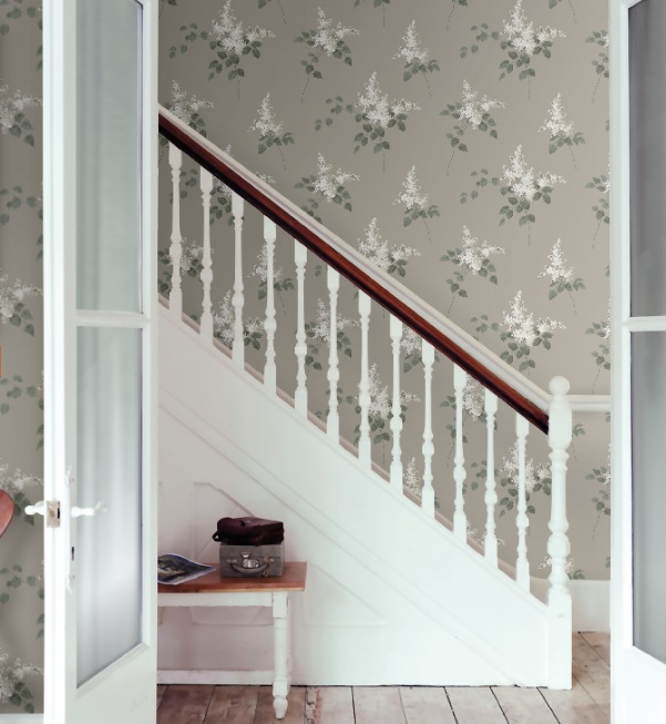
Number Eight | Lilacs by Boråstapeter – Taupe
Lilacs are already one of my favorite flowers, so you might have already guessed that they’d be represented here. These white lilacs with green leaves are just beautiful!
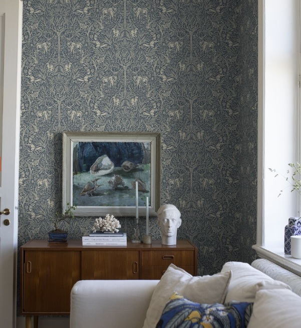
Number Nine | Under the Elder Tree by Boråstapeter
I can see a lot of William Morris inspiration in this print! The small woodland creatures in the woods is one of my favorite plays on pattern.
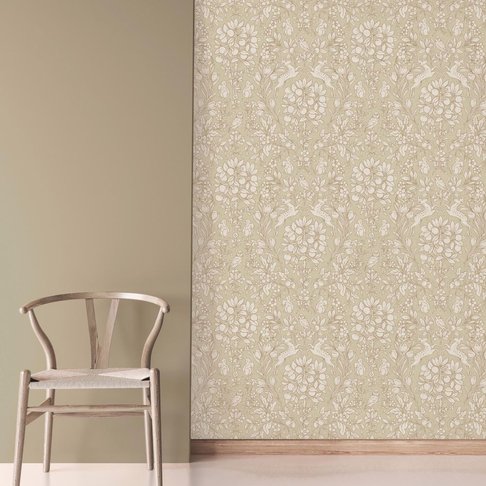
Number Ten | Woodland by Crown – Beige/Gold
This sample involves plants, growing fruits AND woodland creatures – a trifecta! Plus it’s a beautiful neutral beige that could fit a number of applications.
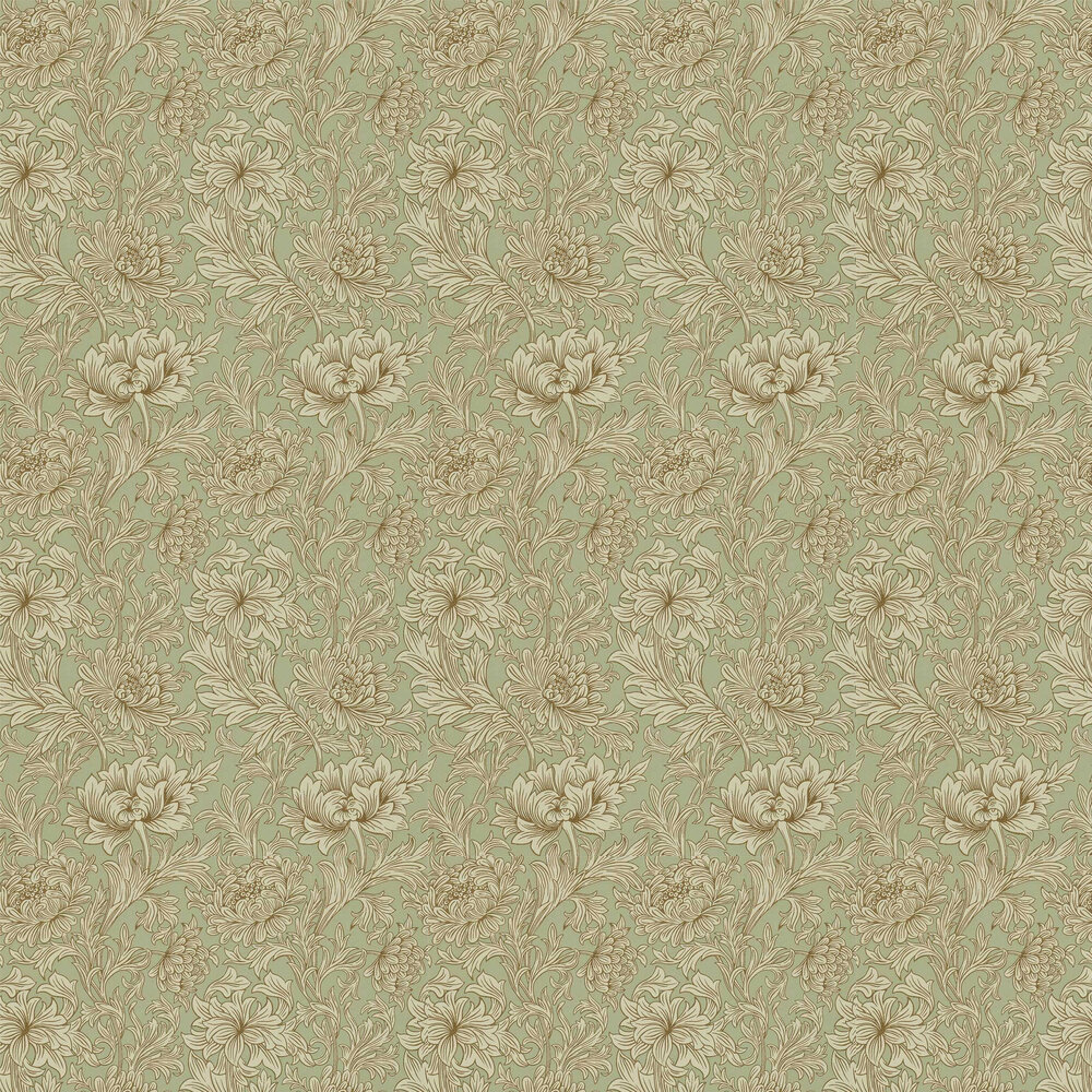
Number Eleven | Chrysanthemum Toile by Morris – Eggshell/Gold
This is a more dramatic version of toile and is based off a William Morris design.
Number Twelve | Giorgio Tree by Albay – Green
This is another option with lots of coordinating greenery in the leaves, but also involves larger spaces of visible branches in nice neutral colorway.
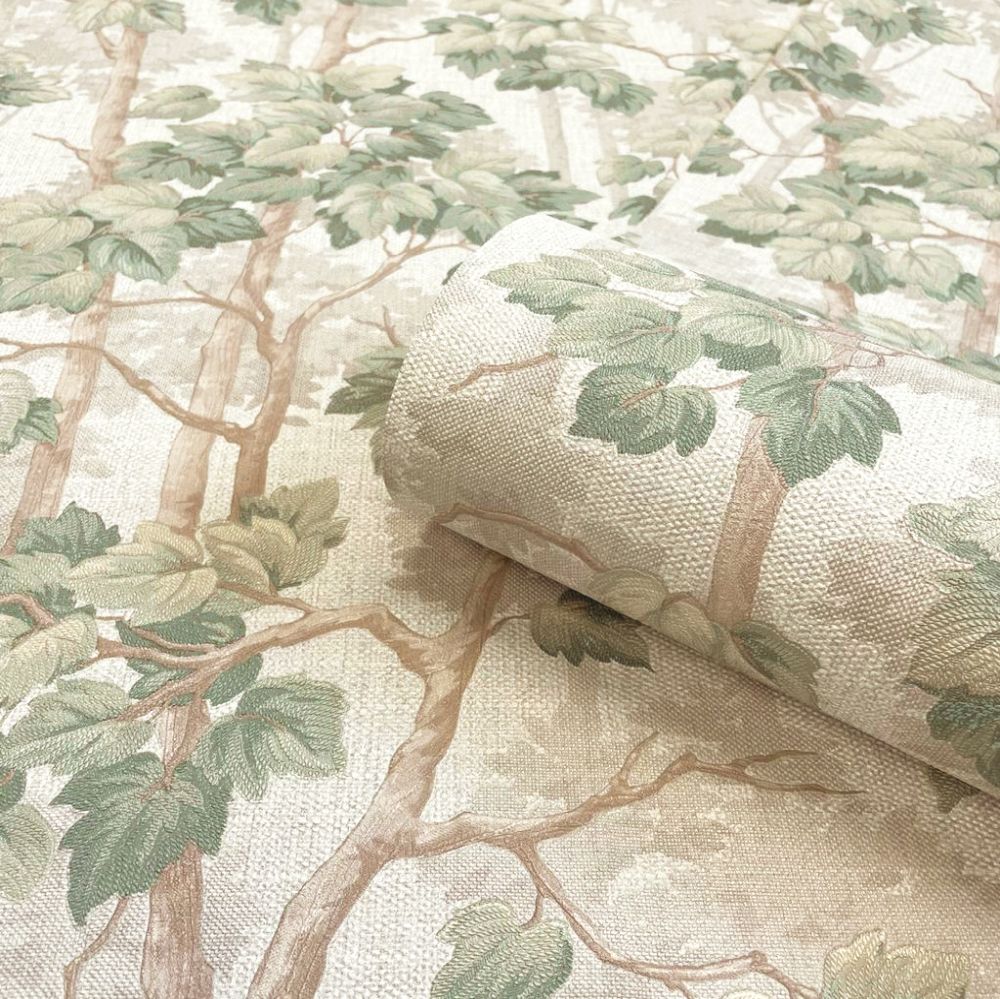
Number Thirteen | In the Oak by Boråstapeter – Green
Oak leaves have a special place in my heart – and eagle eyes might have also seen them in different versions of my logo! This one incorporates beautiful snacking birds and is so precious!
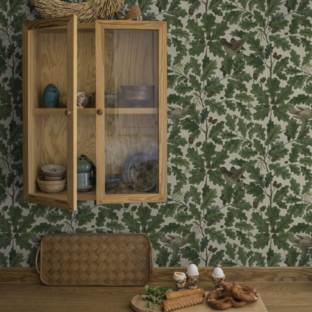
Number Fourteen | Rosenvinge by Boråstapeter – Brown
This one was a real contender when I was considering a wallpaper in our living room! It’s included in my post: Choosing Wallpaper Like A Pro. It’s considered a tutor style with the roses & daisies.
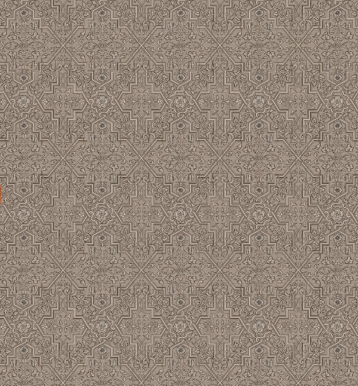
Number Fifteen | Bellfower by Morris – Linen/Cream
This is another one inspired by a William Morris carpet design.
Is it any surprise he’s one of my very favorite designers?! So many beautiful designs.
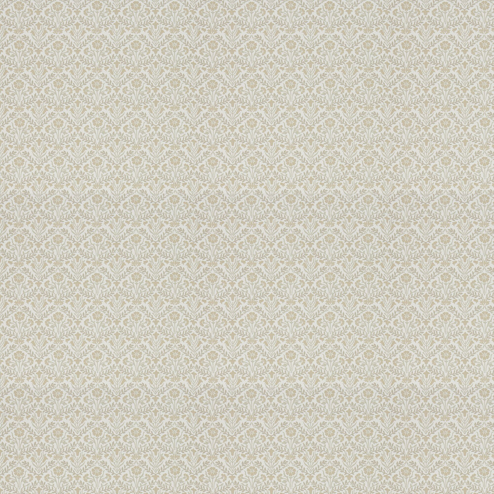
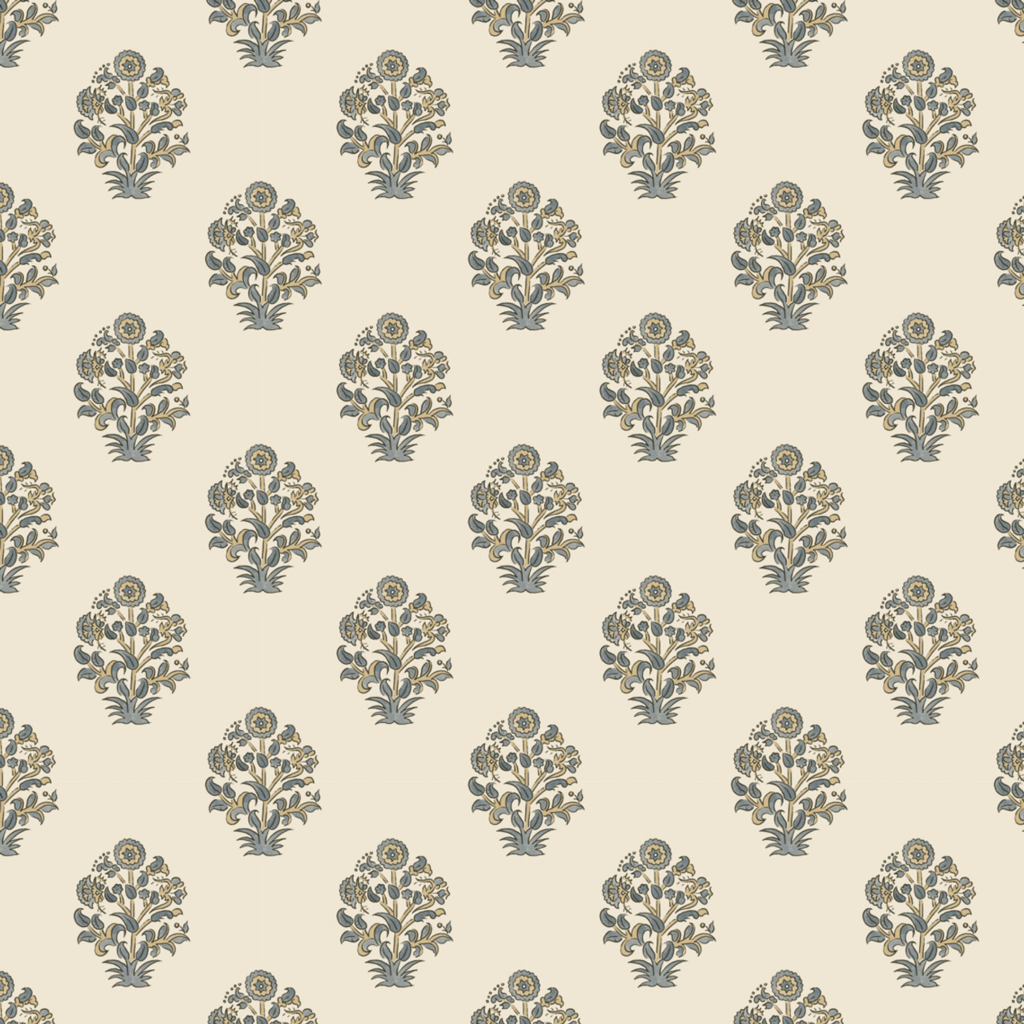
Number Sixteen | Afton Block Print
I’ve been enjoying block prints (both the style & the process) for the past few years, and this one is no exception – it’s beautifully intricate and mixes some of my favorite colors.
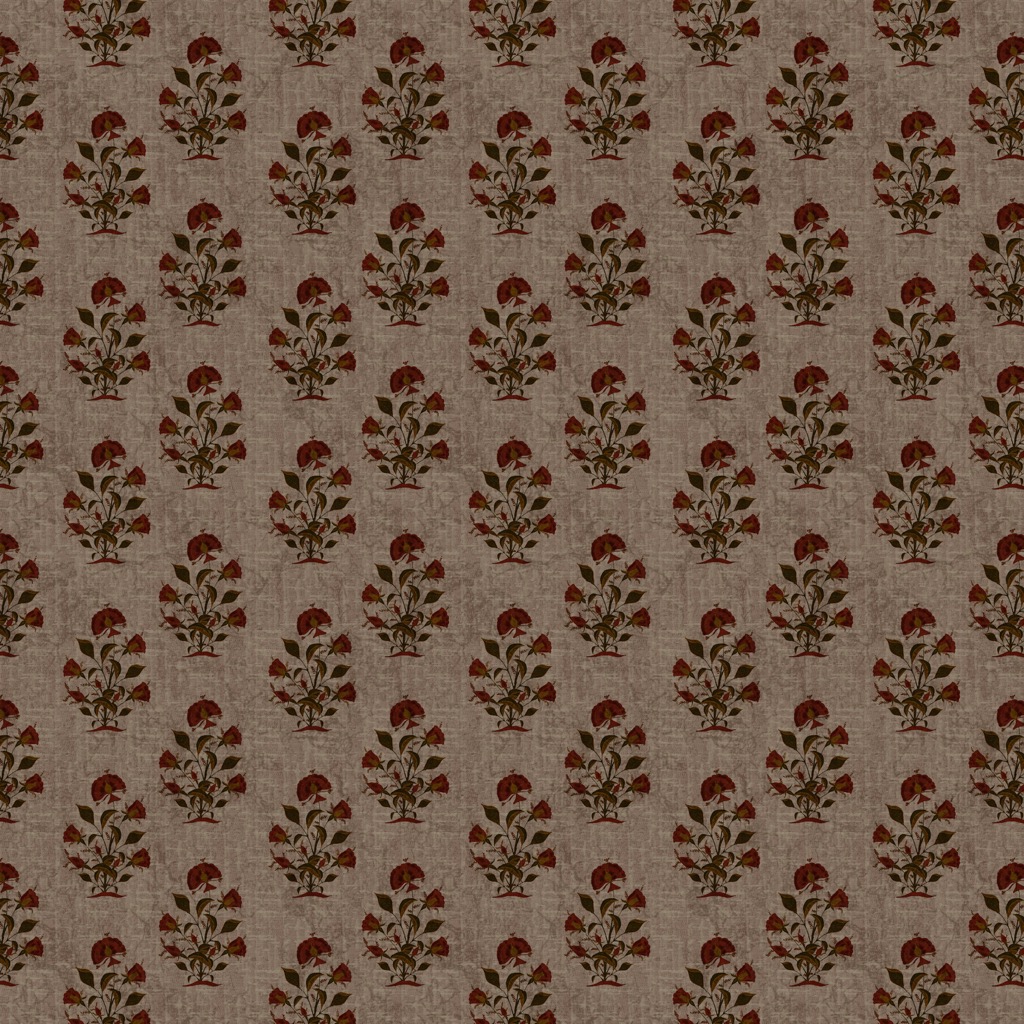
Number Seventeen | Arden
This one feels like the darker, moodier cousin of the block print we just looked at above!
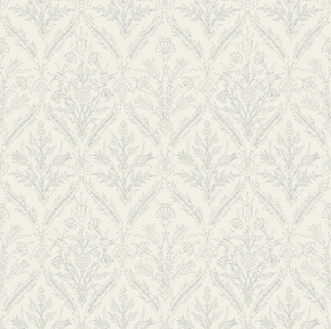
Number Eighteen | Gretta in French Blue
This was one of the most popular contenders in my proposed bathroom wallpaper choices! I do love how subtle and delicate it is!
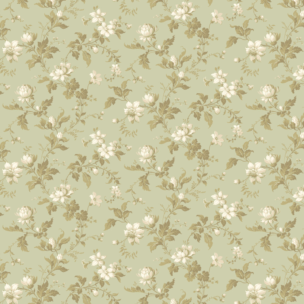
Number Nineteen | Blomslinga by Boråstapeter
The last floral on our list is another with white blossoms on a green background with greenery. These larger flowers remind me of peonies, which I have growing in our yard and have always loved.
Number Twenty | Alma by Cole & Son
Last, but certainly not least – Alma! This is the one we chose to hang in our Fireside Room – I’ve loved the change of having this beautiful print on the walls in that highly used space that is central to our entire home.
We installed this wallpaper near the beginning of the process to make our home feel more like an English Cottage.

I hope you’ve enjoyed these English Cottage Wallpaper options!
Here are a few related journal posts & Pinterest boards you might also enjoy!
- How to Add English Cottage Charm to your Home
- All About Cottage Style | Michigan English Cottage Home Tour
- How to Incorporate Cottage Core Decorating Ideas
- Modern English Garden Teen Girl Room Reveal
- Pinterest Boards : Vintage Wallpapers | English Cottage Style | Cottage Core Style | Vintage Wall Treatments | Vintage Gallery Walls
Pin these English Cottage Wallpaper Ideas for Later:
