How to Design the Perfect Nursery
Let’s Design a Nursery Together!
I don’t know if I’ve ever shared this before or not, but there was a time in my life when I wanted to do specifically nurseries as a design business!
Today I’ll be tapping back into that desire as I share the 5 elements that I think go into an excellent nursery design.
Feature Photo Credit: Historikahem
This is part three of a series all about kid’s bedrooms! If you haven’t already seen the previous videos in the series you can find them here:
Read on to see all about how to design a nursery, and then at the bottom of this post I’ll share some of my other ideas for this series and you can weigh in on which you’re most excited to see next!
Nursery Planning
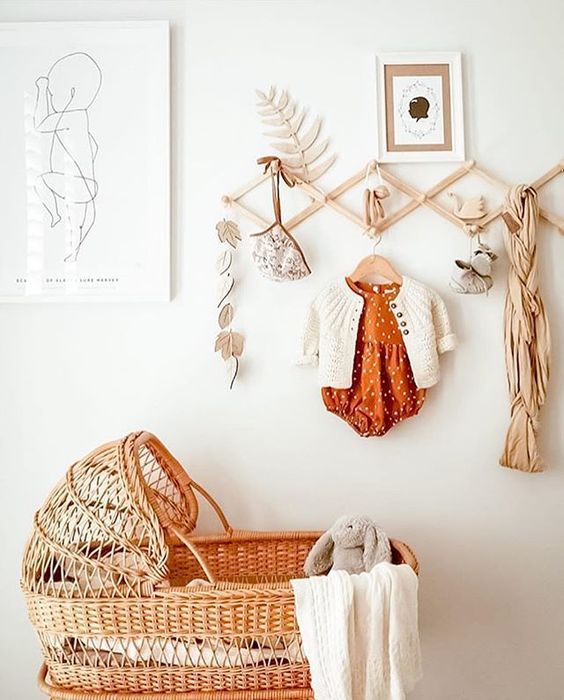
I’m the kind of mom who had my children in my room with me for a while, almost until the time they were crawling out of their bassinet. I look at the direction bassinets have gone recently and love the look!
The rattan woven baskets are so dreamy and really become heirloom quality in my mind. Plus there are plenty of options for styling them. You can find versions that hang from the ceiling, some that come with wooden rockers or stands, and different trims and skirts added to the edges and base.
They have a great boho feel, but honestly look wonderful in any number of different nursery and home styles.
I think bassinets make the itty bitty newborn stage really simple.
Once baby is old enough, or whenever you’re ready to transition them into their nursery, there are 5 elements I think are necessary! Let’s break them down.
In my weekly Behind the Scenes Design Group I love sharing the things I learned in design school, the things I did not learn in design school, and all that I wish I had learned. It’s such a joy to pass it along to such a creative group of ladies! If you aren’t already on the waitlist to join us, now would be a great time to add your name! We’d love to see you the next time we open our doors. (And those of you on the waitlist get notified first!)
When I teach my design lessons I like to give an outline quickly, and then move into looking at actual rooms and seeing the rules and ideas in practice.
It’s a submersion type of education where you’re equipped first with the ideas and then we get to jump right into seeing them in action. I love this way of teaching because it makes it easy to see spaces in a new way that you might not have seen them before!
Let’s get started!
*This post contains affiliate links to products I know &/or love.
The 5 Necessary Elements when You Design a Nursery:
Number One | A Great Rug
Nurseries are one of those rooms where I’d always suggest a really nice rug! Not only do they add a great look to the space, but they’re also lovely to have a comfy place to lay baby down, or even to lay down next to baby.
The layered look is fabulous, especially with a soft sheepskin rug topping it off. I’ve found great quality sheepskin rugs at icowhide.com before! The colors and thickness are spot on. They don’t seem to be offering sheepskin rugs at this time, but I’ve found some on Amazon that are comparable!
Nursery rugs are also fun because anything goes! You can go neutral or have as much fun with color and thickness as you’d like!
Number Two | Zone the Room
In any given nursery I think there are three zones you’ll want, no matter the size of the space:
- Feeding Area
This area includes a great upholstered (and often slipcovered) chair, an end table or other surface for setting your water, phone, baby bottle, and a light.
- Dressing/Diaper Changing Area
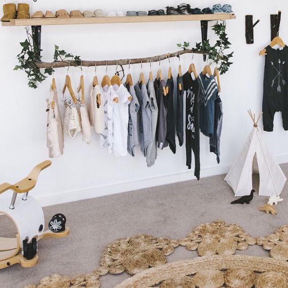
This area includes items like a changing table, dresser, or storage in the closet.
I love how creative this idea is from Amy of thefolkchildstories on Instagram.
- Sleeping Area
Choose a beautiful crib for a great focal point.
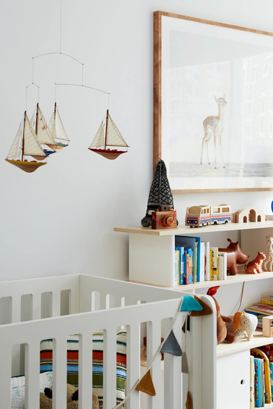
Mobiles don’t seem to be as popular anymore, but they can be a really darling piece to add above the crib.
I love this one with the sailboats by Emily Henderson.
Number Three | Make a Great Accent Wall
Nurseries are a wonderful space to incorporate a really fun accent wall or wall treatment. You can use wallpaper, full size murals, shiplap, there are probably a million great ideas for making the wall behind your crib stand out as a statement.
If you’re looking for printables for an accent wall of your own, click HERE for 12 of my favorite curated prints that you can download for free!
Number Four | Add a Fun Light
Nurseries are pretty simple compared to other spaces like a living room or a kitchen or bathroom, so this is a fun opportunity to add a big jewel pieces to the room in the form of a fun and unexpected light fixture.
This is also fun because when baby is little and spending lots of time laying down and playing, they’ll have something really captivating to look at above them.
Number Five | Double Duty Decor
Plan ahead as you’re purchasing items for your nursery and make sure that your necessary items can double as decor when possible!
This can mean styling toys, clothes, or other little pieces that baby needs or buying cute storage containers to put things away that might not look like decor on their own.
Adding elements of decor to your functional items is a design tip I’ll recommend, no matter the space.
Now let’s dive into some real life examples and see how these five elements can look in different spaces!
Real Life Nursery Examples:
The first of our nurseries to examine is this one put together by Amy Peltier for the 2014 Pasadena Showcase.
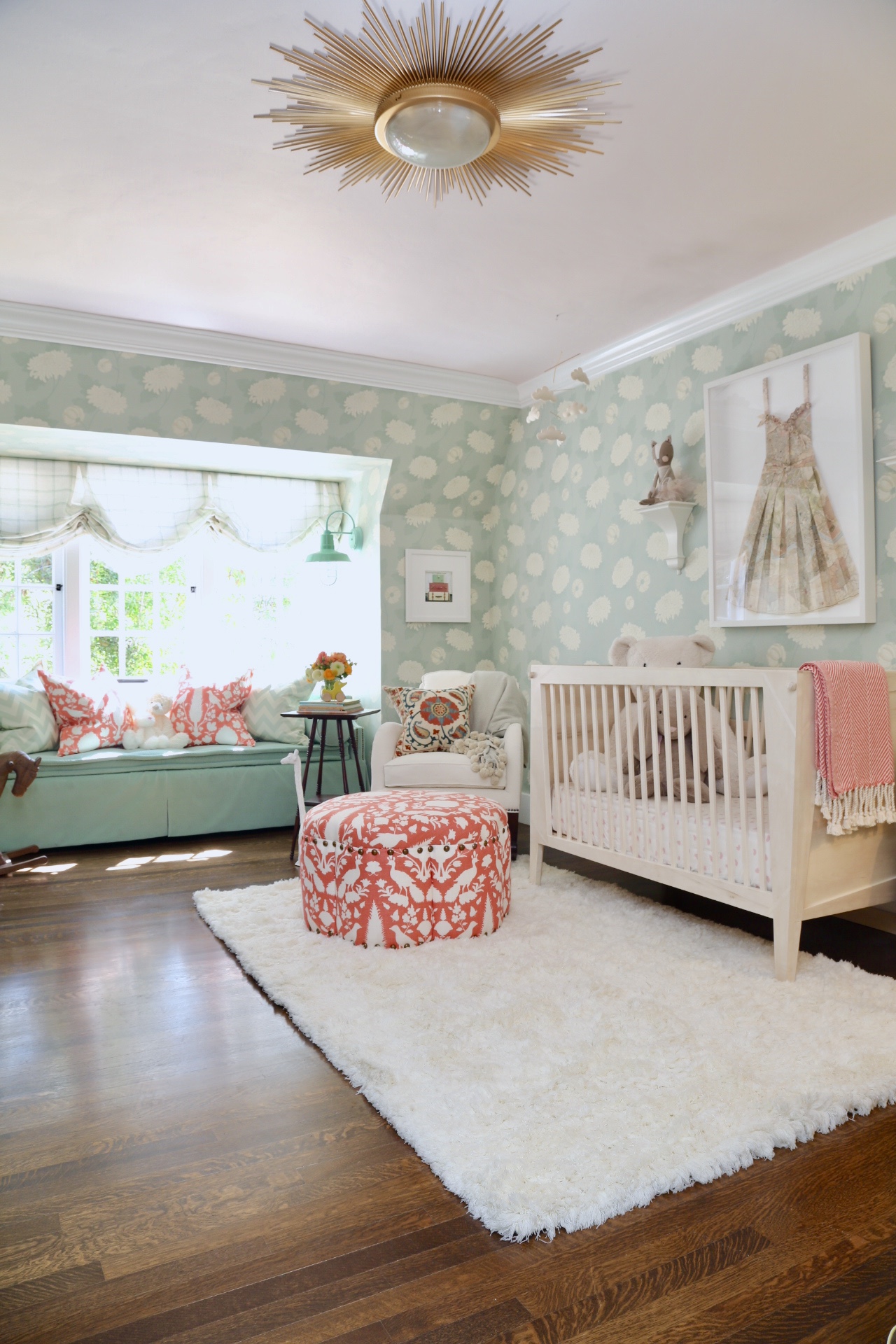
I just love the starburst light, the fantastic rug, and great storage options. The seating area that looks like a window seat is actually a custom made day-bed, which I love.
The wallpaper is beautiful but not too busy, and the fun teal sconce and the framed origami dress are just the perfect finishing touches.
Followed by this nursery by Amanda John of Strawberry Chic Blog.
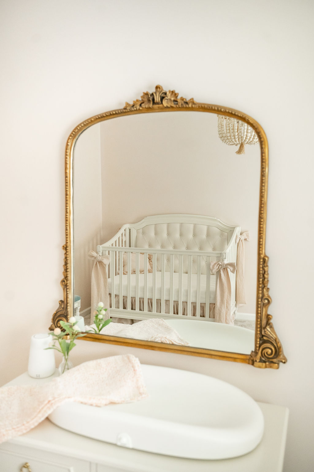
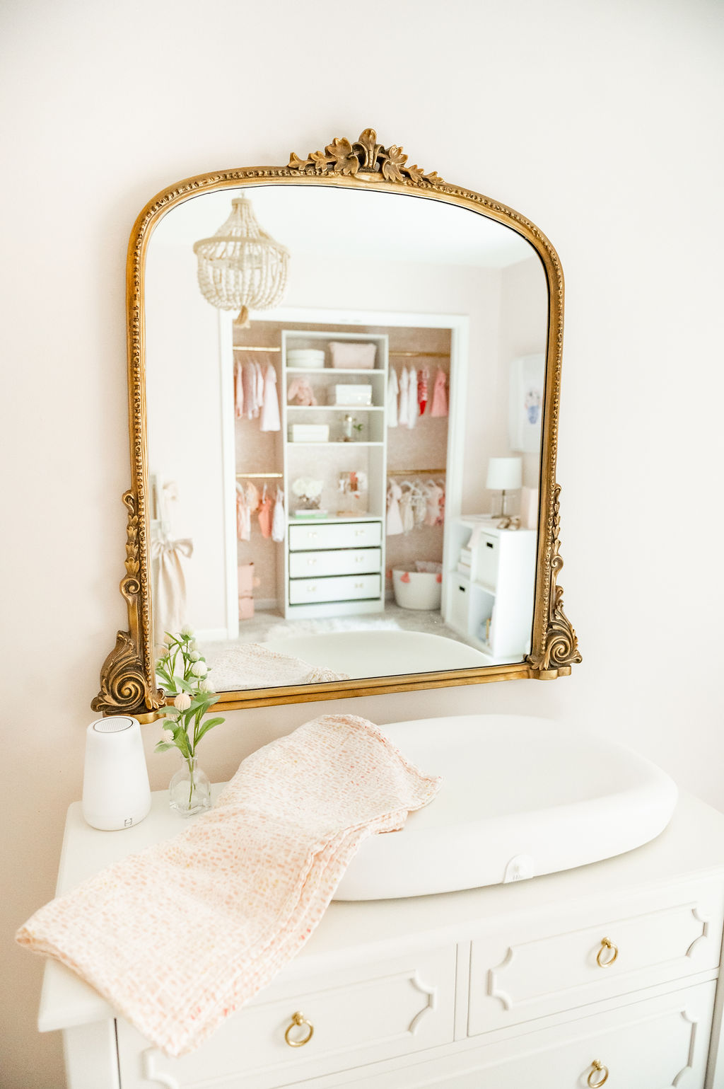
I love the fantastic crib with accent bows in front of the simple blush pink walls and this dreamy gold mirror across the room.
This is a carpeted room, so they chose not to add a rug. The light fixture is beautiful and has a boho feel with the natural raw wooden beads.
She added great storage in the open closet with a surprise wallpaper accent on the back wall.
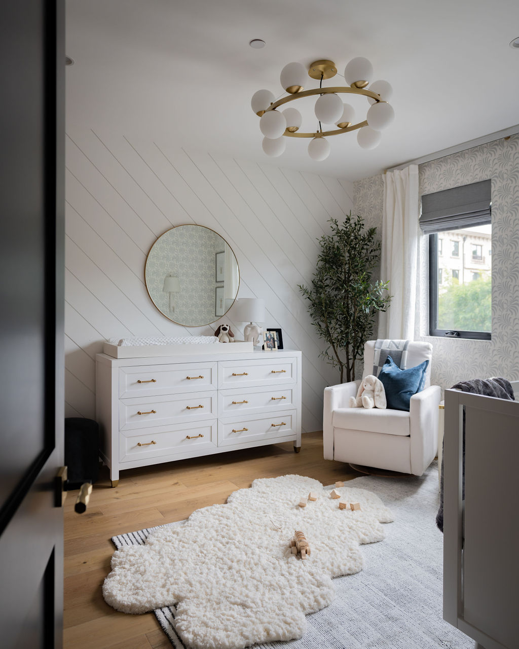
This next nursery is this beautiful one for a little boy named Noah designed by Stephanie of RockabyeMommy.
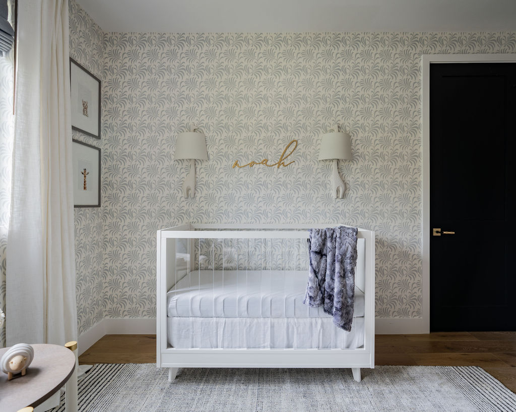
I love the fun repeating wallpaper, the precious framed animal “bust” art on the wall, and the giraffe accent lamps.
The navy door is a beautiful choice as well.
Across the room is a neat diagonal accent wall with the changing area and feeding areas.
Layered rugs offer a cozy floor play space, and it’s all topped off with a really neat circular gold light fixture.
This next space is a baby girl nursery shared by Beth of Palm Beach Lately.
The wallpaper and leafy palm accents are such a fun accent and remind me of palm springs.
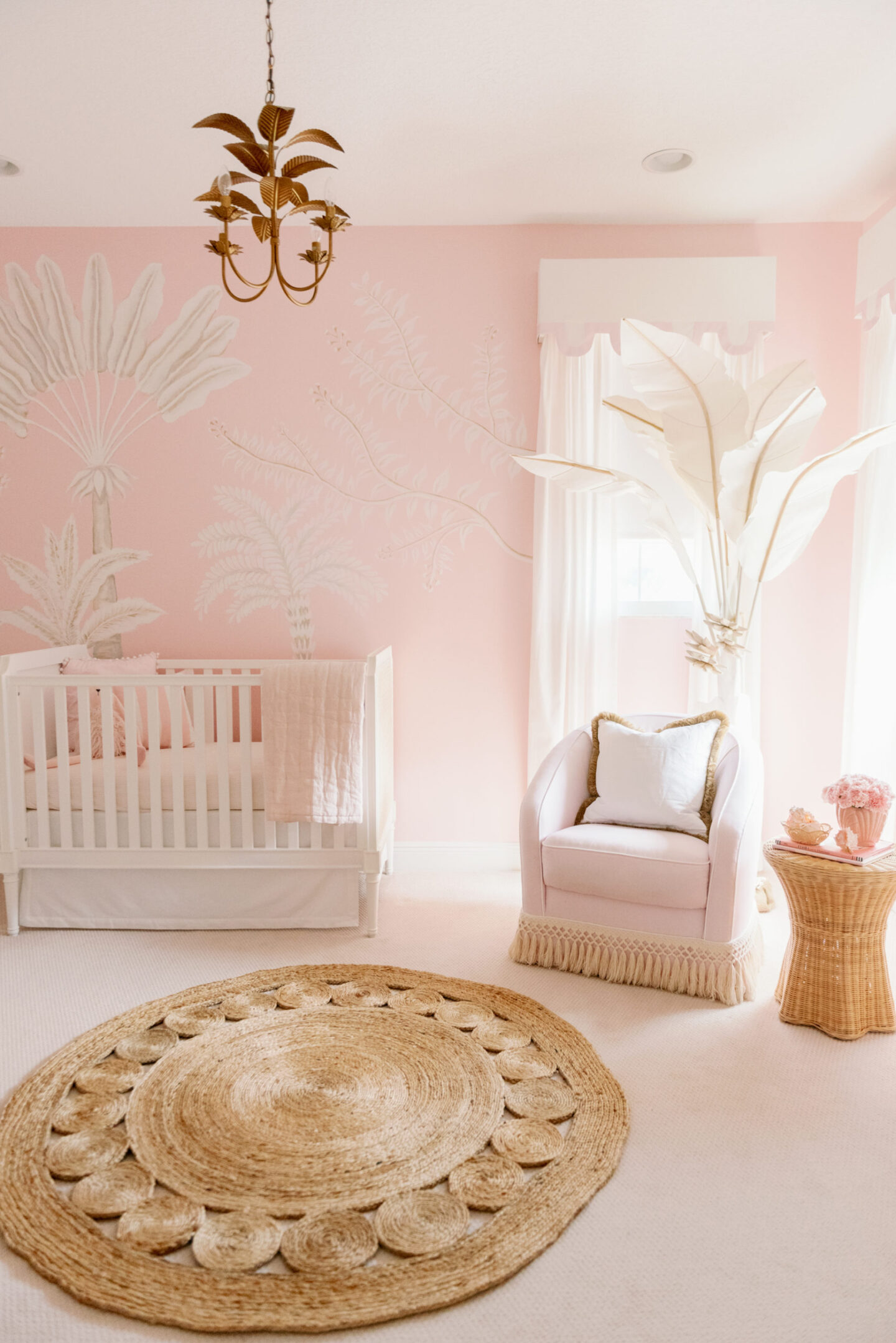
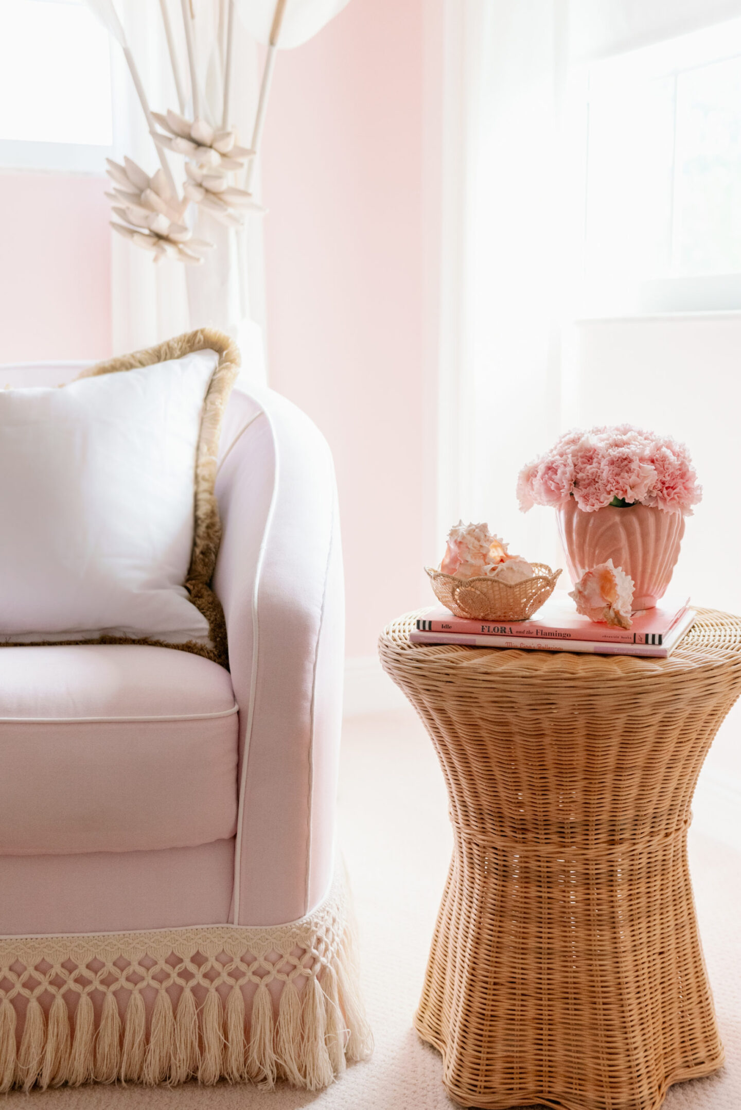
The rug is beautiful and goes so well with the bullion trim added to the bottom of the chair and the rattan end table.
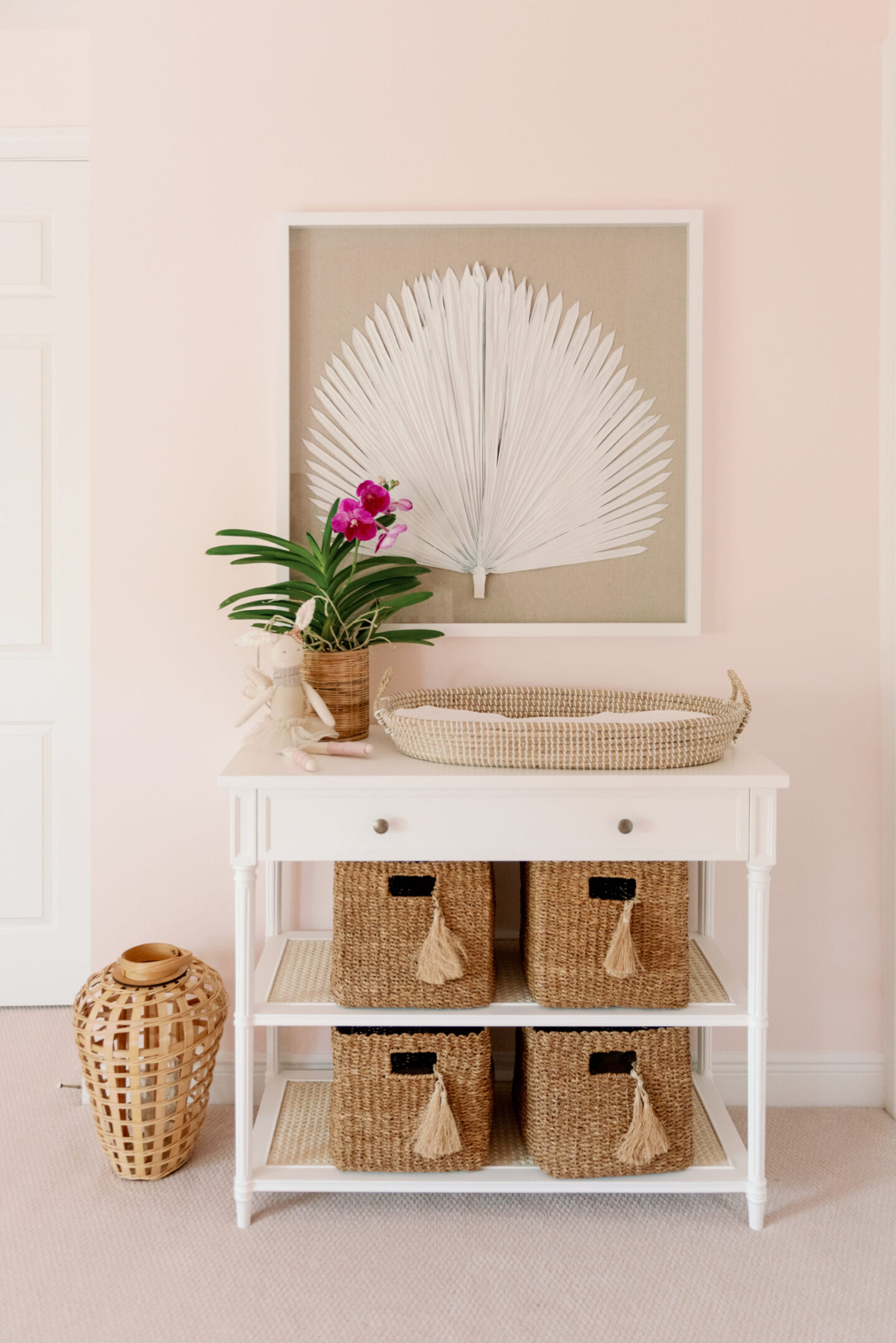
The changing table accent has similar wicker baskets that create a generous amount of out of sight storage. Plus I love the tassels.
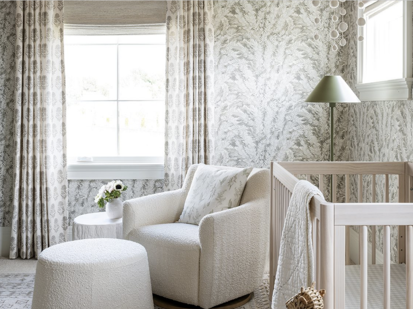
Then we have Margot McGee’s Nursery, Sid & Shea’s newest addition!
They’ve gone with a bold pattern mix between the wallpaper and drapes, and more simple with the upholstered chair and matching ottoman.
I love the mauve paint on the vaulted slat ceiling.
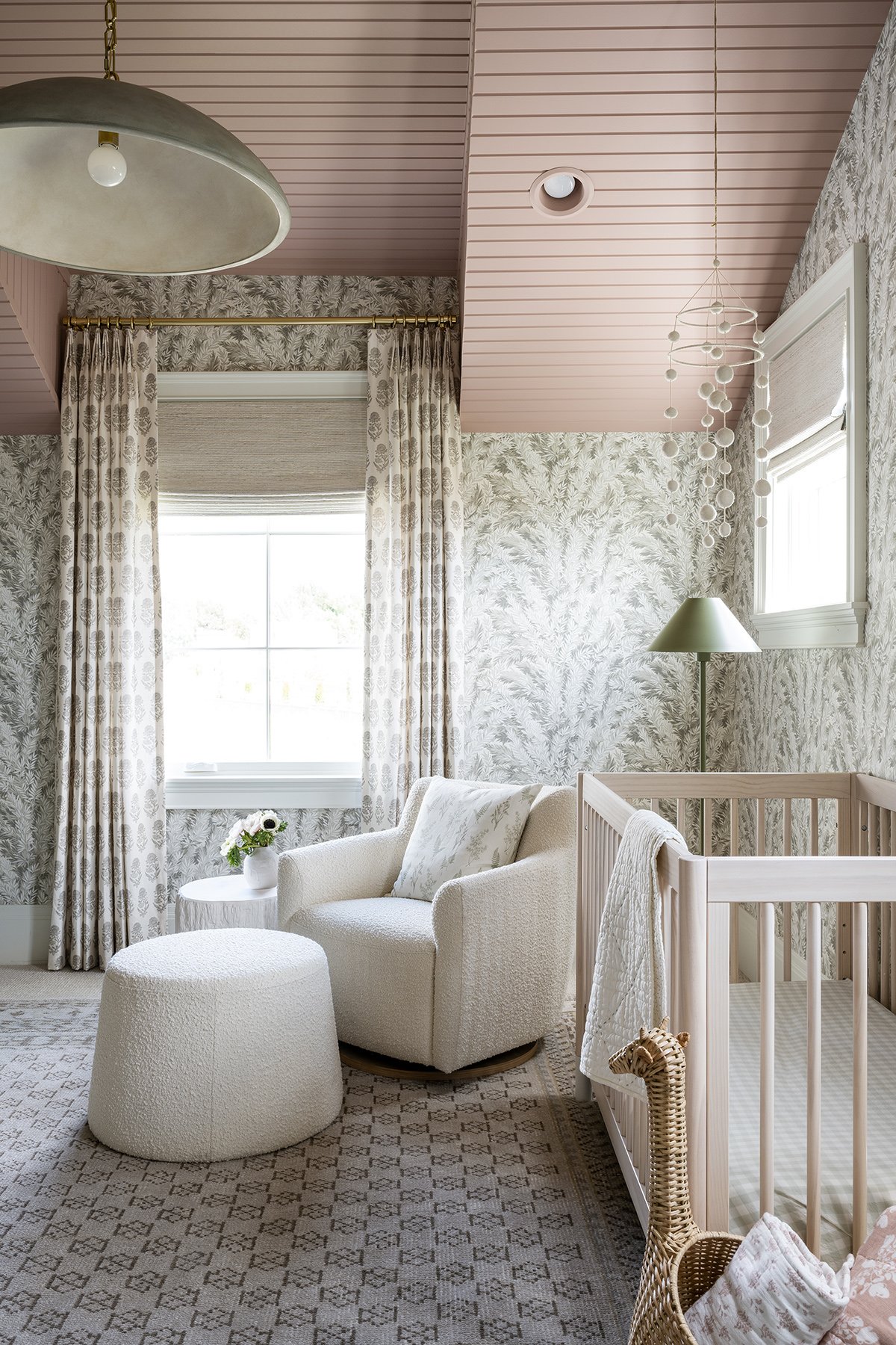
Finished off with beautiful lighting, fun storage options and a beautiful understated mobile above the crib.
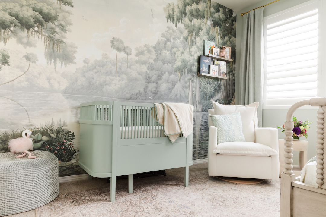
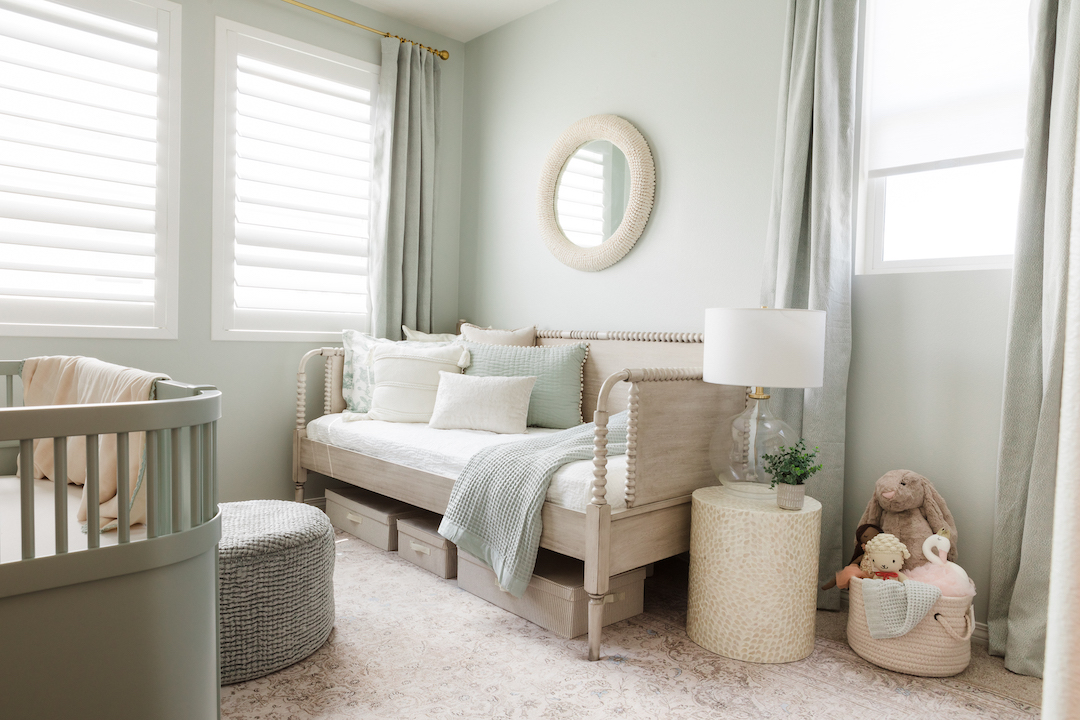
This next space is a beautiful Southern inspired nursery by Little Crown Interiors.
The mural along the wall behind the crib is such a beautiful statement and really set the tone for the rest of the space.
The crib is unique and the light green almost blends right into the scene.
Across the room is a beautiful daybed that would be a great space to house guests if you needed the space, or for a tired Mama to get some sleep while still being close to baby.
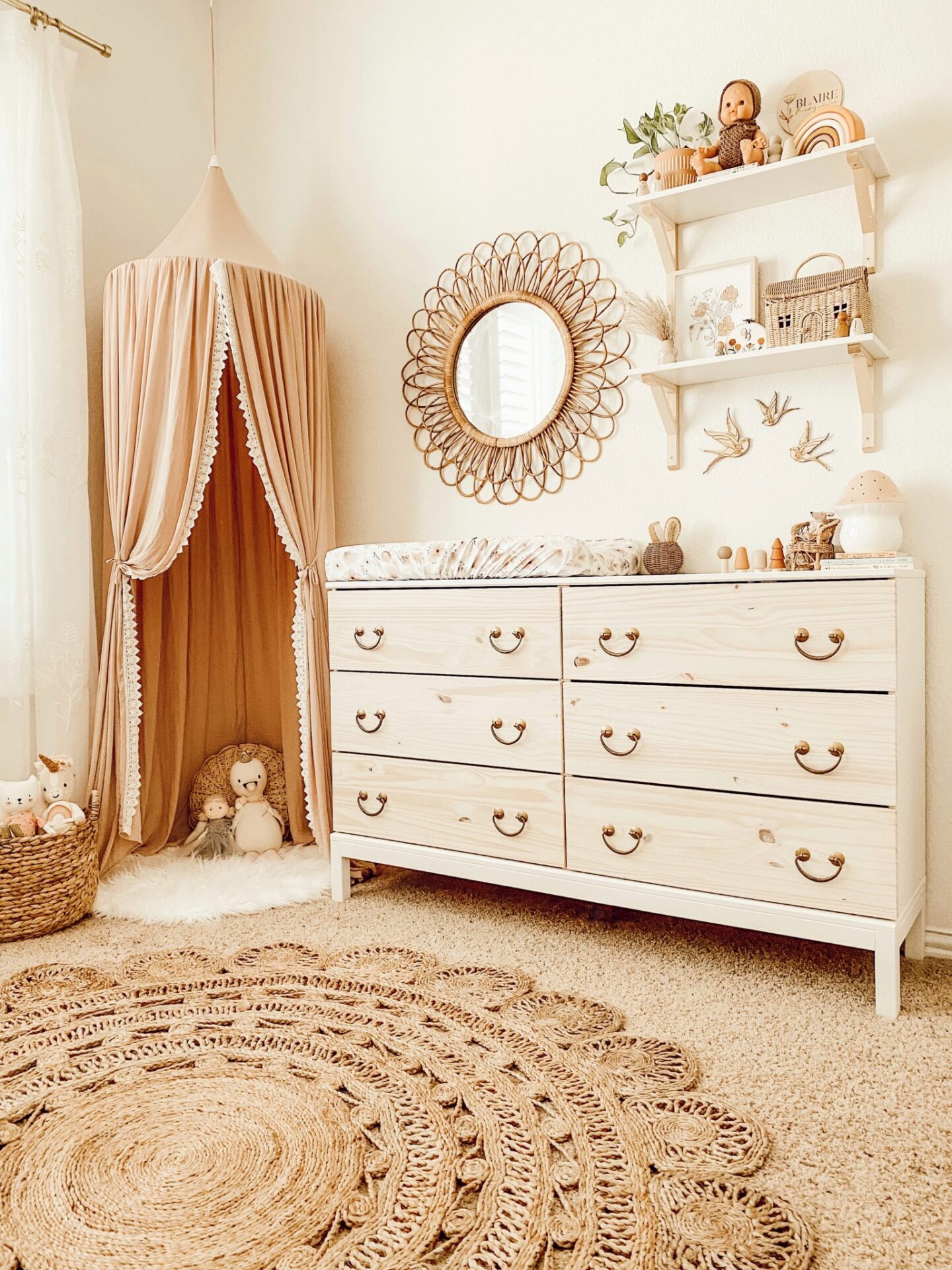
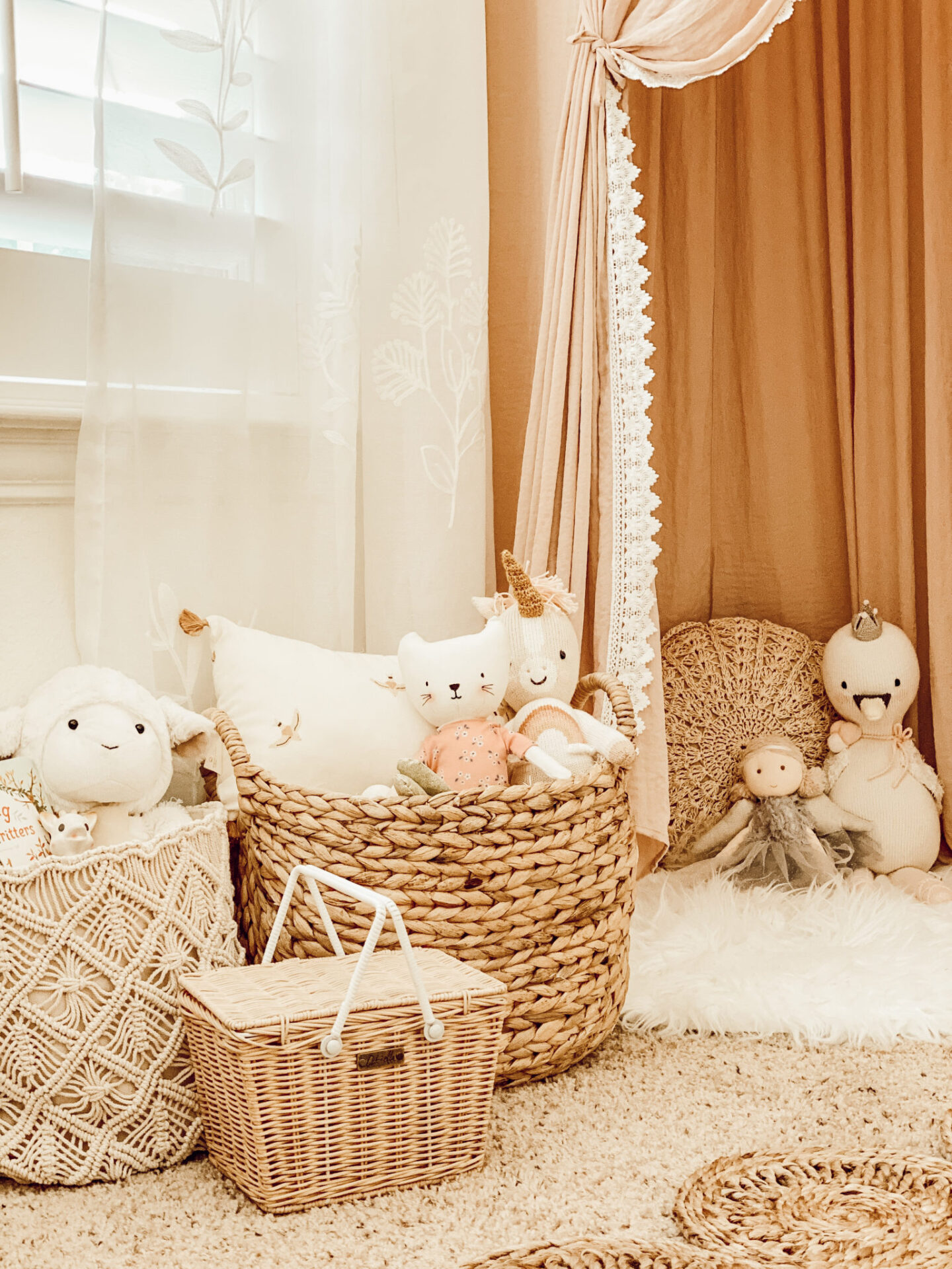
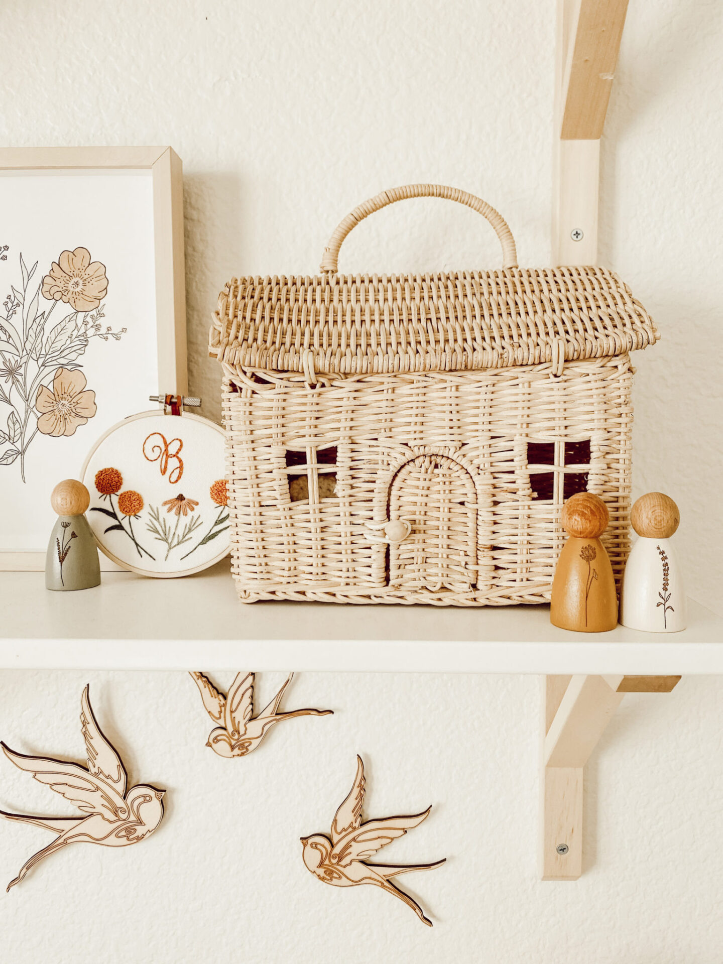
Here is a beautifully cohesive boho nursery by Courtney Fitzpatrick.
I couldn’t pick just a few pictures to share of this nursery because the elements are just so well thought out and complementary.
I love the raw wood and caned accents throughout. The overall neutral feel with fun pops of color.
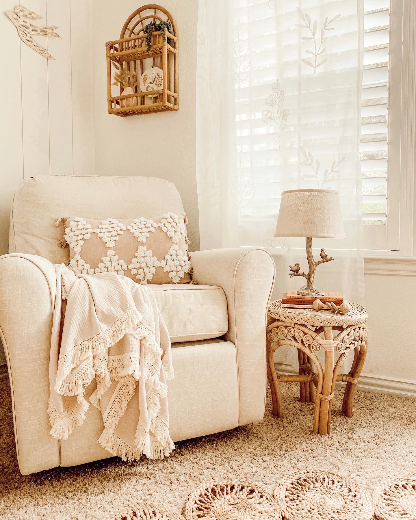
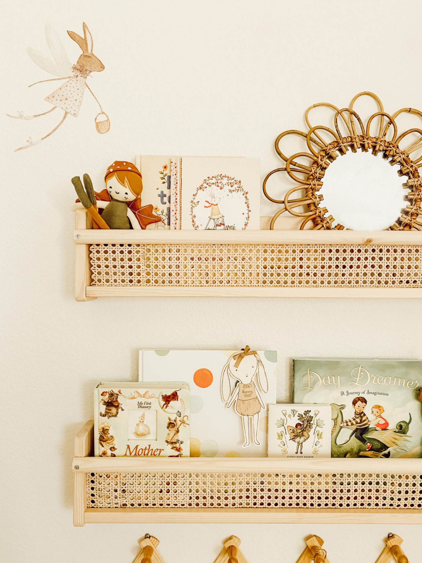
I love the addition of this beautiful corner canopy and the fun jute rug. I got a similar rug a few years back from World Market, and they’re also available on Overstock.com.
Pretty baskets for storage with fun stuffed animals.
Topped off with a fun basket light fixture and a neat paneled accent wall.
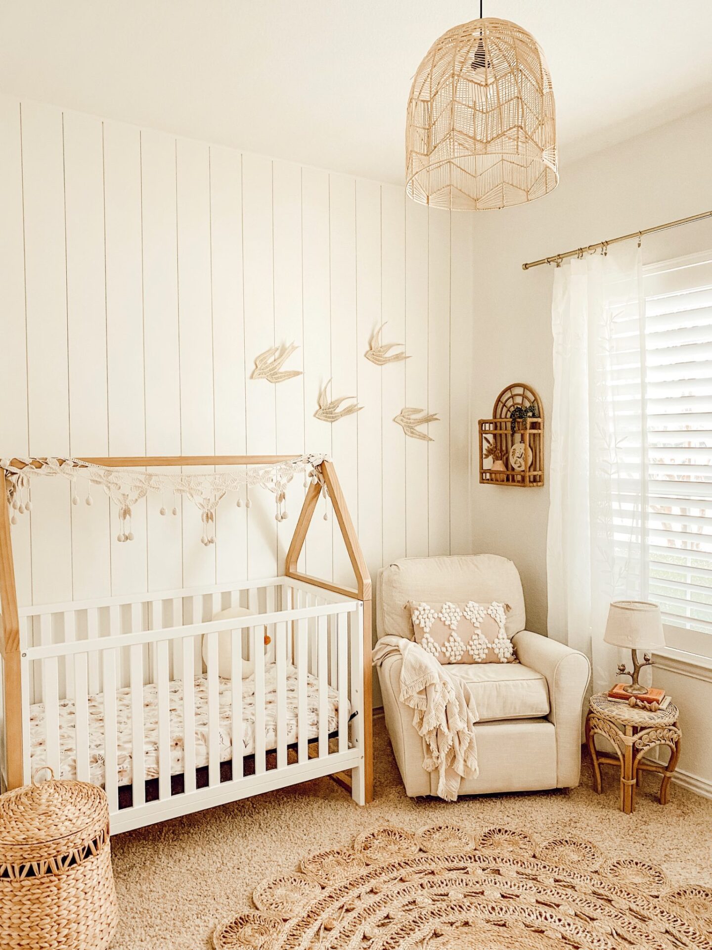
The details are just so beautiful and fun!
Next is my friend Andrea of Pine and Prospect with her whimsical animal themed nursery.
The fun woodland wall paper that Andrea chose was a bit expensive, so they chose to create an accent with it along just the top 25% of the room and finished the rest of the walls with DIY paneling.
I love the plush animal heads and the sweet basket light.
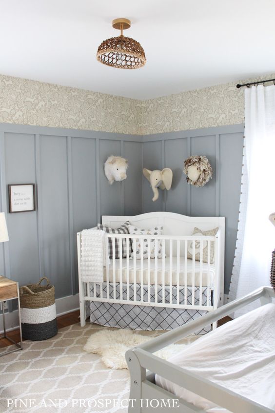
Always trendy and sweet layered rugs in front of the crib.
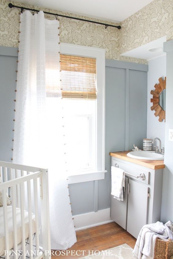
This next nursery is the second in our examples by the talented Little Crown Interiors.
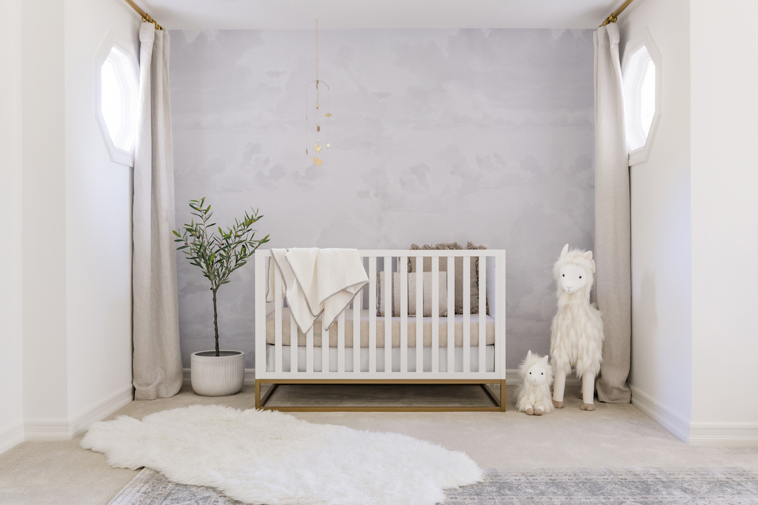
This large space is a really fantastic example of using the principles of zoning to create cozy spaces, even in a wide open space.
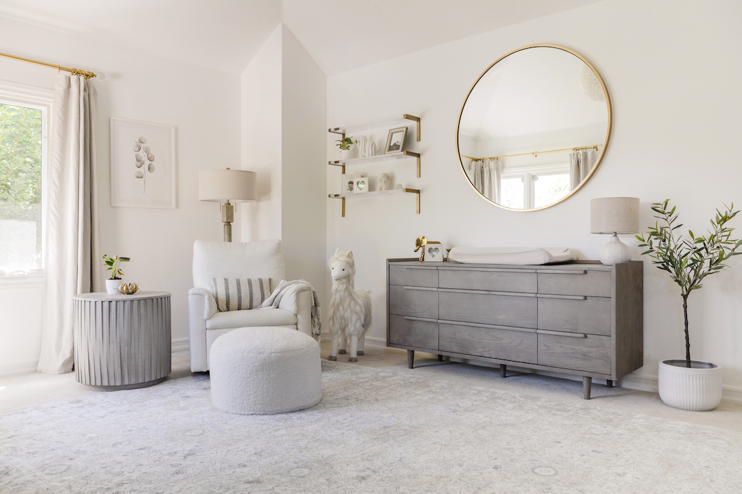
The large dresser provides a great space for storage, in addition to the open shelving.
The massive mirror matches the scale of the large room.
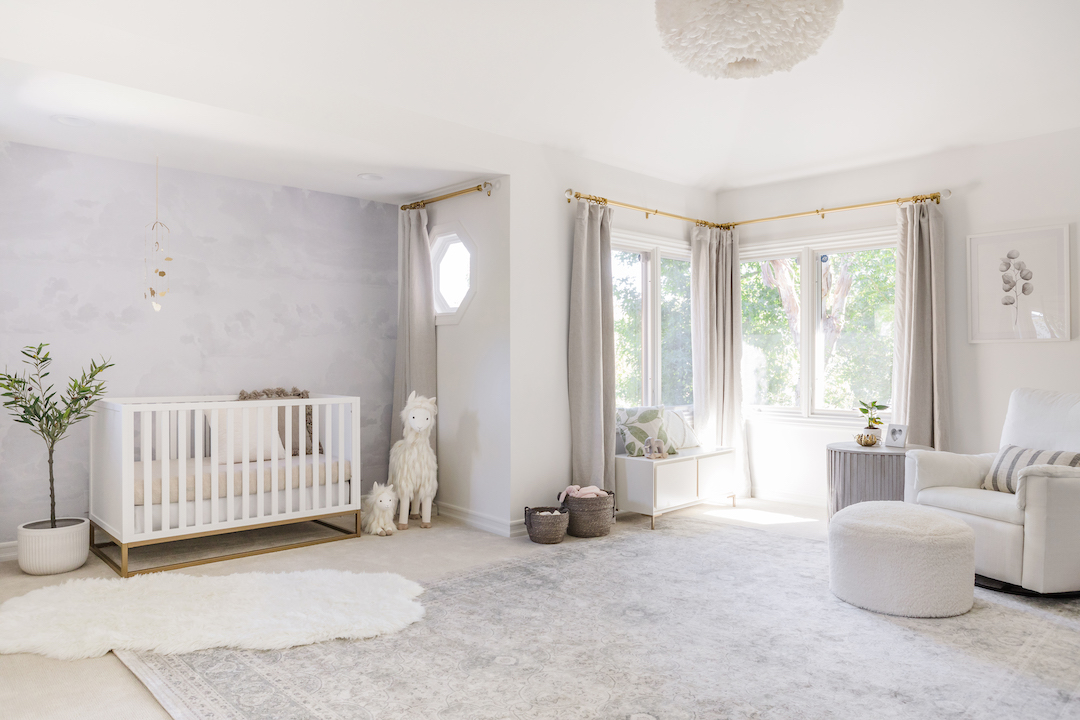
The simple crib is placed in front of a beautiful cloud wallpaper and accented with fun animal toys, a pretty olive tree, golden mobile, and cozy layered rugs.
And last, but not least, this list could not be complete without a nod or two at twin nurseries!
If you didn’t know already, I am actually a twin myself – I have a twin brother.
This twin space was shared by Ali Guarino for her twin girls.
I absolutely LOVE the golden cribs. If I had ever designed a twin nursery for myself, I would have undoubtedly used golden cribs.
If you’re in the market for some of your own, here are a few options!
Gold Cribs
The beautiful rug has a lovely amount of color and character, and it still layered with a soft sheepskin in front of the changing table.
The light fixture is such a great statement piece, and you can see just off to the right is a cozy area to sit and for feeding.
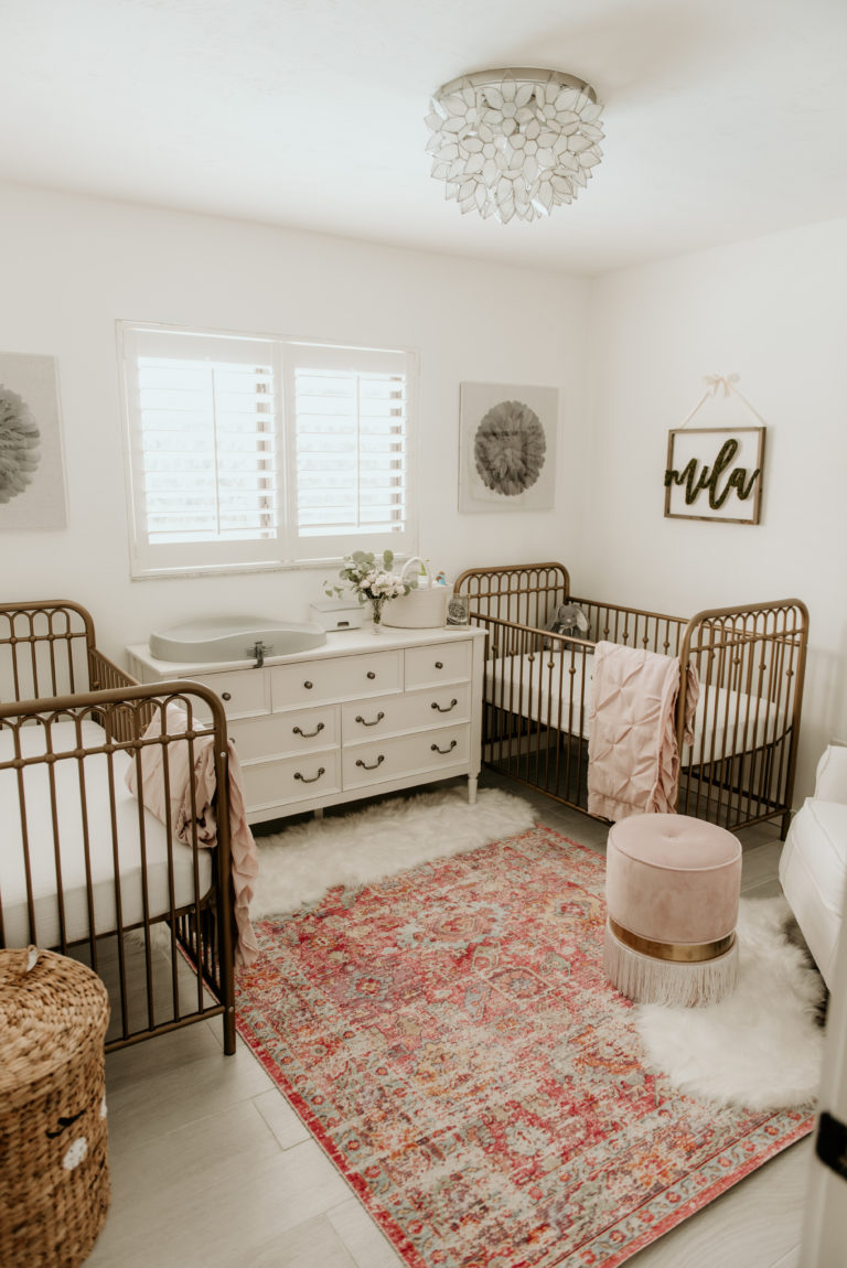
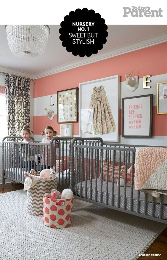
Finally this beautiful set of grey Jenny Lind Style cribs in a nursery designed by Erin Feasby of Feasbyandbleeks.com and shared on Today’s Parent.
I love that there is another version of a framed origami dress!
If you’re on the look out for more nursery designs, I recommend projectnursery.com, there are hundreds of professionally designed nurseries there for inspiration.
I have a few ideas of how I’d like to continue this series on kids’ spaces and would love your feedback on which one you’d love to see first!
- Girls’ Rooms
- Boys’ Rooms
- Playroom/Schoolrooms
Pin This Nursery Inspiration for Later:
