How to : Mixing Any Two Design Styles
Join me as we walk through a recent design I’m working on with a mix of Mid-Century Modern and Bohemian Style! I know that mixing interior design styles can feel really complicated – but it doesn’t have to be that way!
So often we think we have to pick one style to define us, and then most of us feel pigeon holed by that design later down the road. I’m here to encourage you that it’s ok to have your own mix that makes up your style, and I want to give you some tips on how to mix your styles together seamlessly!
I’m in the midst of the perfect project to use as an example, where I’m currently mixing mid-century modern and bohemian!
So come along! I’ll let you in on the behind the scenes of my designs and the processes that go into them!
The Project | Nursing Mother’s Room at Church
The project I’m currently working on is part of our church building; specifically a nursing mother’s room!
We’re wanting a welcoming environment for moms of young children who might need somewhere to either have some privacy for feeding or changing their child(ren), or a place to be able to listen to the worship and sermon even with a baby in their arms (no matter how active or noisy that baby might be feeling at that given moment!)
The plan is to have the room done and ready for a reveal on Mother’s day!
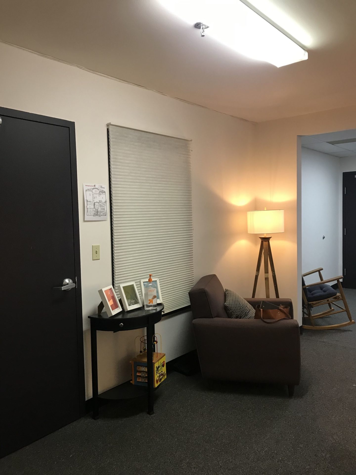
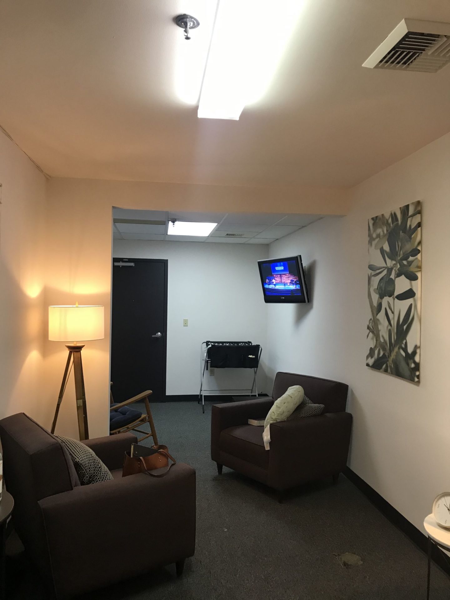
The Current Space |
Some positive things to note about the space are that it’s:
- Both easily accessible and easy to find (located directly off the main foyer area) .
- Separate space just for moms with no other uses.
- Working doors for privacy.
- Has some cute decor already (mid-century modern lamps) available.
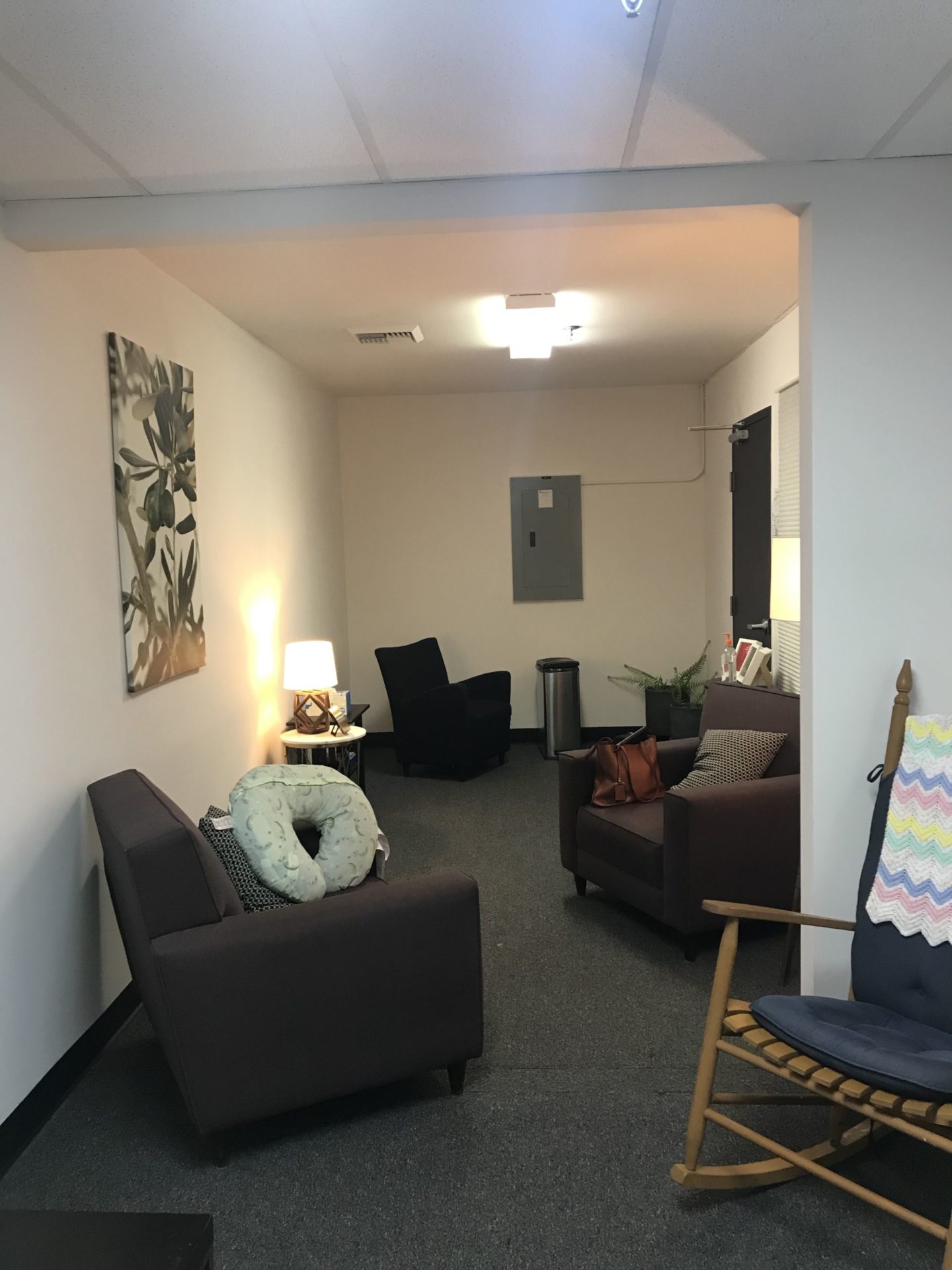
But the overall look of the room isn’t very welcoming – yet! (We’ll be changing that soon enough!)
The space itself is also a unique (long rectangle) shape because it was formerly two offices which have now been combined. Approximately mid-way through the room there is a supportive beam that had to be left in place.
The dimensions are 26′ x 10′ and there’s 1 window (that looks out into the main foyer and won’t often be used), and 2 doors.
*This post contains affiliate links to products I know &/or love.
Wish List |
When I’m working with someone else on a design, it always helps to have an idea of how the space will be used, and what their wishes for the space would be.
To get a sampling of the list for this room, I chatted with quite a few of the Moms of young children at church and these are some of the things that were important to them:
- Signage of some sort to let people other than moms that need to use the space know when the room is occupied or vacant.
- Rocking chair(s)
- Volume Control (Some wanted to be able to hear the sermon, others wanted it quiet for their baby, others wanted to be able to visit with other moms who were in there.)
- Options for more privacy even within the room
- Toddler/older sibling space
- Changing Table
- Baby Proof
- Hygienic (things like washable covers on the changing pad & nursing pillows)
- Soft lighting
- End tables for drinks and belongings
I loved their lists, and they matched up really well with the designs and plans I already had swirling!
Some other things I added to the list that were important to me on the design side:
- Smells Good
- Plants
- Artwork
- Rugs – soft for babies to crawl on
- Welcome table with snacks, drinks, the wifi password and any other important notes
- Pillows and blankets
- Beautiful textures.
And here are my design boards showing how those two lists came together!
And if you read on, I’ll share the details about how I meshed the mid-century modern and bohemian feels for these looks.
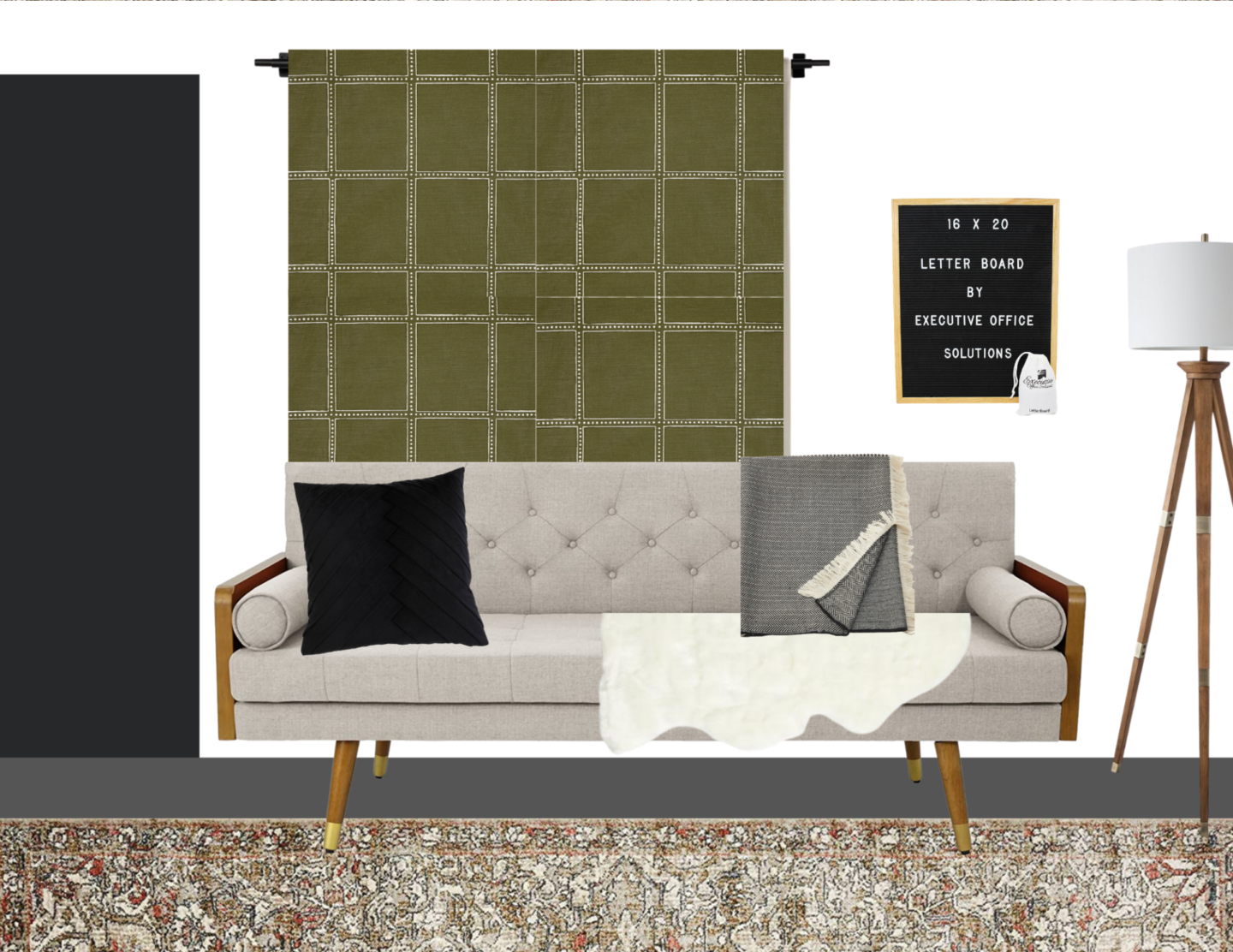
This seating area is the first half of the more social side of the room near the door in front of the window that will remain closed.
Sources:
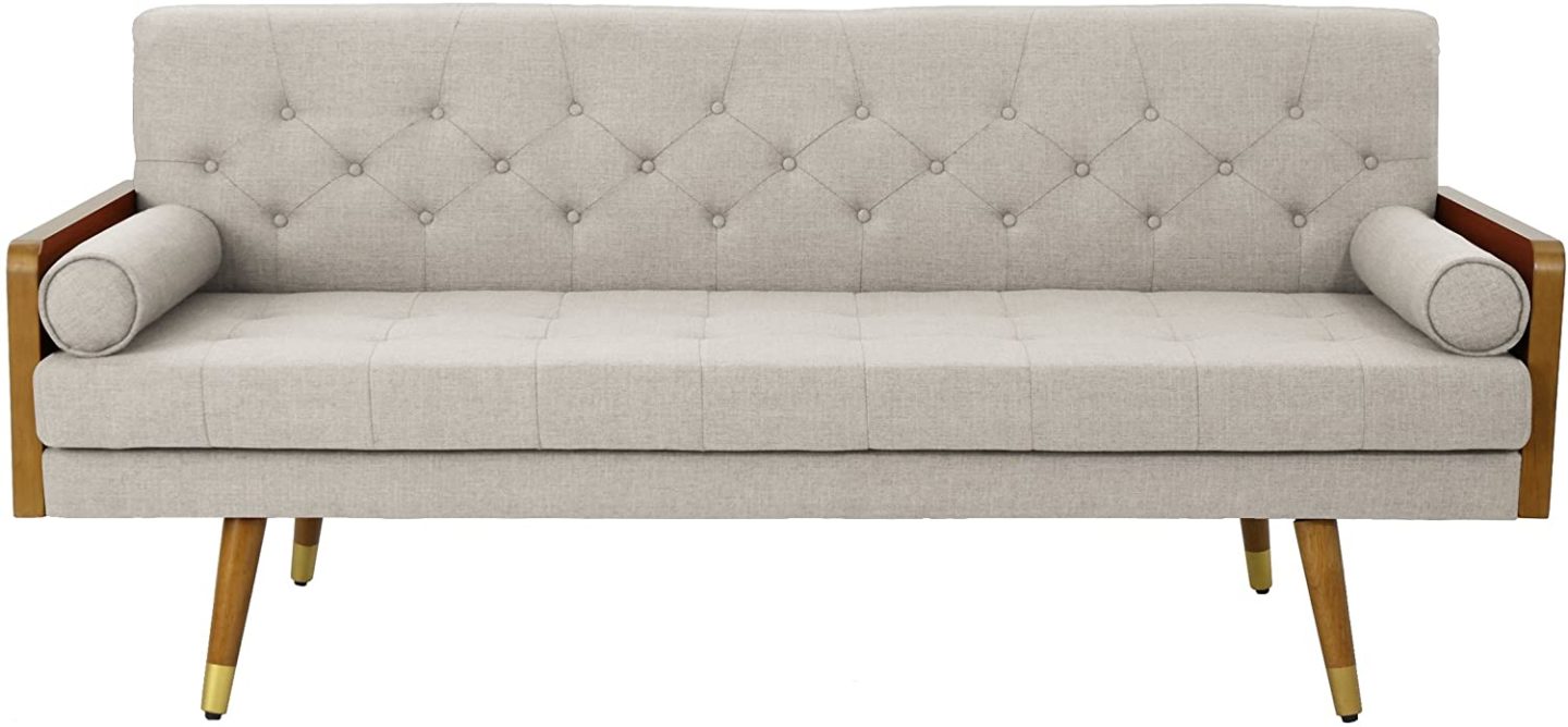
The cream couch is by Christopher Knight.
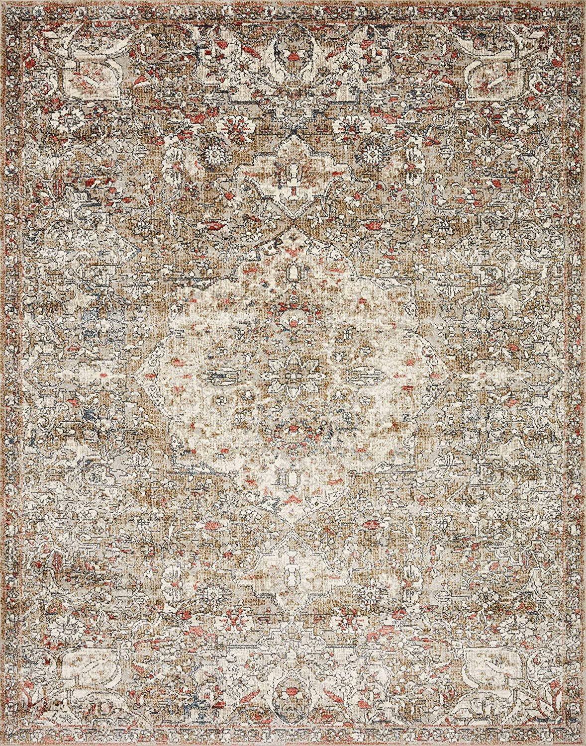
The Rug is from Loloi.
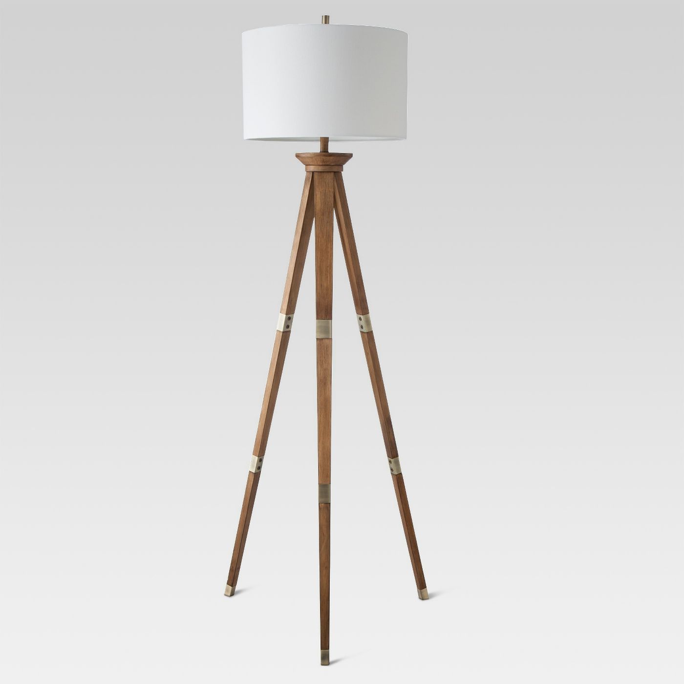
The Floor lamp is from Target.
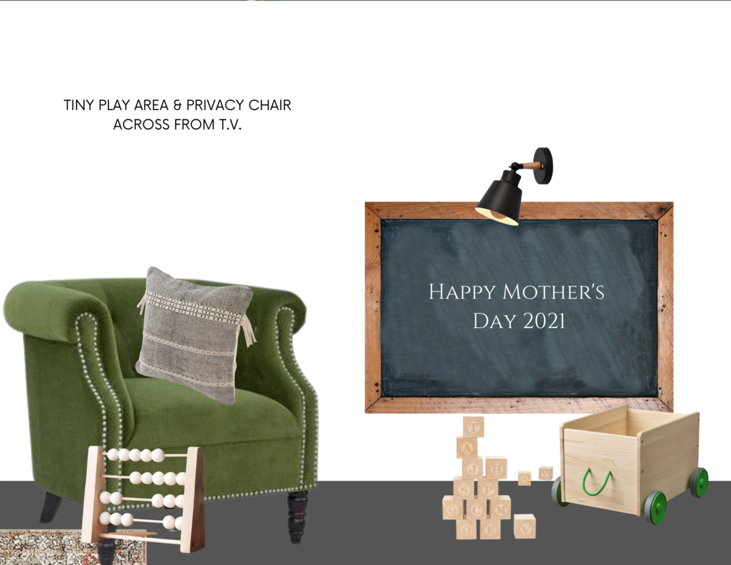
This little seating area will be on the other side of the little support wall that was left when they removed the center wall, which will give the option for a Mom who prefers extra privacy when nursing. And the area near it will be a great space for toddlers and older siblings of the littlest babies to have some room to play quietly.
Around the corner to the right will be this far wall that will house the changing station next to the 2nd (less frequently used) door.
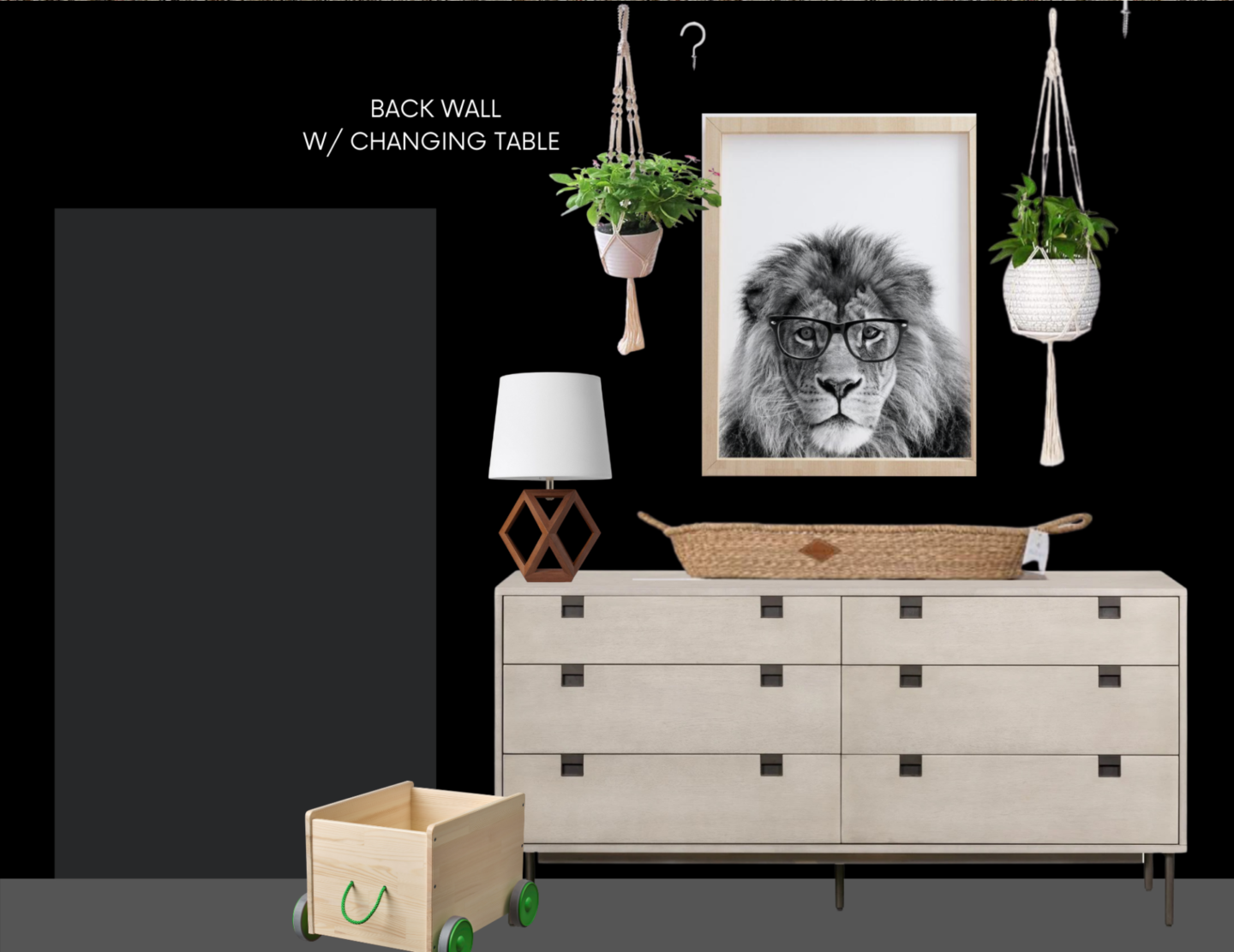
This wall will be painted solid black to help create the illusion of the room being more square rather than such a long rectangle.
Sources:
The adorable Lion with Glasses print is from Etsy.
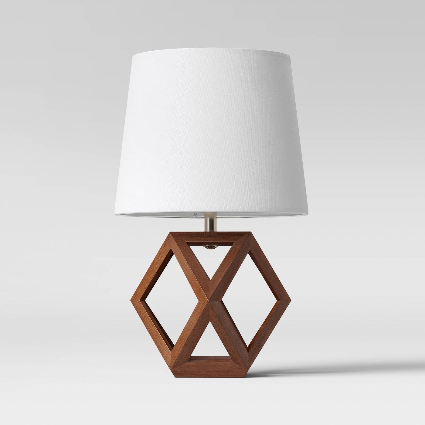
The Table Lamp is from Target.
The long wall that runs the full length of the room opposite the main door will be treated with the faux white brick that we used in my daughter’s Bohemian Teen Room Reveal .
The vertical lines created by the brick help give the illusion that the ceiling is higher!
Across from the green chair and the toddler’s area will be the TV for viewing the worship service and sermon happening in the sanctuary. Along with the TV we’ll have Bluetooth headsets available that allow each Mom to customize the listening experience for her and her baby’s needs!
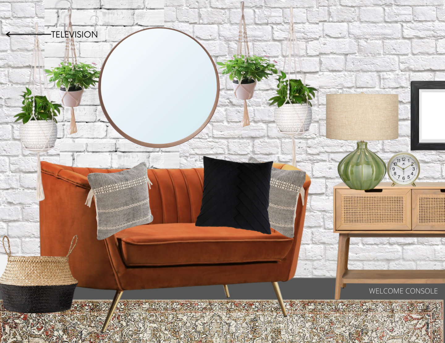
Because the room is narrow, there aren’t many options for putting furnishings on both sides of the room while still giving a 36″ walkway between. Luckily there is space across from the cream couch for this gorgeous velvet settee to add to the social side of the room!
If you follow me over on Instagram already, you’ll have already heard about the slight hiccup I’ve run into with the settee! I found a similar one that I love locally on craigslist for $175 and snatched it up, hoping I could have it professionally reupholstered by our deadline. But EVERY SINGLE upholsterer in our city is on a 6+ week backlog. And Mother’s day is coming in 4 weeks, so it is looking like I’ll be reupholstering a settee! It will be worth it, though!
Also on this wall, directly in front of the main doorway will be a cute welcome console with snacks, drinks, and a sign sharing important information like the wifi password and how to use the Bluetooth headsets if desired.
Sources:
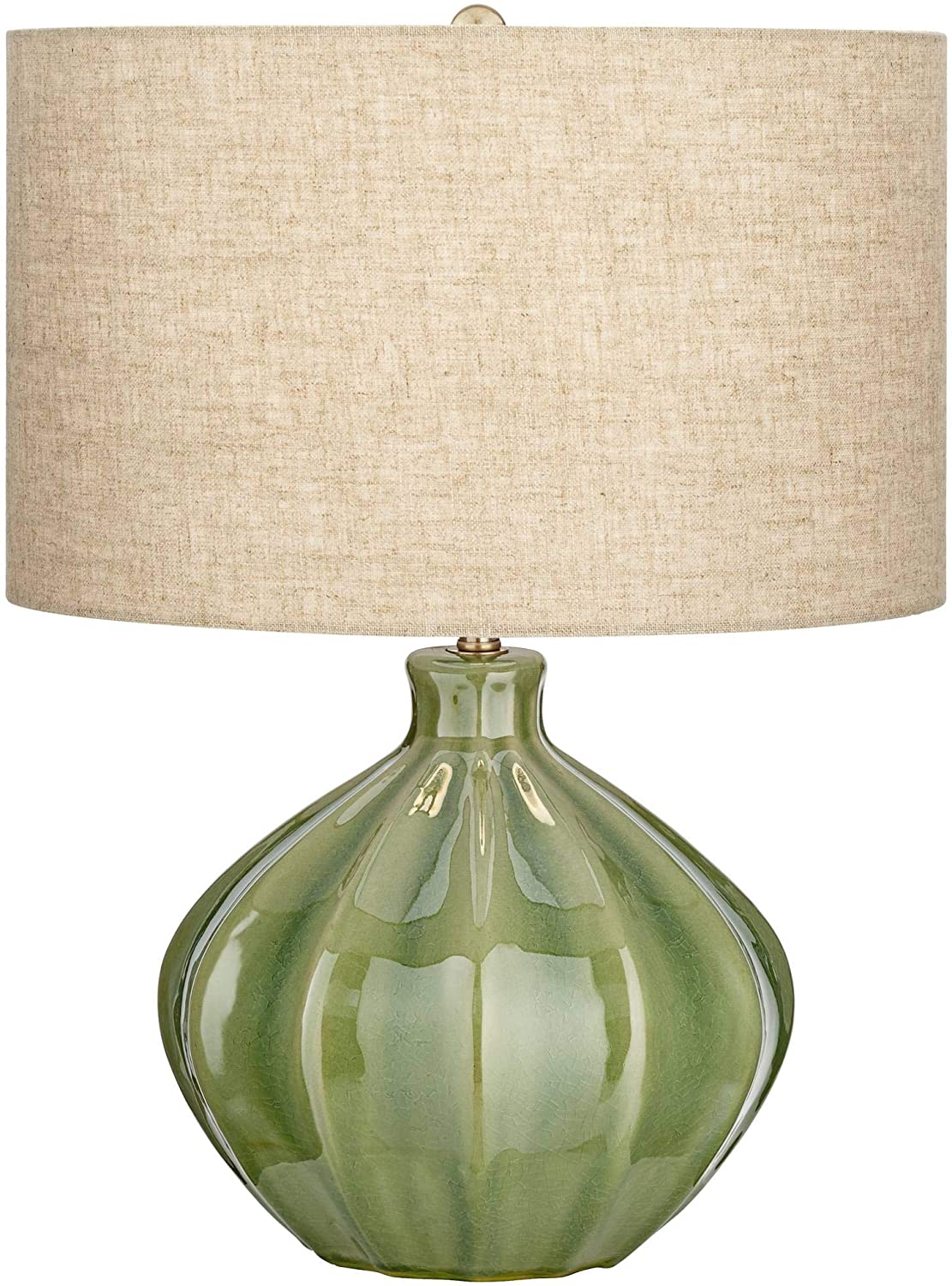
Green Gourd Lamp is from Amazon.
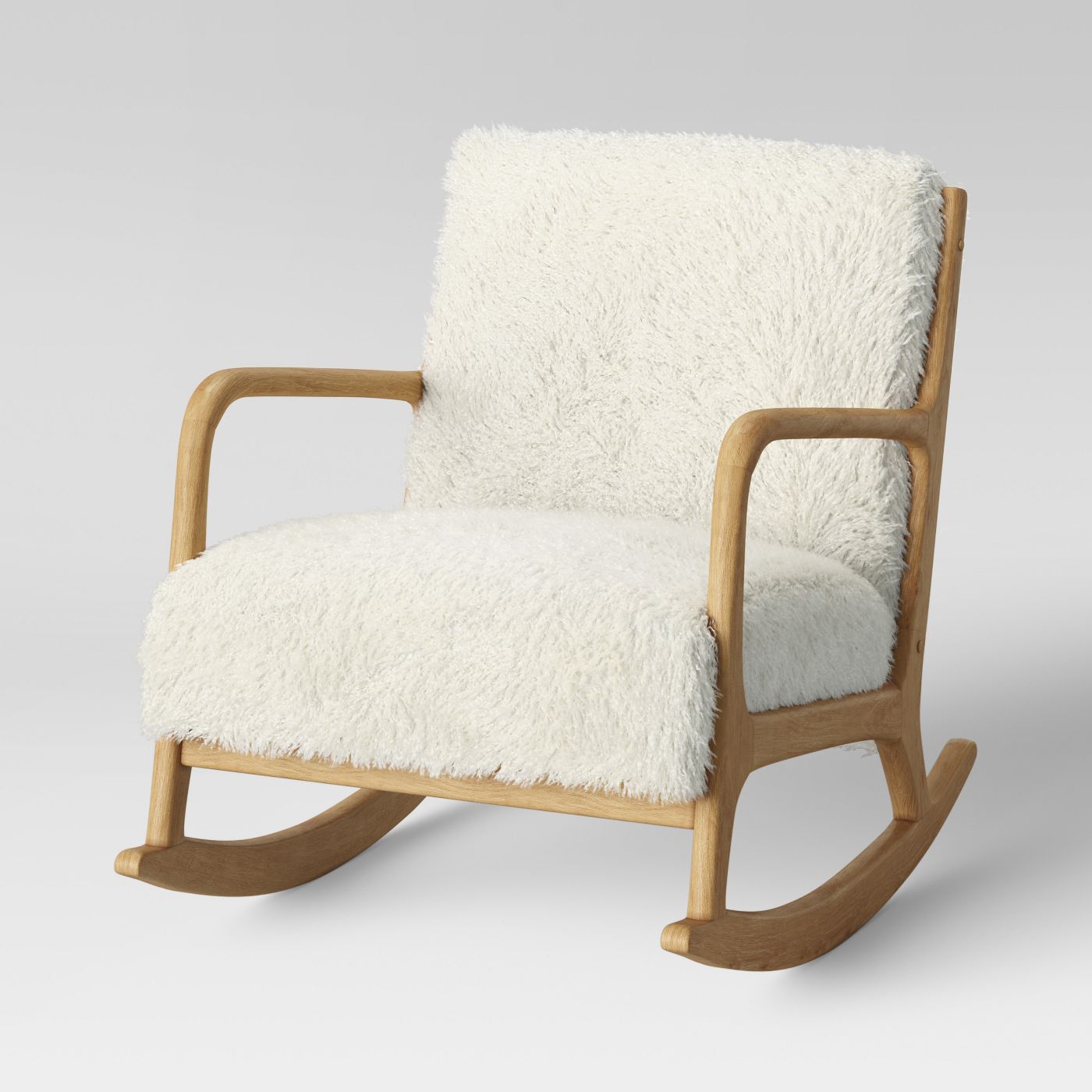
And then lastly, on the end wall closest to the main entrance, will be a rocking chair in front of a second black painted wall.
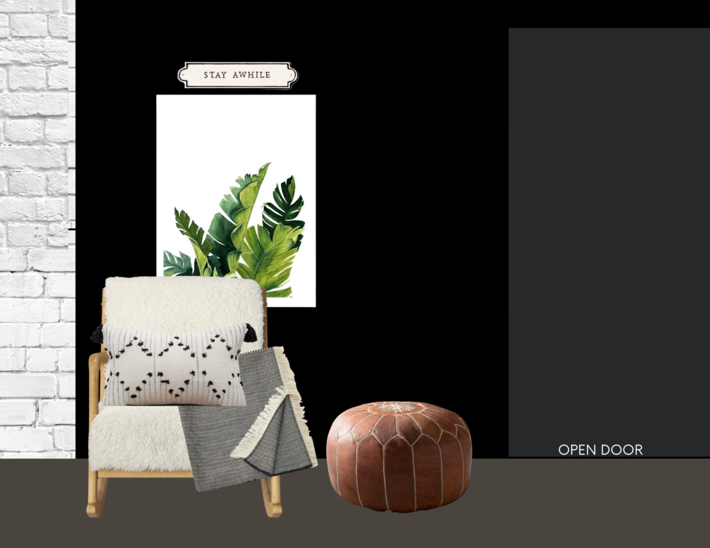
Sources:
White Fur Rocking Chair is from Target.
If you’d like to learn how to make design boards of your own, enter your email address below!
Now that you’ve gotten the full glimpse of what I’ve been working on for my project, let’s delve into the specifics of why and how I mixed two styles for this end look.
Mixing Design Styles – Mid-Century Modern and Bohemian |
The reason I chose to mix these two styles specifically is that the rest of the church is decorated in a very mid-century modern feel, and I wanted to compliment that while adding a more feminine bohemian touch since this will be a retreat for women and young children during service.
Here’s how I went about mixing the two styles.
It’s all about balance! I looked at each category of items (like “seating”, “lighting”, “pillows” and “art”) and made sure that I had a mix of both mid-century modern and bohemian items.
- So while the cream couch is definitely mid-century modern, the settee is very much bohemian.
- The existing wooden table lamp and floor lamp are both very mid-century modern, so I’m mixing in the two green gourd boho lamps.
- The plants hanging from macrame screams boho, so I chose calm mid-century modern-esque plain white pots to put the faux plants in.
In each set of items, I made sure to balance while I mixed.
That’s the secret! If this room were a ratio, we’d want the equation to be 1:1 Mid-century modern and bohemian.
The Test for Everything You Order |
Before signing off I wanted to give you one more piece of information about when you receive items you’ve ordered from online! Bringing plans to life is such an exhilarating part of the process, but orders thatt aren’t quite what you expected can throw a big wrench in your plans. Before settling on any item you receive, make sure that each and every piece can past the following test:
- The color is as expected.
This means it should match any samples and swatches you had previously ordered, it should have the correct undertone (very important), and if not, you should send it back!
- The size is as expected/works with your design plan.
Design boards are so fun to make, but they CAN be easy to accidentally skew proportions and how things will look when you get them into your space (especially if you aren’t a careful measurer when you’re designing). So once your item is in hand, double check that the size and scale are appropriate for your design.
- The quality is appropriate for what you need.
If what you thought was a metal piece ends up being plastic, or the fabric feels cheap in your hands – return and start again! Don’t settle for something that’s less than what you were hoping for just because you have it already.
Analyze the details of each piece and make sure it’s a good fit.
I estimate that I’ve reviewed about 150,000 items while searching for all the details of this mid-century modern and bohemian room, to narrow it down to about 75 moving parts to make this come together!
This, and other design projects are a big undertaking, and I want to encourage you that feeling like you’re struggling with your design decisions is NOT a problem that only you face – it’s kind of part of the design process, and it will be worth it in the end!
I hope this encourages you! Let me know in the comments below which styles you’re working on mixing, or any big design projects you’re currently in the middle of!
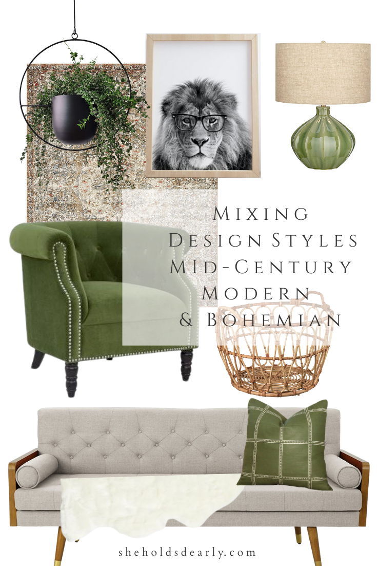
Pin This Mixing Design Styles Tutorial for Later:
xoxo,
