Cottage Core Bedroom Plans
Our recent YouTube giveaway winner had questions about her cottage core bedroom – are you curious to see my final plans for her space?
In celebration of the She Holds Dearly community growing and surpassing the 60,000 mark on YouTube, I held another giveaway for a design consultation with one of YOU!
This is the third design consultation giveaway we’ve done, but if you’ve missed any of the others, you can find them here:
40k Giveaway Winners (I couldn’t pick just one!)
50 K Giveaway Winner:
Michele S. Design Studio Plans in an Attic Space
Cara Kelly is the winner this go-around, and I think you’re going to love her cottage core bedroom plans!
I begin each of these giveaways requesting information that gives me some background to read up on before we have our 1 hour zoom call!
These are the questions I ask:
- Can you describe your design dilemma?
- What are the dimensions of the space?
- What do you consider the pros & cons of the space?
- How is the space used, and by how many people?
- What needs to stay?
- What can be replaced?
And I also love reviewing a Pinterest board of the space and any “before” (current) pictures.
Cara sent all of those things over and then we got to do our 1 hour zoom call!
I think you would actually be surprised to know how much ground we can cover in 1 hour, especially with everything listed above all ready ahead of time!
About Cara’s Space:
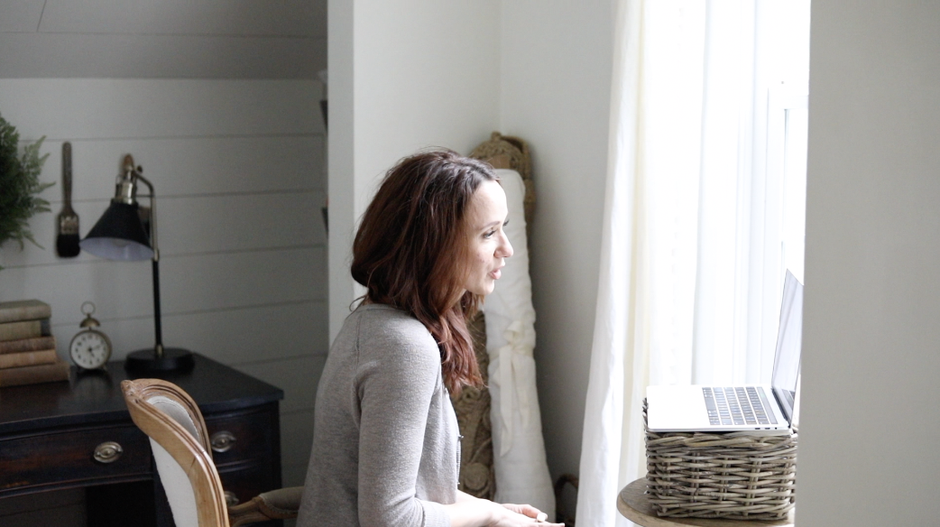
Cara and her husband live together in a home built in the 1980s, and their master bedroom is about 13×15′ – which is a pretty average size room.
Here’s a quick video of their current space:
The home itself seems to have been built or remodeled by someone with an old soul and a love of character which shows in the pretty millwork they added. The floors are a beautiful medium wood tone which is my favorite option because I think it’s both vintage and classic at the same time.
Their bedroom ceilings are slanted which I personally love in a bedroom because it gives off a really cozy cottage attic feel, which I think adds a lot of charm in a bedroom, especially one where you’re wanting it to have a cottage core vibes.
Through Cara’s Pinterest board and inspiration pictures I could tell she wanted a strong grand millennial and cottage core influence for their bedroom. Lots of color, florals and layers.
I think these looks are some of the most fun to pull together!
Design Stipulations:
With just about any design there are usually a few non-negotiables, and that’s OK, because as I mentioned in my post, “4 Things Your Husband Doesn’t Want to Change“, we can compromise and still come up with great designs that we love!
These are the items Cara said we’d need to keep in mind while putting together our design:
- No wallpaper – her husband is not a fan, and thinks it’s too granny-ish
- Ceiling fan must stay
- Cara & her husband are planning to share their room in the future once they have a baby and she wanted to make sure the space was designed in a way one corner could be set aside for the baby’s crib & other items.
Nothing we can’t work around!
*This post contains affiliate links to products I know &/or love.
Cottage Core Bedroom Design Plans:
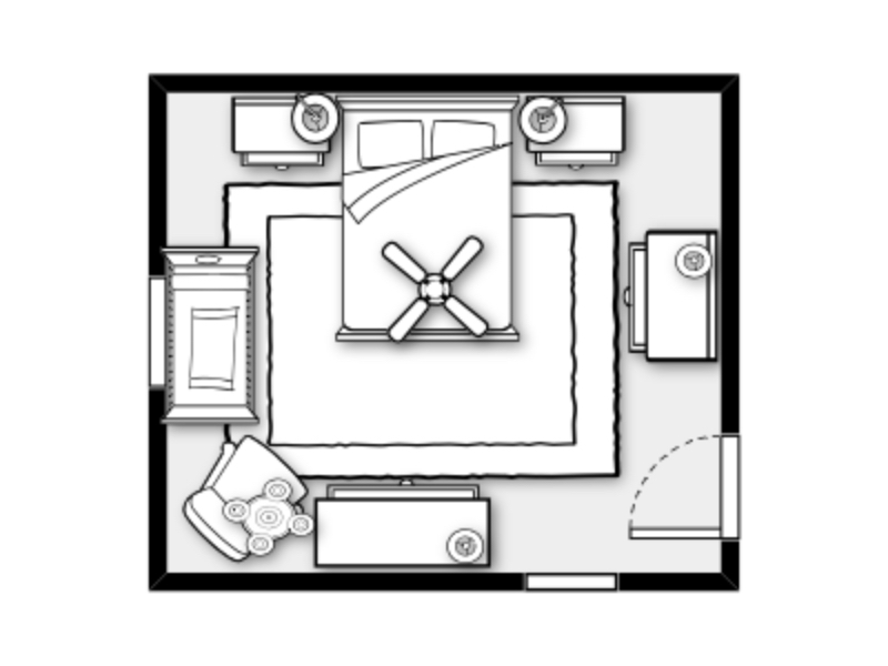
Armed with all of our pre-consultation documents, and the 1 hour long zoom call that Cara and I had, I set to work putting together this plan for her space:
For the wall color, I suggest Convivial Yellow by Sherwin Williams (SW #6393) which is this happy beige with a heavy yellow undertone.
Design Boards:
As part of the winning prize package, I put together some design boards for Cara’s space, and if seeing your room like this would be helpful for you, I have an entire blog post dedicated to making design boards for your own space!
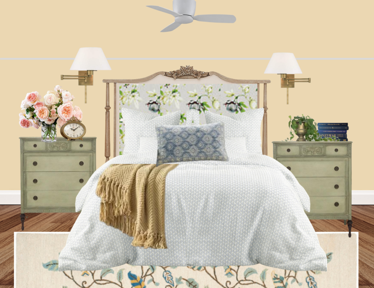
Here is the main wall in Cara & her husband’s room:
Cara’s husband is 6’7″ tall and they currently have a queen size bed. I wanted to try to get a California king size bed in there for them (which removes 4″ from the width of the bed and makes it 4″ longer), but I could not get it to work in the room with the small nursery area included.
That could certainly be something they look into later, though!
In the meantime, in place of wallpaper on the walls, I focused on bringing in our colors and patterns with our fabrics.
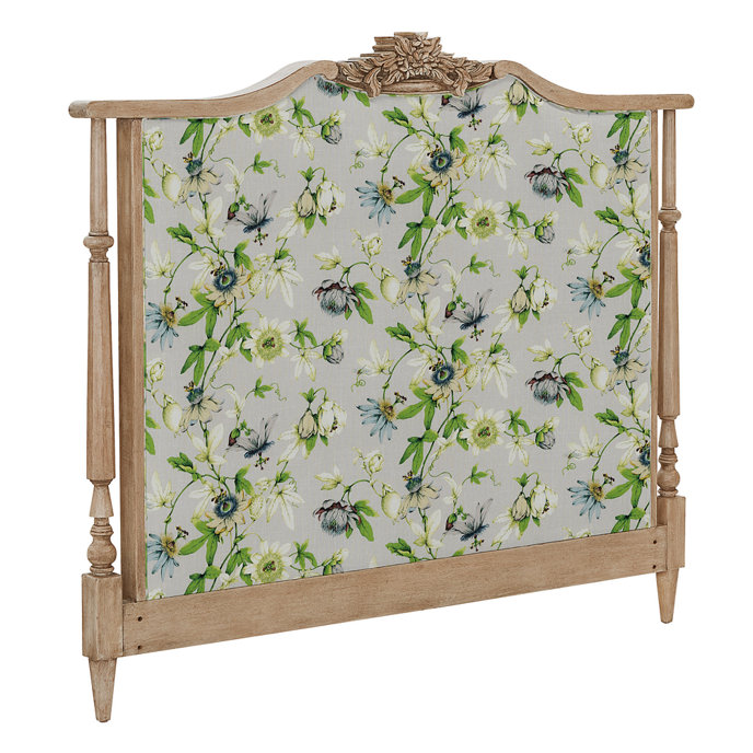
One of the biggest focal points in the room is this upholstered headboard by Ballard Designs. If you haven’t ordered from them before, you might not know that they have some great customization options – which is a wonderful feature for those of us who love design.
To style their bed I used linen bedding, a beautiful blue lumbar accent pillow, and a yellow throw at the foot of the bed.
The bed is anchored by this cute rug from Martha Stewart’s line at Lowes.
In place of standard bedside tables, I opted to give them small dressers which increase the storage space (they both like to read and have quick access to books by their bed) and the functionality. I added some books, flowers and a gold alarm clock to finish the look.
Instead of adding table lamps, Cara asked that I show her some sconces, and I thought these gold sconces would be just the right accent.
You can see that for their ceiling fan, which they did not want to remove, I opted to replace it with a sleek “hugger” fan that is really subtle, especially when in white, the same color as the ceiling.
I know that fans are at times truly a necessity in a room, so I don’t have anything against them, but do think that they often look better when you can remove the light fixture from the equation and incorporate that in another way.
I’m not too worried about removing their main source of ambient light, because they do have light that comes in from the windows and because I chose to add a chandelier back in, just in a different part of the room!
Because they wanted to have a space set aside for their future child, I set aside the space on this wall for a beautiful crib, and a sweet wingback chair for late night snuggles.
It’s on this same wall that we relocated the chandelier to make sure the room wasn’t missing out on it’s needed ambient light, but also to add some charm to this sweet space.
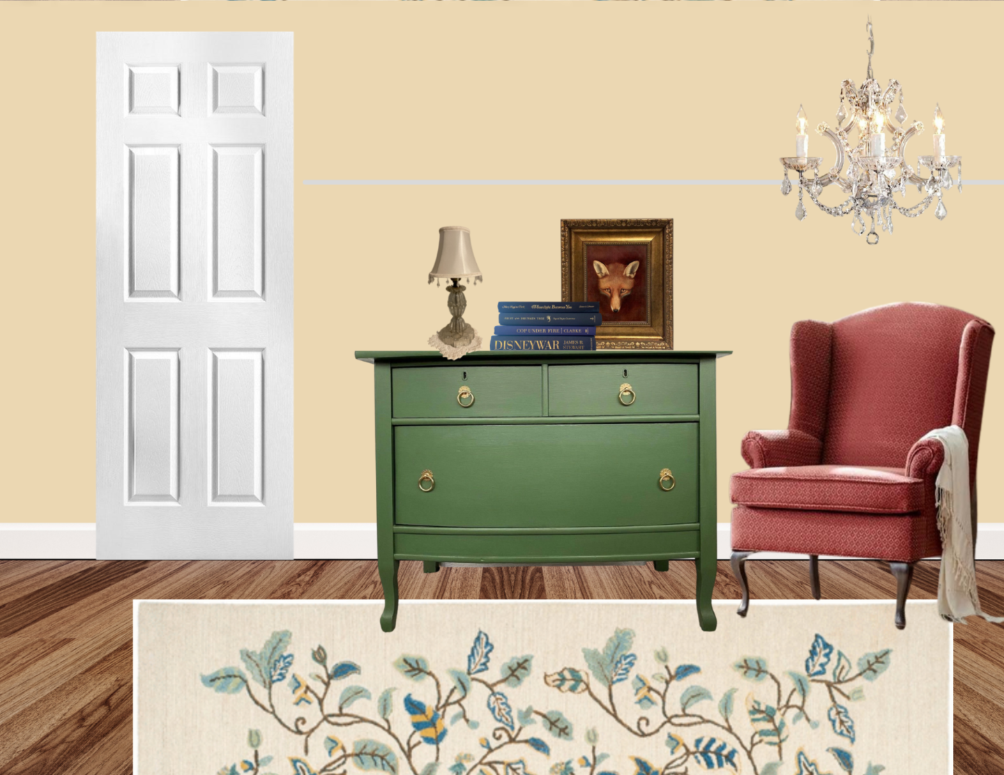
For Cara’s things, she wanted a lower longer dresser, so I opted for this one.
The lamp on the dresser is one of Cara’s that she was wanted to keep in the room. She has a set of them, but they’re only about 14″ tall, which isn’t quite tall enough for table lamps. I chose to style them more like tall candles, and put one on each of their dressers as part of the accent lighting and decor.
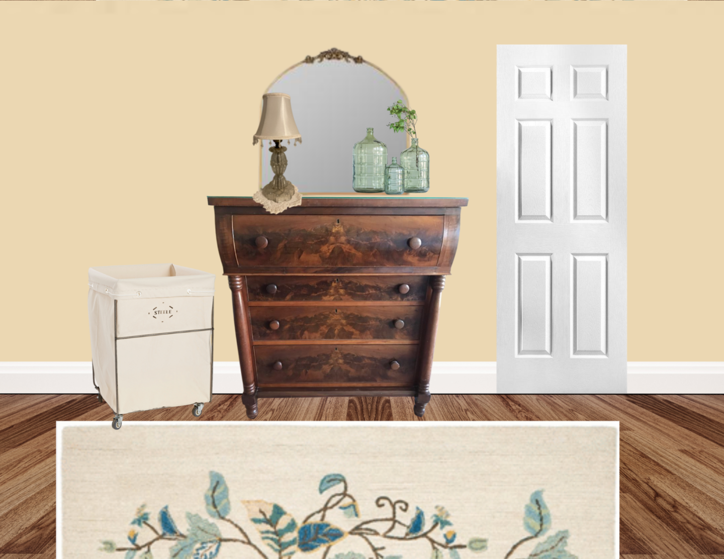
I suggested this tall empire dresser in rich dark wood for her husband’s things, because I think the wood tone gives a masculine feel to the piece.
The matching accent light is included, and these pretty green glass bottles layered in front of this beautiful gold mirror.
[show_shopthepost_widget id=”4570244″]
It’s such an honor and so much fun to get to (virtually) step into the spaces of those of you in this She Holds Dearly community! I so appreciate that you’re here and that your support grows this community and gives us opportunities to keep celebrating growth milestones!
If you would like to be the next one I consult with, make sure to sign up for your very own Power Hour!
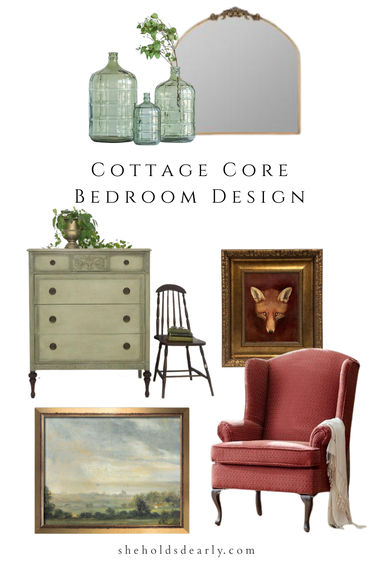
Pin This Cottage Core Bedroom For Later:
xoxo,
