What You Need to Know About the Interior Design Trends for 2024
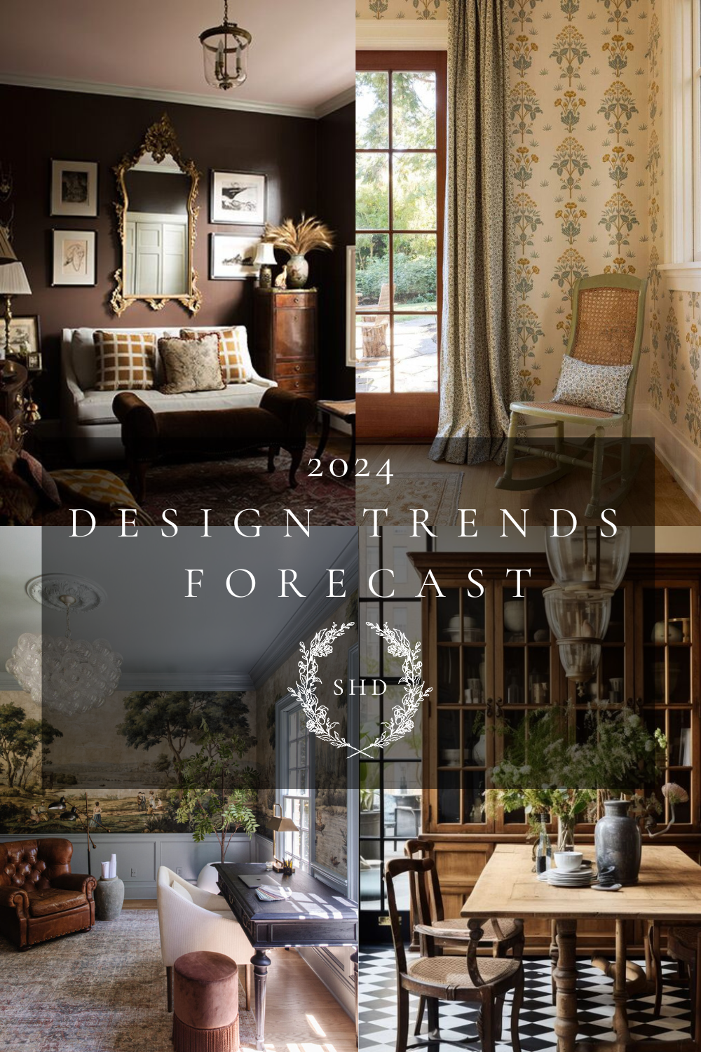
It’s time to look ahead at the Interior Design Trends I’m forecasting will be popular through 2024! Come along!
At the beginning of each year I love to “stick my finger in the wind” and spend some time noticing what is lasting and what is changing in the design world.
Trends naturally have about a 10 year lasting period; but for a while, I was concerned that social media would abbreviate how long each trend lasted. I’m happy to say that it isn’t coming true! I think that interior design trends have a more natural boundary that inhibits starting over again year after year on a large scale because of how big the process is!
Alternatively, when you look at things like fashion design, you can see those truly changing within the course of a year after only a few months because individual pieces of clothing are much easier to swap out than overall room designs!
*This post contains affiliate links to products I know &/or love.
Interior Design Terms
One thing I have noticed, though, is that social media is causing the vernacular around interior design to explode! There are so many names for the genres and even subsets within the genres – it can feel hard to keep them straight.
So, to help us, let’s go back to basics for a few minutes before we jump into the 2024 design trends!
There are just THREE main, over-arching genres in interior design, and all of the sub-sets fall into one of the three! Knowing which of these three you love the most can be really helpful to narrow down the field of what you’re keeping an eye after within the genres.
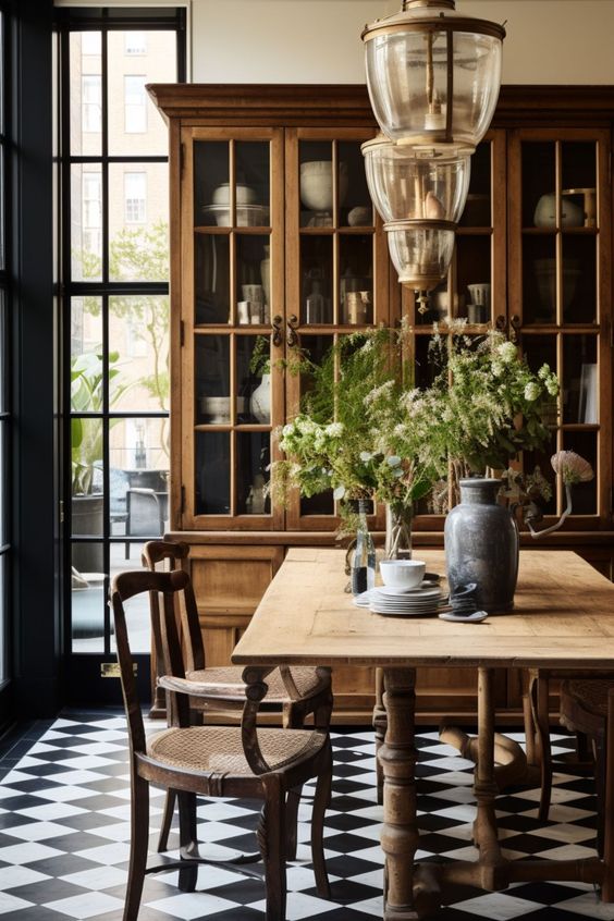
Photo Credit : Melanie Jade Design
Number One | Traditional Style
I’ll say right off the bat, I’m all about traditional! I love designing within this genre and teaching about it. My own home has been decorated in a few varieties, but always under the traditional umbrella.
This look is very vintage and old-world European. Think of the styles that were around 100-200 years ago, and you’re set!
As examples, Farmhouse, English Cottage, Cottage Core and Dark/Light Academia all fall under Traditional.
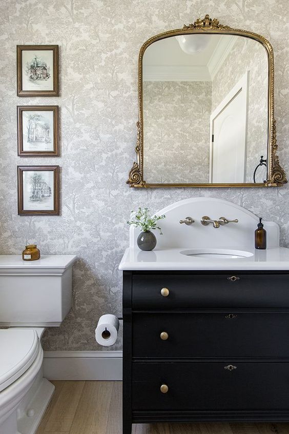
Photo Credit: Jenna Sue – Heights House Powder Bath
Number Two | Transitional Style
Transitional style is the transition from Transitional to Contemporary. So it’s the time period within the 1900s, but I’d also put styles in here that intentionally cross back and forth between the two.
Grand Millennial is an example of this – They’re very traditional in most aspects, but will include a modern piece of art or a modern statement light fixture.
Mid-Century Modern falls here, as well as Modern Farmhouse.
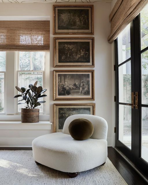
Photo Credit: Meg Lonergan Interiors – Studio
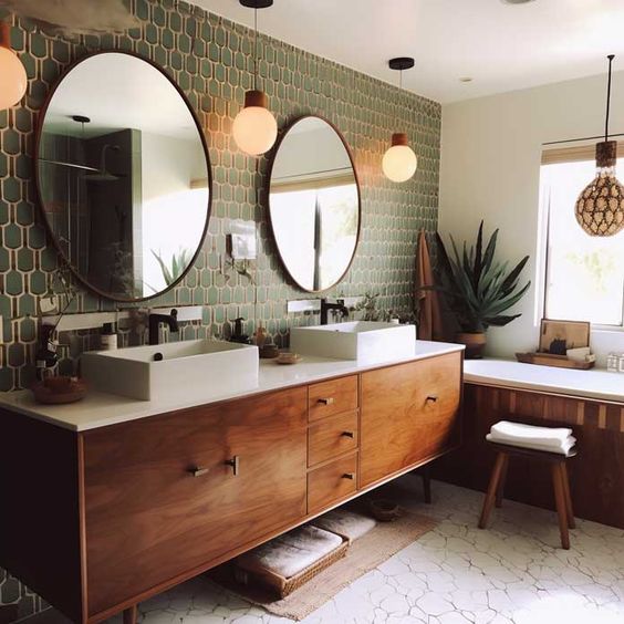
Photo Credit: Art Facade
Number Three | Contemporary Style
Contemporary style is modern. Here you’ll find more saturated colors, lots of man-made materials and organic shapes.
This style includes Industrial, Scandinavian, Eclectic & Glam, to name a few.
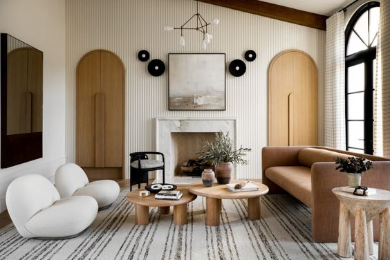
Photo Credit: Lindye Galloway – Earthy Ecclectic
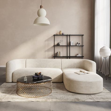
Photo Credit: Amazon – Acanva Luxury
Words Used to Describe Traditional Design
I really noticed these changes in design vernacular this past Christmas. On social media, designs that were very traditional were being named things like “Little Women Christmas”.
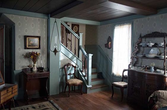
Photo Credit: Set decorators – Little Women
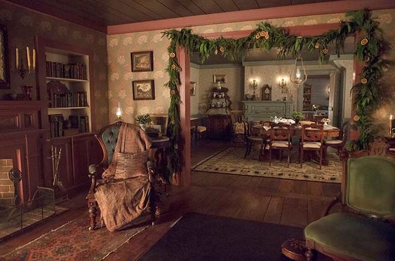
Photo Credit: Set decorators – Little Women
There were references to Jane Austen, as well as more specific dives into the individual styles like Victorian, Edwardian or Light & Dark Academia.
I’ll be curious to see what comes back up around at the end of this year for Christmas and how things change!
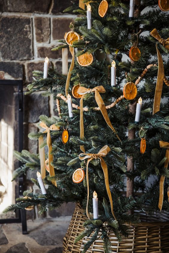
Photo Credit: Dress Corilynn
Now, let’s dive into 10 of the 2024 Trends I see happening, especially in the Traditional sphere.
The first four are lasting, repeats from when I did this research back at the beginning of 2023.
2024 Interior Design Trends to Look For:
Number One | Muted Colors
Muted colors are sticking around! It seems to be highly agreed upon that muted earthy tones are what we’re after. Browns, reds, peach, coral & plum are especially popular.
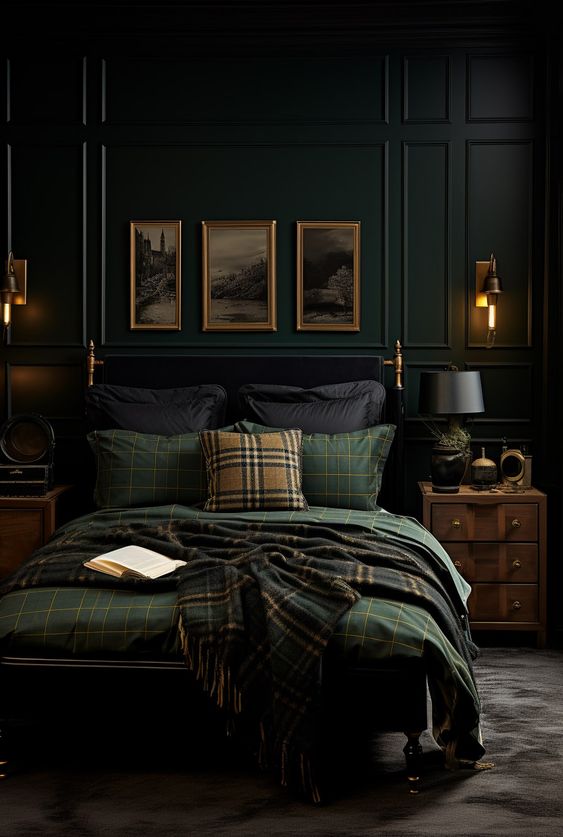
Photo Credit: Posh Pennies
Most big paint manufacturers have a Fan Deck that you can pick up or purchase from their locations, and I love to use the Sherwin William one for comparing colors. In the back of their recent decks, they have sections called:
- Timeless Colors
- Historic Interiors
- Historic Exteriors
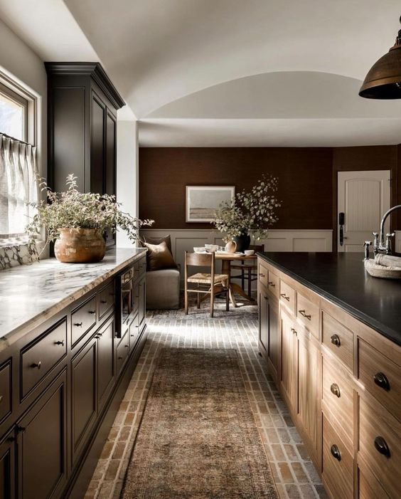
Photo Credit: Amber Interiors
These were originally created to help those who had actual historic homes and needed to follow recommendations by the Historic registry when making any changes.
But now, those same colors are being presented as the current trends! It’s true what they say, what goes around comes around.
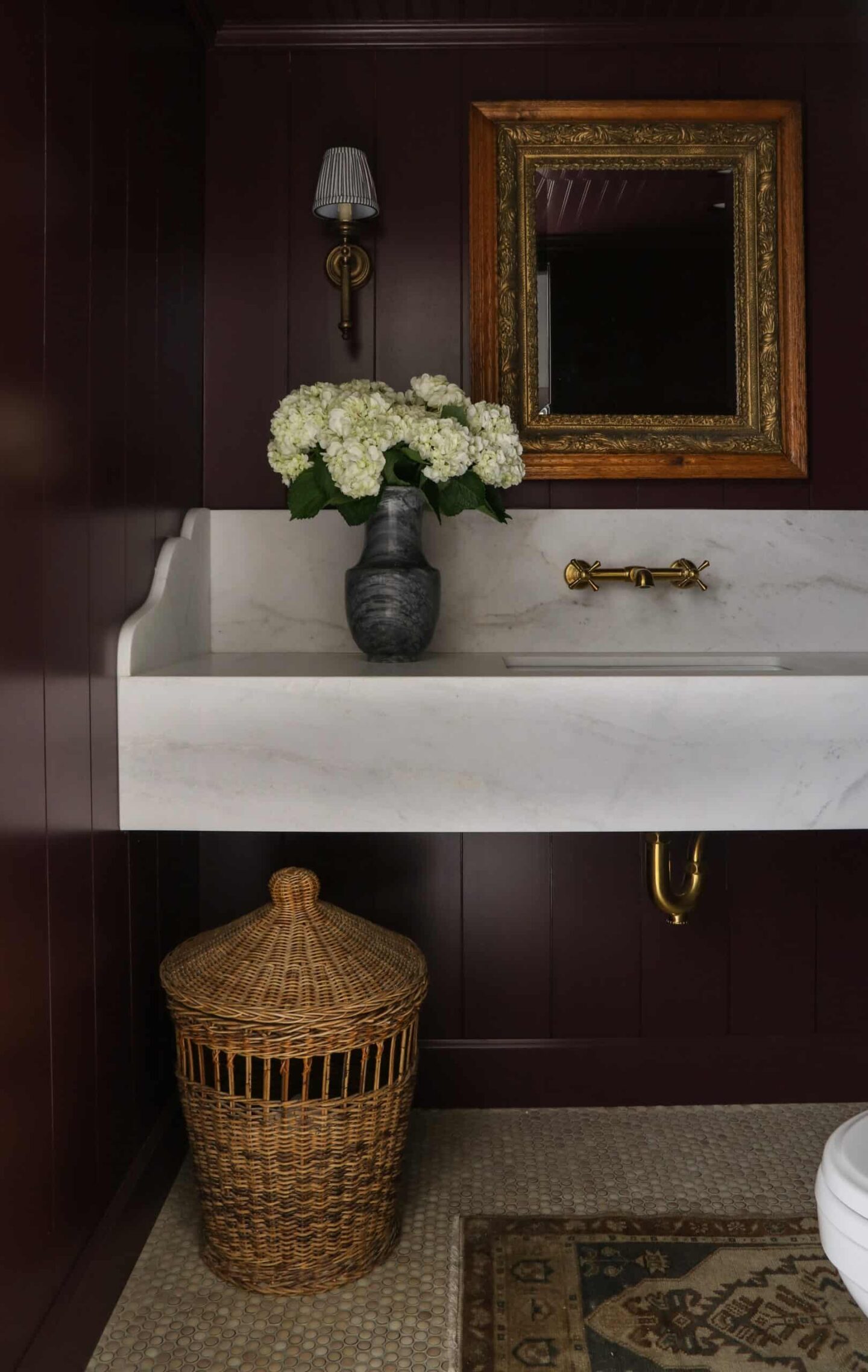
Photo Credit: Wildflower Home Interiors
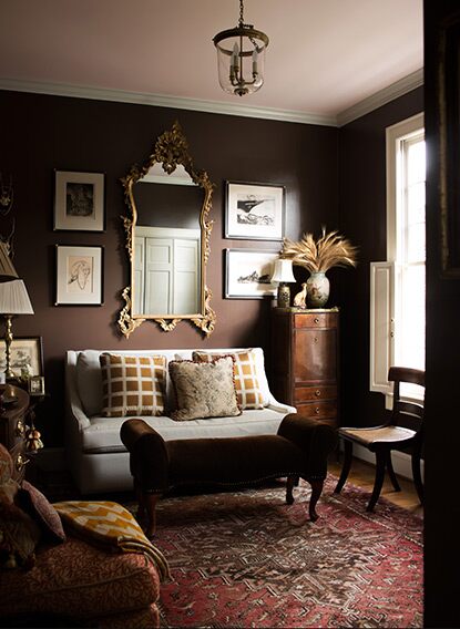
Photo Credit: Benjamin Moore
Number Two | Wallpaper
Wallpaper is also still enjoying it’s resurgence! I think the manufacturers realizing the “cons” that formerly held people back from enjoying wallpaper and making changes to application and removal processes has been a great influence.
I love seeing William Morris patterns showing up with his beautiful color palates and natural patterns in homes everywhere – he’s my favorite designer, and for good reason!
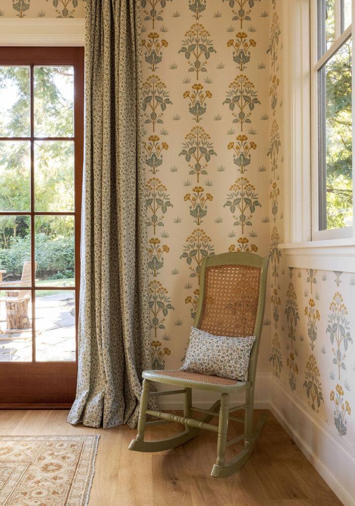
Photo Credit: Caitlin Flemming Design – Larkspur
Wallpaper murals are a great way to add visual interest on walls!
I love when I see them across the back wall of a stairwell – and in offices and dining rooms.
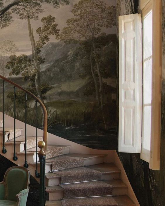
Photo Credit: Fine and Dandy Co – Imaginarium Mystic
They make a great backdrop and contrast to modern day activities.
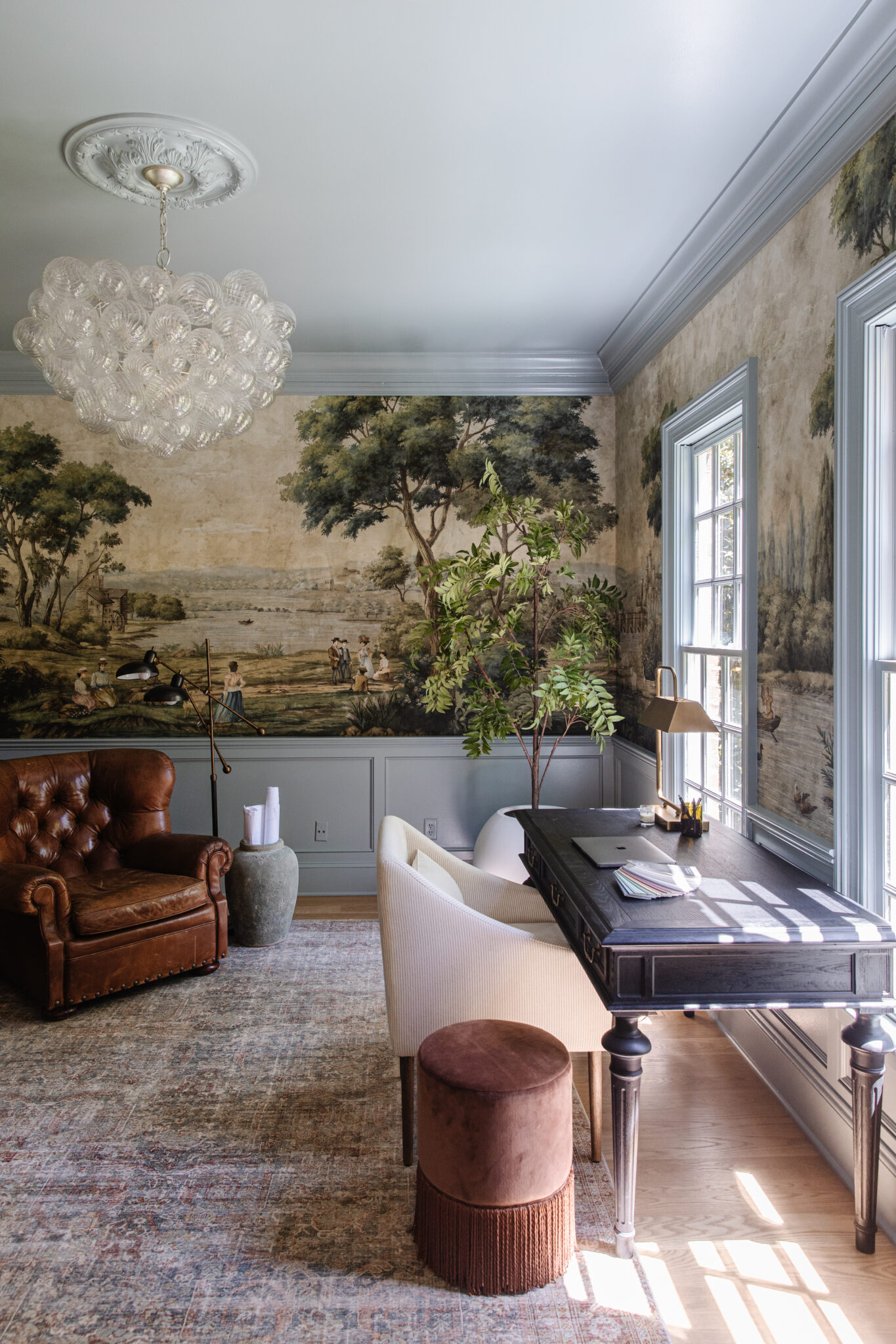
Photo Credit: Chris Loves Julia
Number Three | Prints & Patterns
This year is another where you’ll see lots of layering of prints and patterns. It’s a very English Cottage/Cottage Core idea, but it’s spread across to other design styles as well – and it’s neat to see!
I love how Heidi Callier used a textured wallpaper as her base, and then layered her patterns across her remaining furnishings.
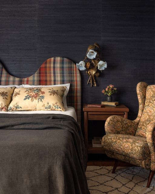
Photo Credit: The Nord Room/ Heidi Callier Design – Fox Island Home
We’re also bringing in patterns in older places like beautiful pleated lamp shades! I’m fully on board with this idea.
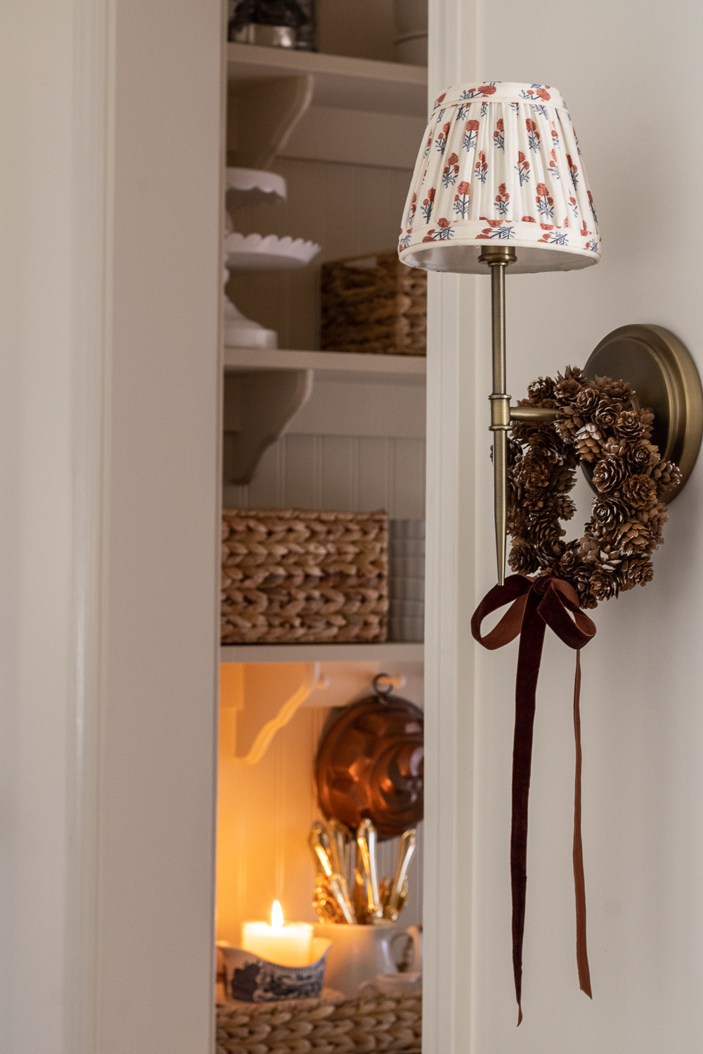
Photo Credit: Sincerely, Marie
Number Four | Antiques
Any traditional designer will tell you how much they love incorporating antiques – and this idea is spreading and regaining popularity. I think it originally started to pick back up during 2020 when it felt like the entire world was struggling with supply chain issues.
People were also home more and decluttering, and that mix of furniture being dropped off at thrift stores, and then immediately available for purchase to those who were looking worked out well for everyone involved!
The idea of thrifting storied pieces that have history about them is also a bonus to most traditional designers who love to bring about strong feelings when they’re creating their designs.
It’s also gaining in popularity because often it’s less expensive to buy second hand pieces, and it’s less wasteful.
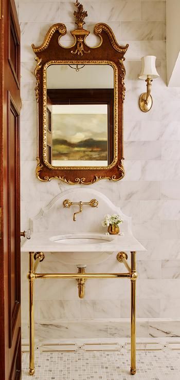
Photo Credit: Decor Pad
A few specific ways I’ve been seeing thrifted/second hand items showing up are in:
- Tapestries as wall art
- Backsplashes being brought to a new level of design with shapes and “corners” that are reminiscent of old furniture pieces.
- Stained glass, leaded glass and mercury glass being used in interesting ways.
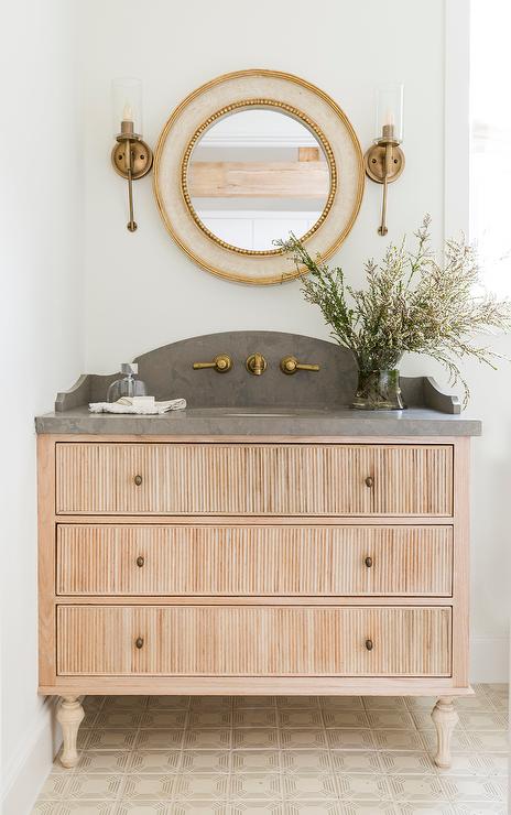
Photo Credit: Decor Pad
Are you Enjoying Learning about Different Trends & Designs?
I think you’ll love my Elite Decorating Academy! It’s a 6-module course that can be completed at your own pace online that touches on practical design advice and skills.
One of my most recent EDA graduates just let me know she is taking on her first paid design client! I’m so proud of her and excited to see what comes from her endeavours.
If YOU would also like to start taking on paid design clients in 2024 – come join the EDA!
Number Five | Collections
I think the idea of collections being embraced is good for everybody! There’s something so special about being encouraged to show off your personality in your design, rather than feeling like you need to hide it away.
We’re getting more comfortable and supportive of individuals showcasing their hobbies and interests in classic ways, and I’m loving it!
It’s called “Personalized Eclecticism” and it’s another way of saying that there’s a desire to feel art on an emotional level.
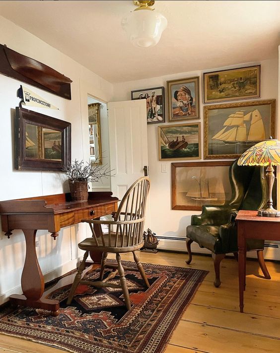
Photo Credit: The Groggy Anchor
As a way of bringing this about in my own home, I’ve made the decision that I don’t bring in artwork unless it brings tears to my eyes when I first see it.
There’s something about honoring our life, travels, plans and memories and incorporating them into our day to day surroundings that is just so beautiful & inspiring.
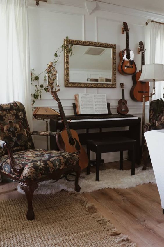
Photo Credit: Apartment Therapy
Number Six | Crown Molding
Gone are the days when you needed a contractor, truckload of tools and/or medium to advanced skills for decent millwork! There are some great options available now in foam and other synthetic alternatives to plaster and wood millwork.
There are a lot more DIY millwork projects showing up now that some of the technical difficulty has been removed!
I will offer a quick reminder that if you build up your crown molding, you’ll also need to pay attention to your base molding! You don’t want to end up with a “top heavy” look that involves ornate crown and a tiny builder grade base board.
If you’re adding crown molding, I often suggest going with at least a 6″ base molding so the room doesn’t end up feeling top heavy.
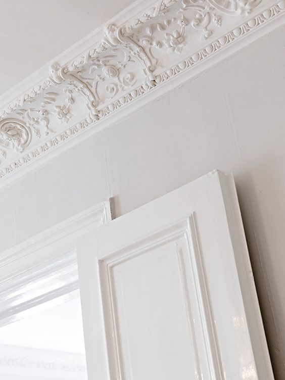
Photo Credit: Laurel Bern Interiors (Angelique de Paris)
Number Seven | Ceilings
Don’t forget about your “5th wall”. The ceilings can sometimes be neglected in design – but this year we’re all doing our best to make sure that isn’t going to happen.
Wallpaper & tin paneling on your ceilings are a great opportunity to add a wow factor!
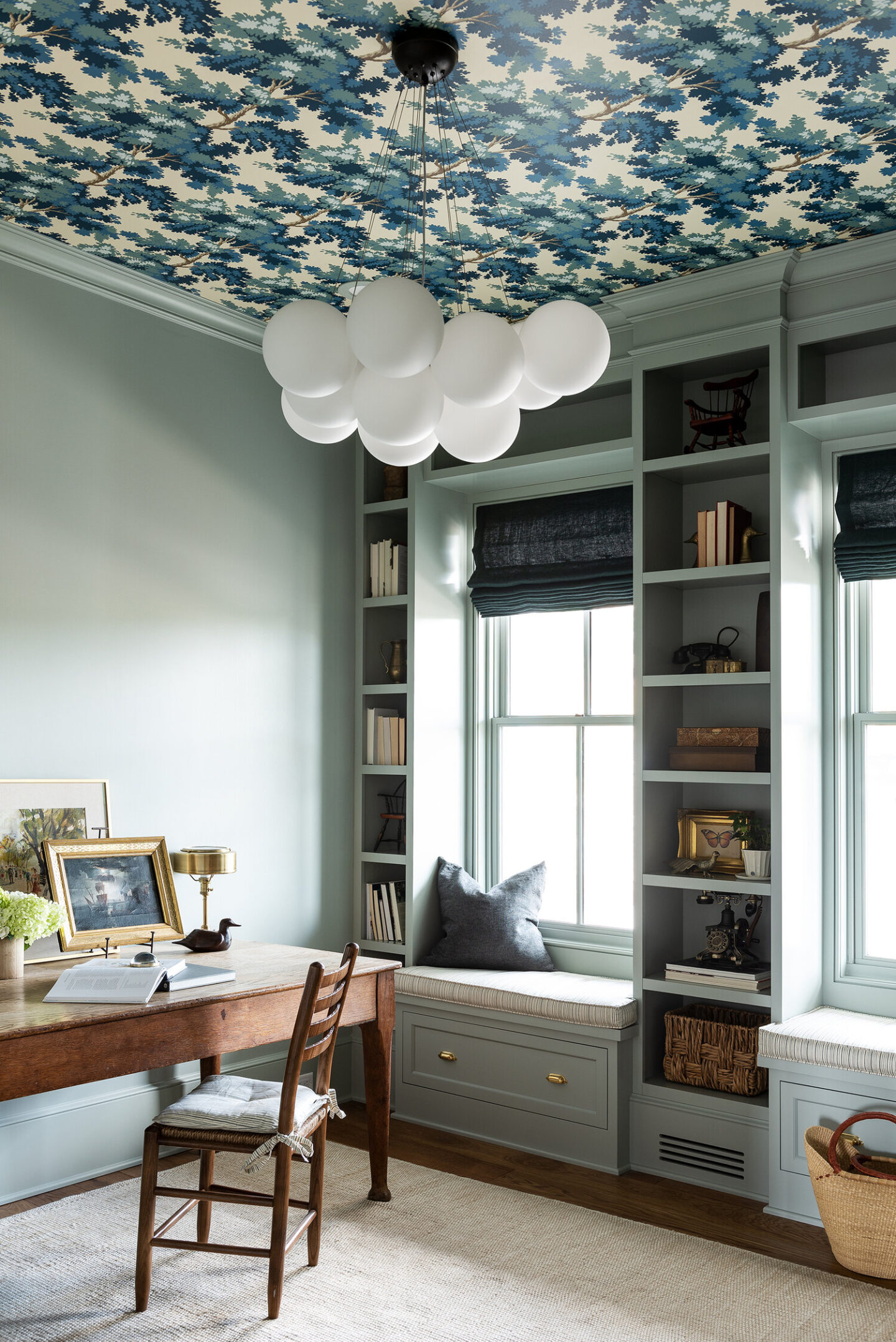
Photo Credit: Marianne Brown/W-Design Collective
If either of those things might be too much, another great option is to add a beautiful statement medallion around your chandelier.
These have also come a long ways are available in light materials (plastics and foam) that are easy to install.
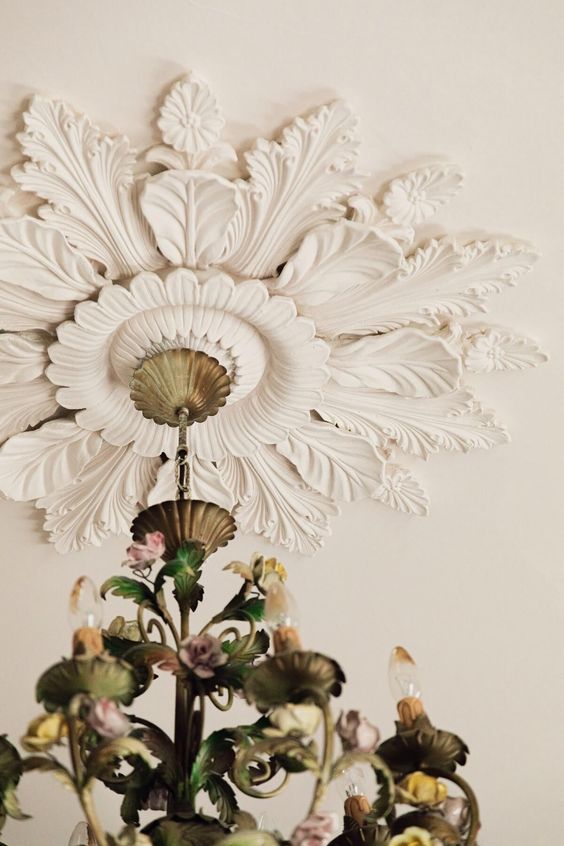
Photo Credit: The Nord Room
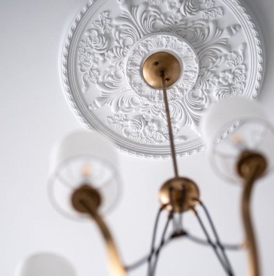
Photo Credit: Kichler
Number Eight | Tone on Tone
There’s a new term, “color drenching” that talks about using the same color for your walls and trim. Some even go so far as to also paint the ceiling and doors all the same color as well.
In my own living room I used the same color (Slate Tile by Sherwin Williams) for my walls and trim – but I chose not to do the ceiling or doors the same. I think if you’re going to color drench you need to make sure you’re picking a beautiful color that won’t feel overwhelming.
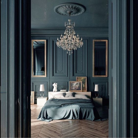
Photo Credit: Black Haussman – CGI
Something I realized is that by using this process of making everything the same color, designers are taking busier spaces and making them feel very sophisticated and elegant. They even have a miniamalistic and spacious feel.
If you have a more transitional style where you love traditional furnishings, but love the simplicity of some of the modern looks – color drenching might be a great way of having those things work together.
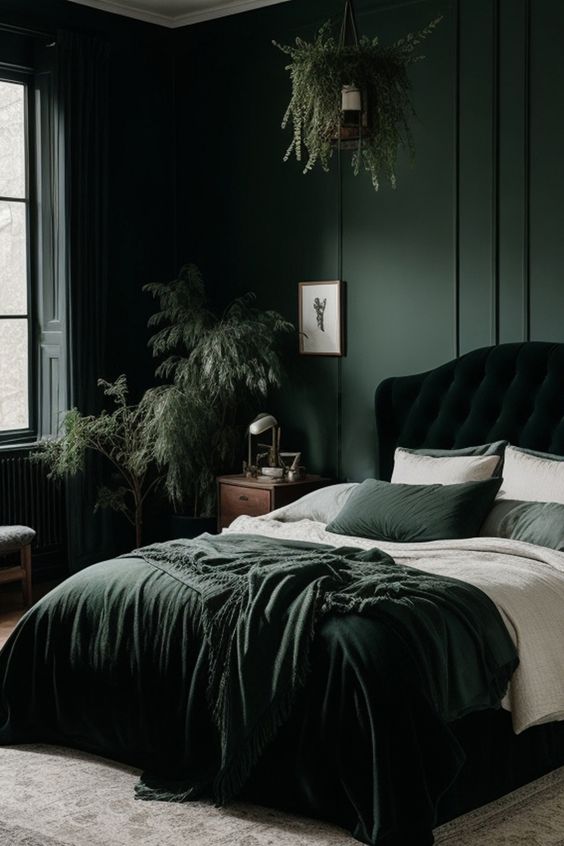
Photo Credit: Steline Design
Number Nine | Pillows
This one makes me a little sad, because I love pillows as much as the next gal – but throw pillows seem to be taking a bit of a backseat this year. Instead of just piling on the pillows on our beds and couches, it seems more likely that designers are picking 1-2 special pillows with great color and texture and are letting them speak for themselves!
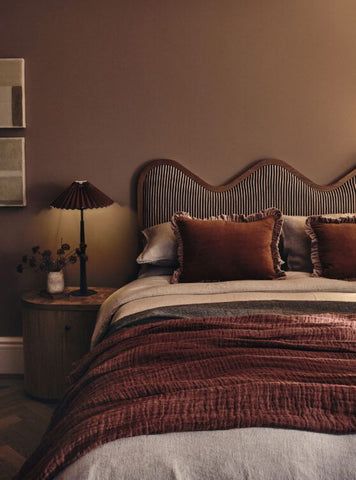
Photo Credit: Est Living
I’m leaning towards trying this out, and as a way of re-using some of my current 20×20″ pillow forms, I’m repurposing them into a more trendy 24×15″ lumbar pillow! If you have the space, you can also put two side by side and create a 48×15″ lumbar for a big statement.
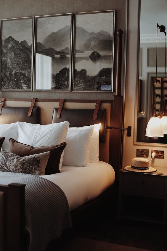
Photo Credit: Intercontinental Edinburgh Hotel
Number Ten | Arches
Arched doorways and entryways are very popular, and I’m noticing that the doorways are getting wider and wider as statements.
I’m LOVING the look of millwork around the arches, as well.
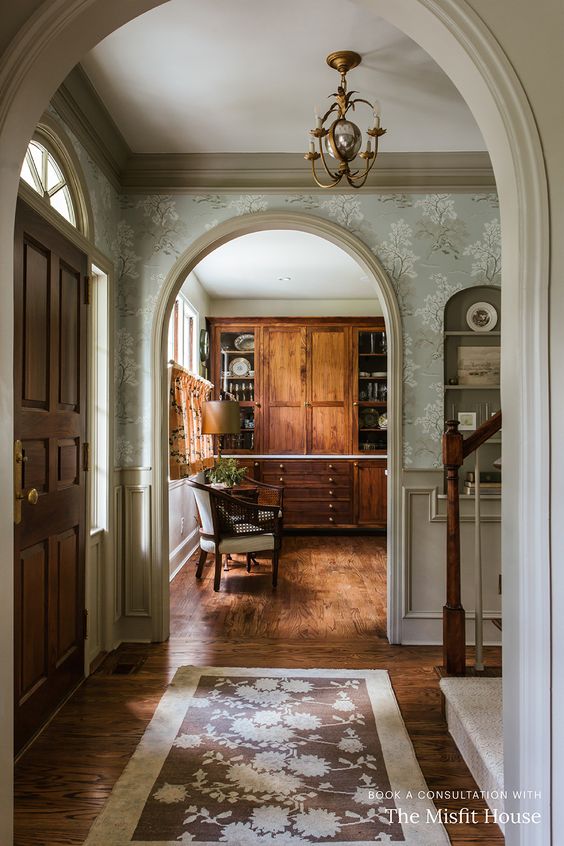
Photo Credit: The Misfit House
And it’s not just in hard finishes that you’ll find arches. There are curved sofas with overstuffed cushions, and club chairs.
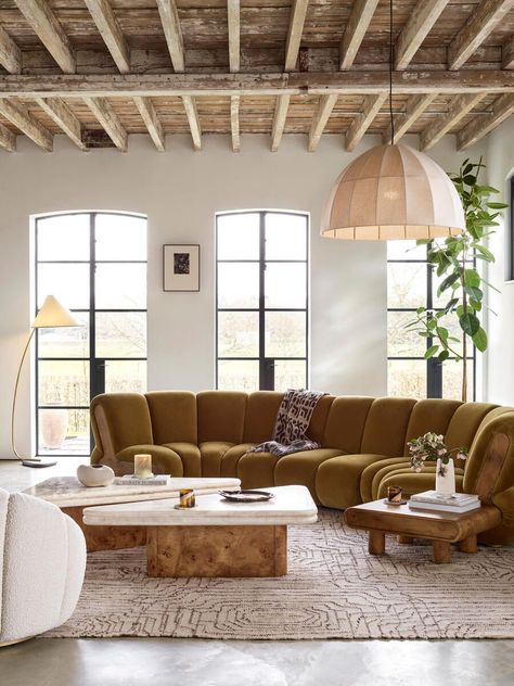
Photo Credit: Soho Home – The Noelle Sectional
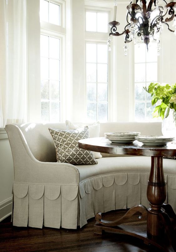
Photo Credit: Westbrook Interiors XII
The most traditional way to bring curved furniture into your space would probably be with a vintage setee. They’re just covered in feminine curves and beauty!
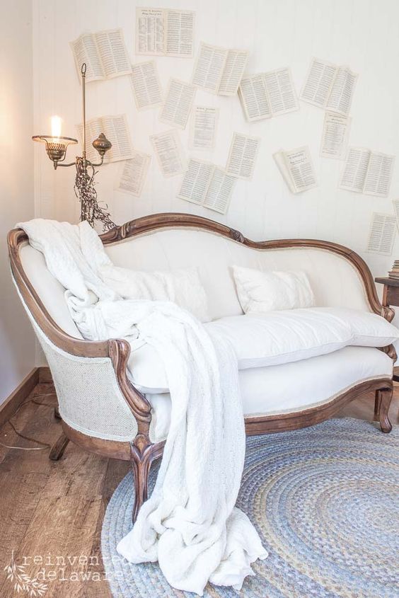
I hope you’ve enjoyed these 2024 design trends and forecast! Looking forward to seeing how they play out and evolve through the year!
Posts Related to 2024 Design Trends:
Pin these 2024 Design Trends for Later:
