How to Fix 10 Common Bathroom Design Mistakes
Follow along as I share 10 of the most common bathroom design mistakes I see being made, and learn how to keep from making them yourself!
Bathroom designs, whether for a remodel/makeover, or as a new build are a really important topic because they’re the second most expensive room you’ll work on in your home.
Can you guess the most expensive? Kitchens! The countertops, cabinets, appliances, plus the mixture of plumbing and electricity makes for complicated and therefore more expensive work. Depending on how much work you hire out, kitchen remodels can easily run $30k, and that would be for a pretty bare bones project!
Bathrooms aren’t far behind, and for many of the same reasons.
In a bathroom you also have cabinetry, countertops, fixtures (toilet, bath, shower), and again the mixture of plumbing & electrical. Anytime you’re working with both of those in the same room, you’re going to have to pay close attention to the applicable building codes for your area.
Honestly, if you’re not very comfortable with the codes and tasks surrounding a process like this, I think this is the time to call in a licensed contractor, and at least have them do a consultation to review your ideas and ensure they’re fitting for the space and your area.
It will be money well spent to have the peace of mind, especially if you’re planning a DIY project of this level for the first time.
Another big added expense in bathrooms is the tile work! It can be done as a DIY, but often if you’re adding inset shelving niches in the shower or other more complicated tasks, this might be another area you’ll want to default to a professional.
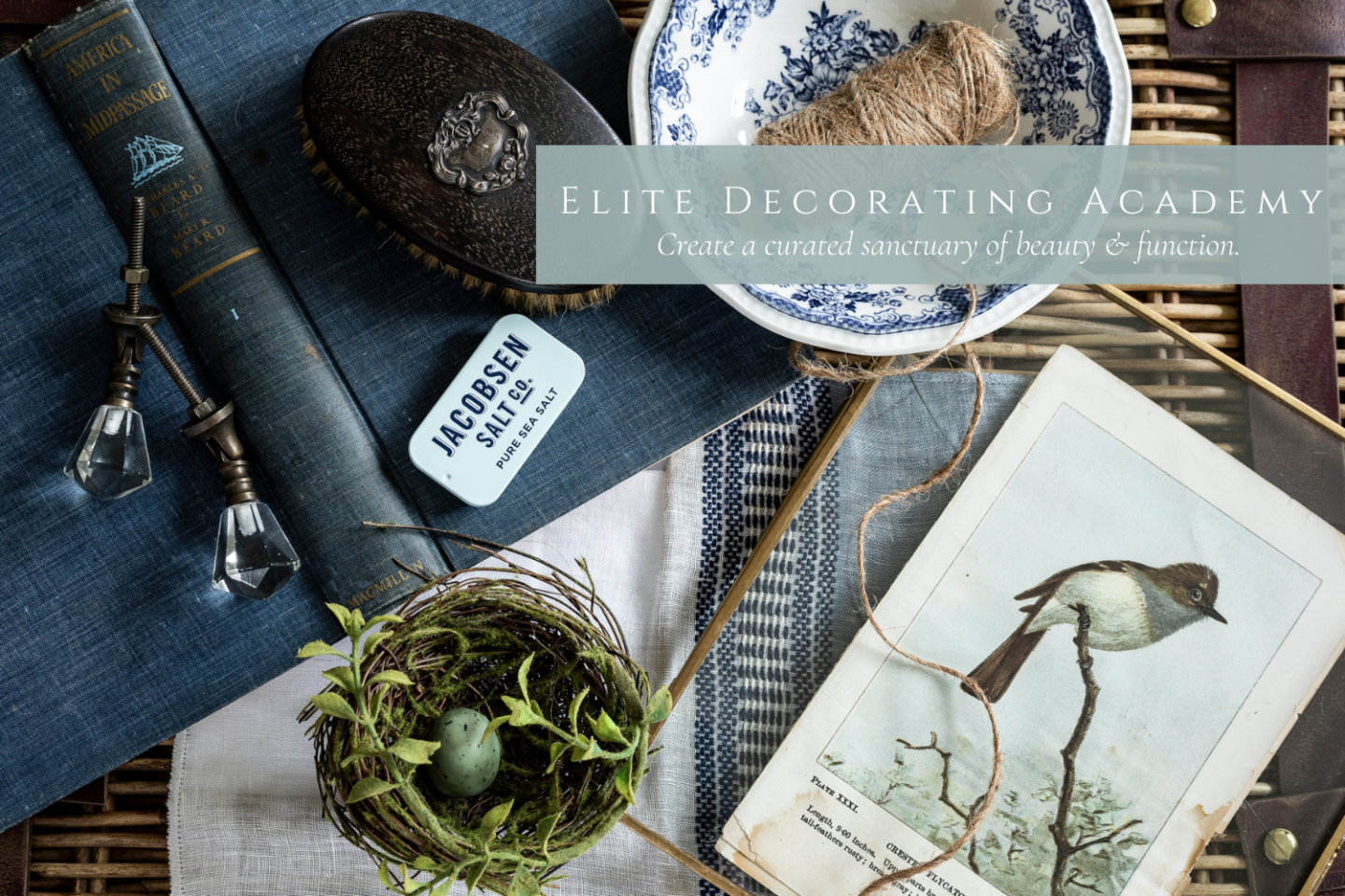
If you enjoy this kind of design teaching, I think you’re going to love my ELITE DECORATING ACADEMY!
Registration is open now at elitedecoratingacademy.com!
*This post contains affiliate links to products I know &/or love.
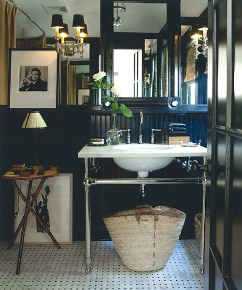
1 Big Caveat in Bathroom Designs…
Before I jump into my list of 10 design mistakes, I need to make it clear that some of these rules do not apply in a specific instance:
Powder rooms will often be exempt! Think of them as a tiny jewel box where you can push the limits!
Because they’re smaller and typically not used for the more specific work of getting clean or preparing for your day, you can be quite a bit more flexible with your design choices.
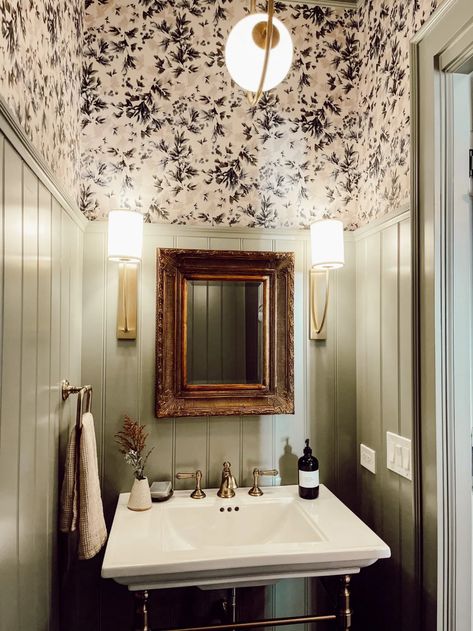
As an example, I would typically not recommend painting your bathroom walls green, because it reflects a really yellow hue onto your skin that can make you look less than healthy.
In this powder room, however, I think it looks absolutely stunning. The decor adds a rich, masculine Edwardian feel.
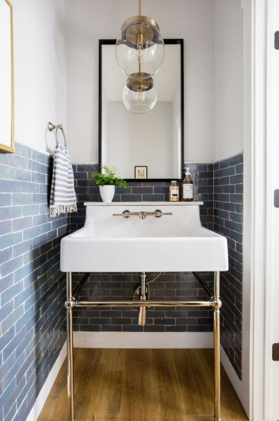
This one is another example of an exception to the rule. I would typically not recommend such a dark color because you want the place you go to get clean to be bright and fresh feeling.
But in this powder room, the dark navy blue works well and is balanced nicely with the abundance of mirrors.
Ok, now let’s dive into our list of 10 bathroom design mistakes!
No. 1 | Samples
Put plainly, you need to order samples! Don’t skip this very important step!
Most places offer sample sizes of their items for sale, usually for $1-5 per piece. This will of course depend on the item. Something like tile or flooring might be a little more.
I highly suggest working $100-200 into your budget to ensure you can get all of the samples you need.
And I also really suggest getting samples of everything you can get your hands on. That’s not just the hard fixtures like your flooring, cabinetry, hardware and tile, but also your paint swatches, a washcloth in the line you want to use, curtain fabric, etc.
Get as many of the items as you can as you work on your design so you can put them together on a small scale.
This is where you can be ahead of the game catching problems with things like undertones or clashing hardware.
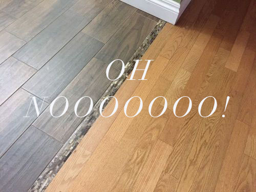
No. 2 | Flooring
Not understanding classic flooring choices is a big no-no. If you’re doing a remodel, be careful not to put two different woods side by side without understanding how they’re going to work together. Nothing says, “I’m in the middle of a remodel” like two mismatched flooring choices meeting together in a big transition at your bathroom door.
If you’re in the midst of a remodel and plan to replace the rest of the floor later, then this wouldn’t be applicable for you. But as a long-term option, this looks unfinished and spotlights the rocky transition from old to new.
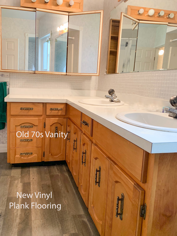
This is another similar example where the flooring was updated but without much thought on how the flooring would work with the existing cabinetry.
If this were my bathroom and replacing the cabinets wasn’t on my list of plans, what I would do is embrace their 70’s style and run with it. I’d paint them turquoise, and add some Moroccan tile to fully adopt a bohemian/70’s vibe.
It’s like the old adage, if you can’t beat them, join them!
If you have a specific piece in a space that is not changing, make sure to keep that in mind and work with it, not against it.
Also, I don’t think I can overstate this enough. Please NEVER put carpet in a bathroom. On a microscopic level, there’s just no way you’re getting that clean enough.
My two favorite flooring solutions for bathroom floors are either continuing the existing floors throughout the house (if hardwood or similar), or using classic tile. My favorite tile sources are Cle and Bedrosians.
No. 3 | Tile
Speaking of tile – bathroom tile is not the place to incorporate trends! Realtor after realtor will tell you how often they hear “Oh no, this dated tile has to go!” when they’re showing homes.
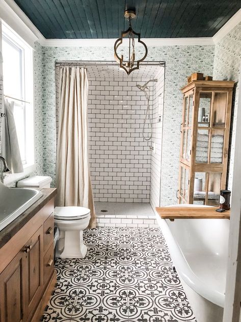
This example shows where just a bit too much was taken on all at once. The floor tile plus the shower tile, plus the wallpaper and the shiplap ceiling is a lot to take in visually in a small space. Individually these design elements could be really pretty, but I don’t love them all together.
Tile lasts a long time, like over 100 years, and it’s really unlikely that something will stay trendy for that period of time.
Stick with classics for these expensive and long lasting investments, things like subway tile and Carrera marble.
Then you can go all out with trendy paint colors and accessories that are easier to change in the shorter term and won’t affect your resale value!
I shared a bit more about when to stick with classics and when to splurge on trends in this blog post from a few years back.
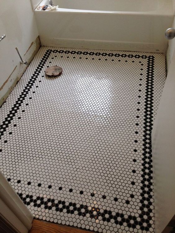
I recommend penny tile in showers because the tile to grout ratio is high which adds texture and traction.
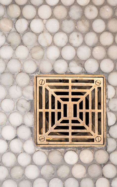
For flooring, framed penny tile is a really classic choice.
No. 4 | Carrera Marble
One thing I always like to make clear when I’m talking about carrera marble is that it has a definite blue undertone.
I have done some deep-dives on undertones and their importance in my Behind the Scenes Design Class, and I’m always reminding them about respecting the undertones they’re working with. It makes for a much lovelier end result.
Because carrera marble has blue undertones, you’ll need to take that into account when picking your paint colors and accents. Even something like a “grey” paint will have either green purple or blue undertones. If you accidentally choose a grey shade with a green or purple undertone, it will not look as nice with your marble as a blue undertone would.
It seems trivial, but it will make all the difference in your end result!
You’ll also want to stick with pure whites rather than creamy whites next to carrera. Creamy whites will look “dirty” next to the bright white in the marble.
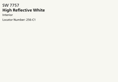
I suggest using Sherwin Williams High Reflective White or Benjamin Moore Chantilly Lace for pure whites.
No. 5 | Bathtub
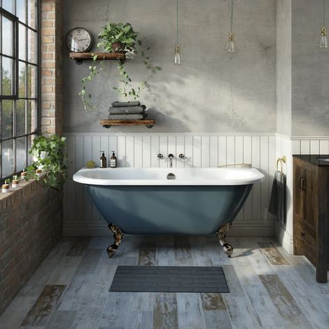
I know some people don’t love bathtubs or the idea of soaking in them, but realtors and I agree that putting one in anyway, even if you never use it, is a good plan for future resale. At least 1 per house, because for the people who love a tub, or need one for bathing small children, it could easily be a deal-breaker if there is no tub to be found.
No. 6 | Barndoors
Depending on where you are in the country, barn doors as a trend are either already out, or are on their way out.
And as a second, but more important point, barndoors add a level of complexity when used in a bathroom when you consider things like privacy, smells, humidity, and sound.
To be frank, they just don’t cut it for bathroom doors. They can be cute elements in specific areas if that’s a trend you’d like to hang on to, but I wouldn’t suggest them for bathroom doors.
If space is an issue and a swinging door just won’t work, I would default to a pocket door over a barn door. They can have a lot of the same concerns, but usually they are lessened in a pocket door because they have a slightly better “seal”.
So to confirm, that’s my official vote on the debate: NO barn doors for bathrooms!
No. 7 | Lighting
As I mentioned earlier, bathrooms are used for getting clean, and getting ready for your day. Because of that, you want a really well lit room. There are formulas out there that you can find that show how many lumens you need for your space (based on square footage), and taking into account what type of room it is.
In kitchens and bathrooms, both, I recommend adding the extra lights.
Again, this example is a powder room, so it might be able to get away with it, but that single light, even in a small space probably doesn’t give off enough light to really fill the space.
Free Workshop : 10 Design Mistakes & How to Fix Them.
Click below to join me as I hold a weekly free design workshop with 10 of the most common design mistakes, AND teach you how to fix them.
No. 8 | Sconce Height
And as an additional detail for bathroom lighting, focus on the type of lighting you bring in!
Overhead lighting, like the common “vanity bar” of lights above the mirror is really unflattering to your skin. It actually creates micro shadows on your eyebrows, nose, and even on individual pores.
If I have my choice, I choose sconces on either side of the mirror every time, without fail.
But the height matters! Aim for the bulbs of the sconce to be right above your head (you might need to average if you and your husband have a big height difference). That means whether your sconce is a down light or an up light will affect your placement. If your light ends up too low you’ll have lighting reminiscent of “ghost stories” around the bon fire at summer camp.
This is an example of sconces that are probably too low.
And these look like they could be placed a little bit too high.
Soft light from the side and just slightly above will be the most flattering to your skin and give you a better blank canvas when you’re applying your makeup and getting ready in the mornings.
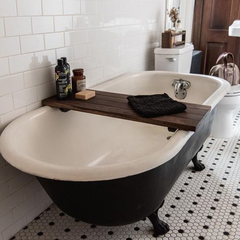
No. 9 | Storage
Bathrooms are one of those places that have a high need for storage! I think it’s an important detail that’s often forgotten in bathroom design plans!
Think ahead to the different storage needs you have, and then build and plan in storage accordingly! If you have place for open storage, find cute containers and take things out of their original packaging.
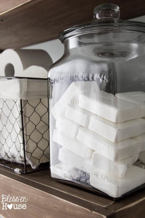
If you have wall space, add a cute display. If you have a tub, add a cute DIY caddy across the top for bath necessities.
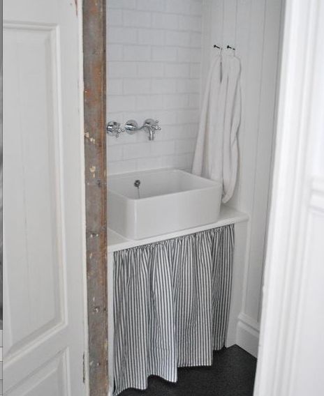
If you have a pedestal sink or other open air area under your sink you can add a ticking curtain around the base which gives a very French feel.
Medicine cabinets are a great way to incorporate storage in otherwise wasted space.
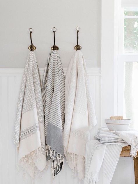
For drying towels, I always prefer towel hooks over a towel bar. Not only does it allow you to hang more towels, but they look prettier and you can see the edges better!
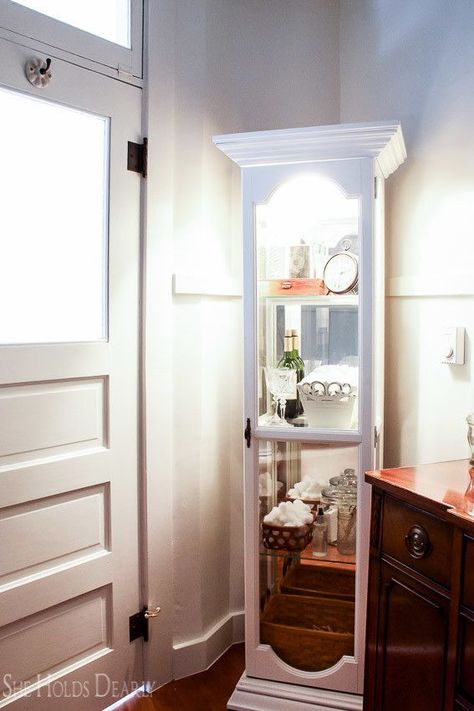
In our master bathroom we painted an old doll curio white and used it for storing some of our bathroom essentials in cute baskets, crates and bowls.
It fit perfectly into the awkward corner behind the door.
No. 10 | Too Sterile
Now I like bathrooms to feel clean as much as the next gal, but I think there comes a point when they can feel too sterile.
When I see that, I always want to warm it up and add a human touch.
My two favorite ways to do that are to add plants & details.
The plants can be real if you have the windows and lighting to meet their needs, or faux!
I love the faux plants at IKEA and Michaels and use them often.
Then work on adding lots of interesting details and special touches.
Things that others may not notice, like cute handles on your toilet.
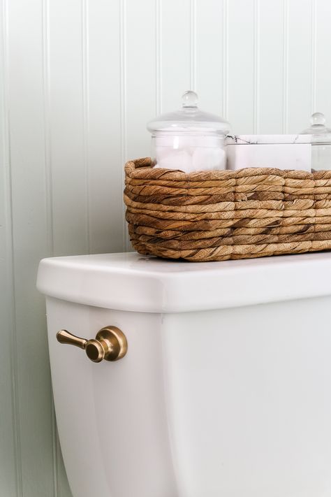
Or the hardware you chose for the door itself.
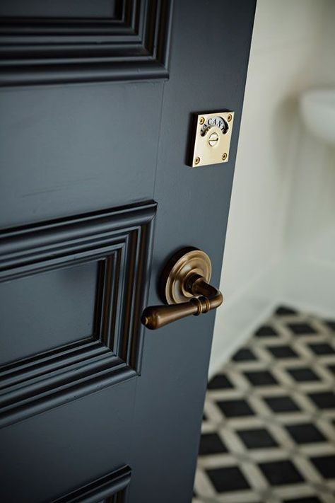
These finishing touches make all the difference in the world! For fun hardware like this, my favorite source is D Lawless.
I hope this list gives you lots of inspiration and helps you as you move forward with your own bathroom design!
DON’T FORGET ABOUT THE ELITE DECORATING ACADEMY FOR MORE DESIGN TEACHING!
Click HERE to Join the Elite Decorating Academy.
This comprehensive interior design course includes:
- 28 Hours of Teaching Material
- Broken down into 160+ classes that are an average of 10 minutes each
- Video, Audio & written material for any type of learner
- Practical design advice for any stage of your journey
Visit elitedecoratingacademy.com to learn more!

Pin these 10 Common Bathroom Mistakes for Later:
Until next time,


