Living Room Makeover Reveal
There’s just something exciting about a living room makeover reveal!
I think it’s especially fun when it’s done as part of a giveaway celebrating our 40k subscriber milestone!
I mentioned this giveaway a few weeks ago in my Organizing Seasonal Decorations post, and we received so many great submissions! So many, in fact that I couldn’t select just one, and instead chose two different spaces to work on!
Congratulations to Heidi & Colleen – our two winners!
In a few weeks I can’t wait to show you Colleen’s really neat Industrial Kitchen space, but for today, I get to focus on Heidi’s Living room!
I also enjoyed this process so much and was so honored that you trusted me to potentially work on your spaces. It was such a good response that I might offer it again at the 50k mark, which is sneaking up on us pretty quickly – so stay tuned!
Now back to our project at hand!
Heidi’s Living Room
Heidi is a teacher, and lives with her family of 6 in California in an old house that they estimate to have been built around 1920.
You know that means it has really great details and tons of character!
Some of their dreams for the space included a space for them to spend time together, with room for playing board games together, and desk space for Heidi to be able to grade papers for work without being too far away from the rest of the family.
After reviewing Heidi’s application and the pictures she emailed, we also got to do a true virtual consultation via zoom! Being able to see the space “live” is really helpful and makes it come together more easily than seeing it in pictures.
Here are the photos she shared of her current living room:
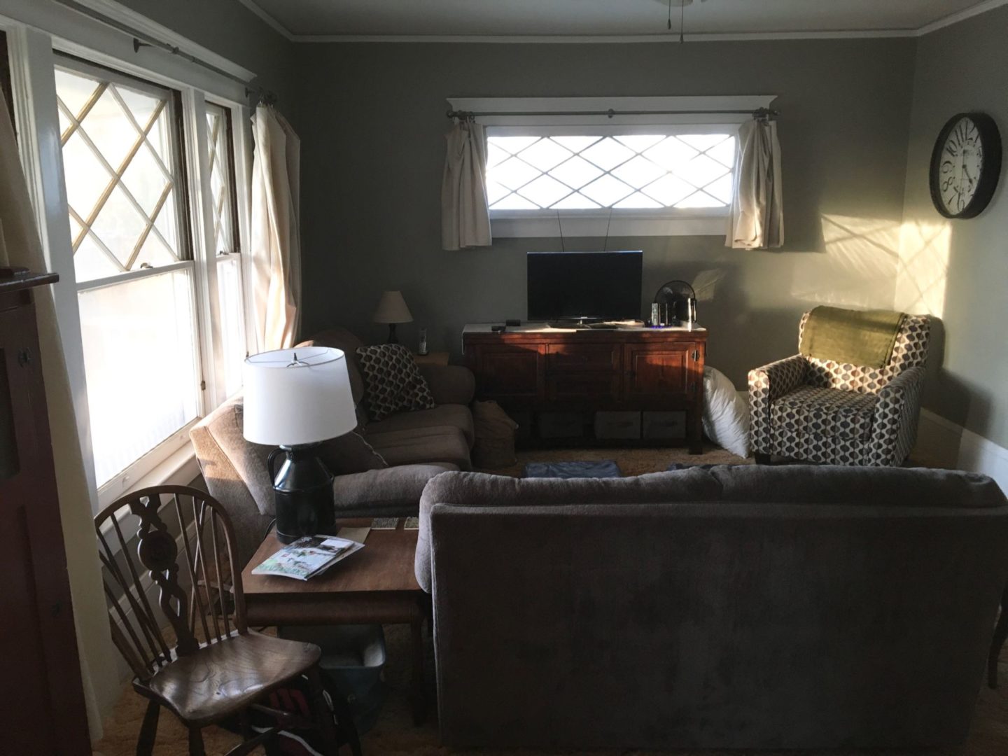
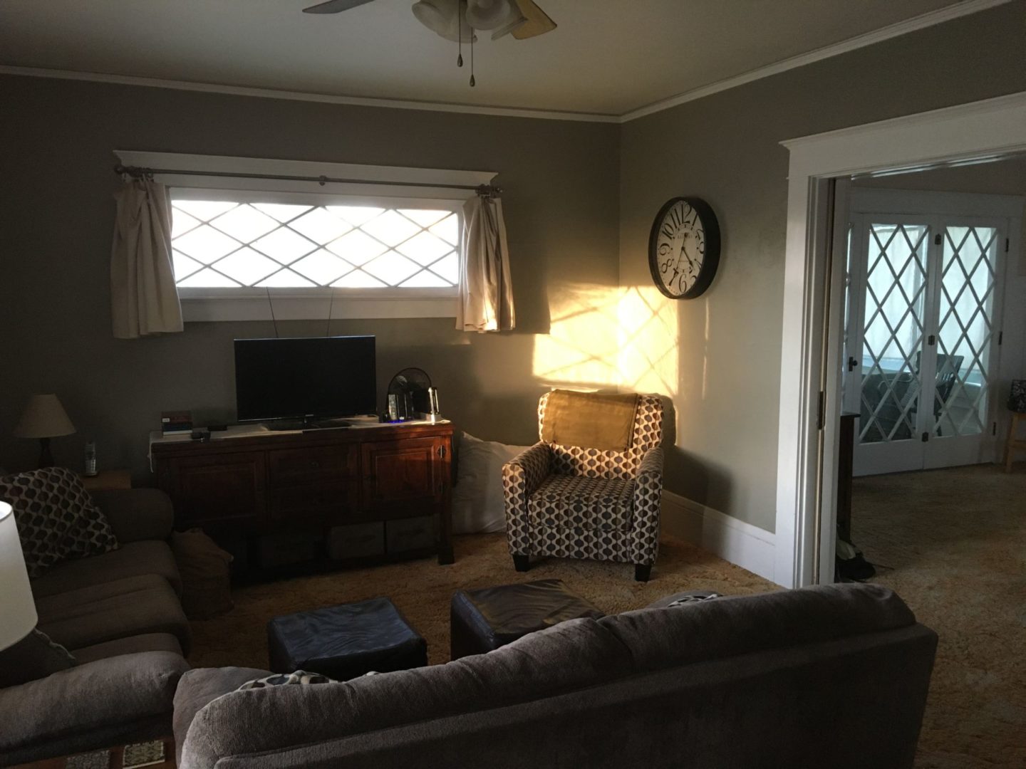
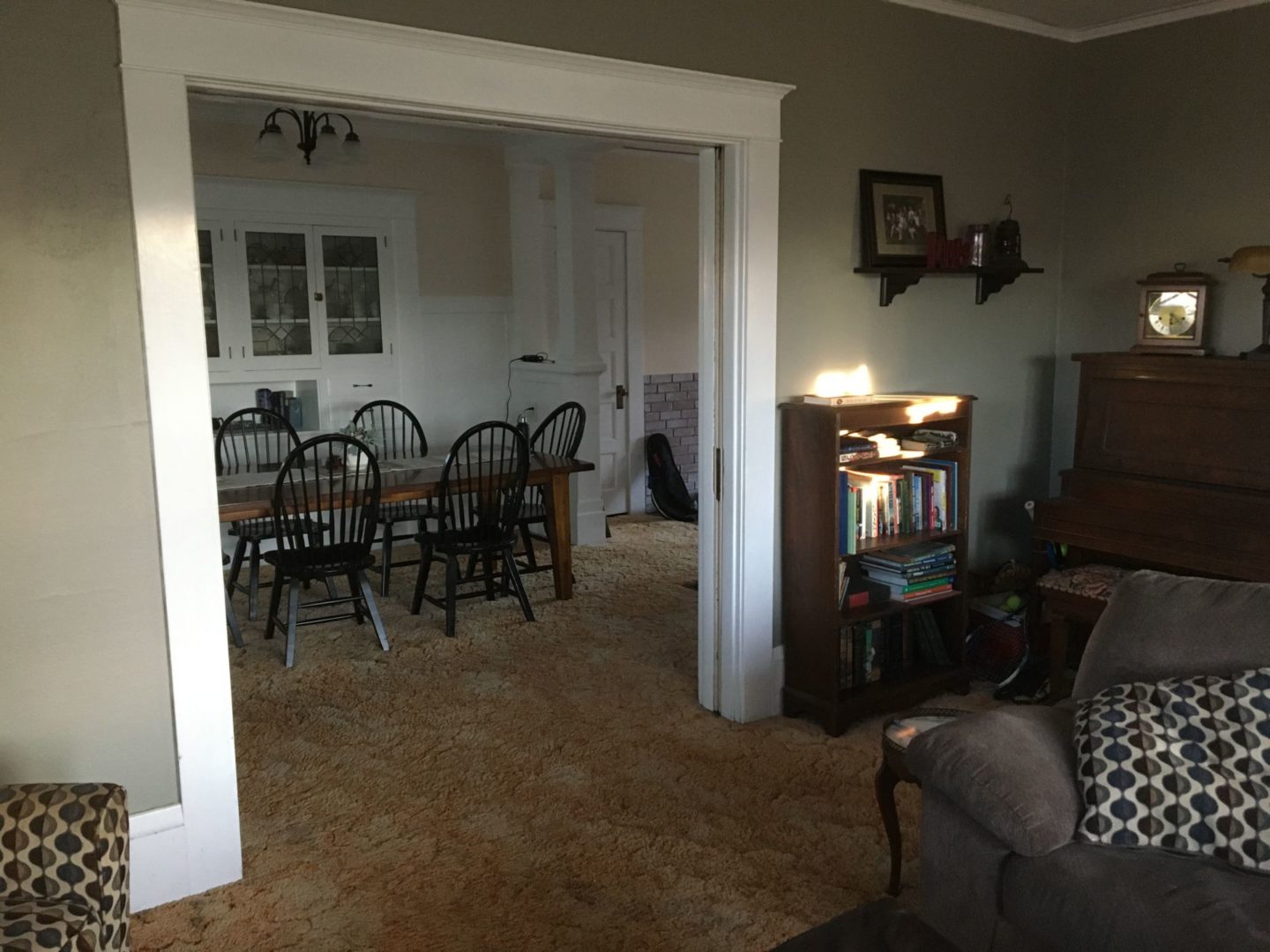
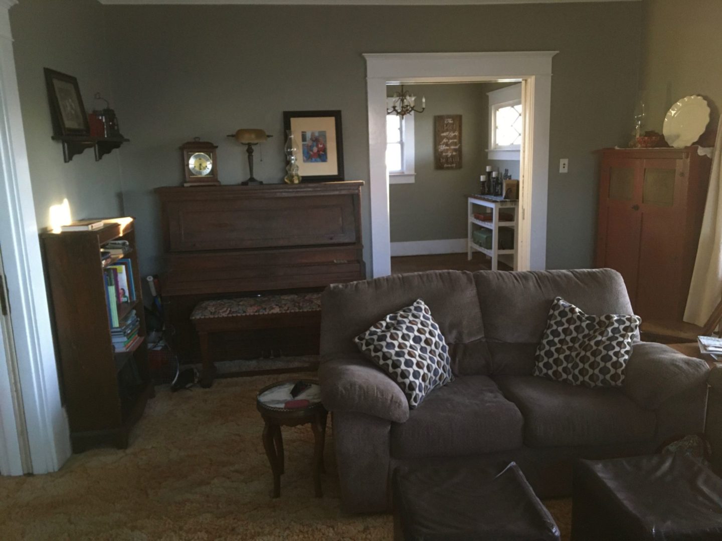
You can see they have great windows and beautiful millwork!
Some of things she knew she wanted to change about the space were the carpet (more about that in just a minute), that it feels a bit dark, and she mentioned that she wasn’t necessarily attached to having the piano and other smaller furniture pieces kept in that room.
Carpet Question!
Heidi said that they had pulled this orange carpet (that she’s NOT a fan of) up in another section of the house and found that the carpet foam underneath was so old that it was almost melted onto the wooden floors below.
She’s worried that if they they pull up the carpet in the living room and dining room that they’ll find the same issue and open up a proverbial can of worms to get it taken care of. (Rather than the simple, “pull up carpet and have beautiful wood floors to refinish” that some old homes are blessed with!)
If you’ve ever experienced this type of melted carpet pad issue in your home or know of anyone with expertise in this area, we’d love to hear any of your comments below about what they might be able to do to get both the carpet and pad up to see what’s below! (Hopefully beautiful wood floors!)
Living Room Makeover Inspiration:
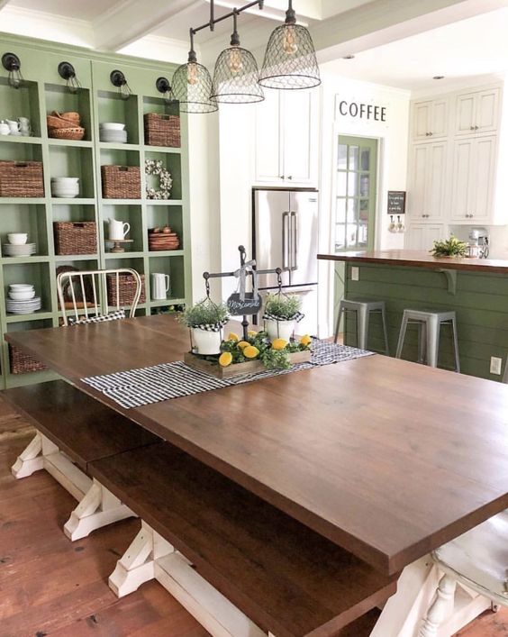
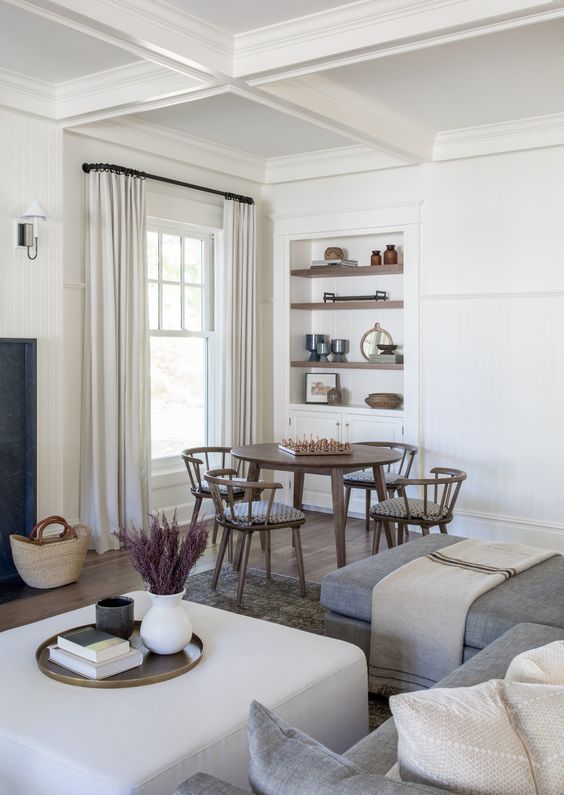
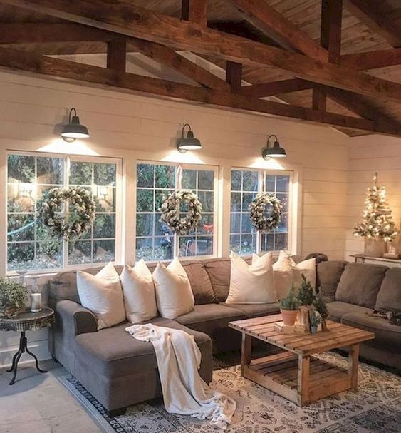
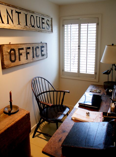
Another thing Heidi did that was really helpful is that she emailed me a few of her inspiration pictures for the space!
I love being able to see multiple inspiration ideas to get a feel for some of the things you love, and sometimes there are even details that I can notice reoccurring throughout the pictures that you might not have even realized were something you’d be drawn to as a stand alone item!
*This post contains affiliate links to products I know &/or love.
Living Room Makeover Plans
After chatting with Heidi on our zoom call, I got to work planning my suggestions!
Paint Color:
The first thing I wanted to share with her was a new paint color for her walls. The existing color is something they chose when they originally moved in, and they were ready for a change!
She mentioned she really loved the green shelves in her first inspiration picture, so I matched that green, and then toned it way down by “adding white”.
When you look at a paint swatch or card like this one in the Sherwin Williams paint fan deck you can see that the bottom color is the most saturated color, and the colors up the card are created by simply adding more white to lighten the saturation and the shade.

This brought me to my suggestion of Sherwin Williams Honey Dew #6428 for her new wall color.

I do think she could also take the original color that she loved and use that to repaint her built-in cabinets in her dining room for a fun accent!
If you’re ever wanting to see a color in your own space before you buy the real thing and paint it on your walls, you can get adhesive samples of your paint colors before purchasing by using Samplize.
Window Treatments:
For both of the windows, I recommend that Heidi make her curtain rods wider, and higher, almost all the way up to the ceiling. Then add white sheer panels that go all the way to the floor.
This will help show off the beautiful millwork, and will help fill out the space on both walls.
Room Layout:
Next I wanted to share my thoughts about her living room layout!
I actually think she should flip the entire room!
Because she wasn’t dedicated to keeping the piano or the two smaller shelving units on this side of the room here, my suggestion is to move them to another space completely. Then I’d move the TV over to this wall on the left side of the doorway.

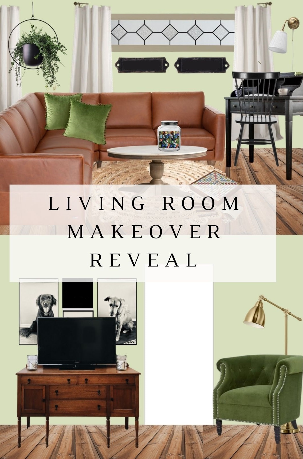
Here’s my design board for the space:
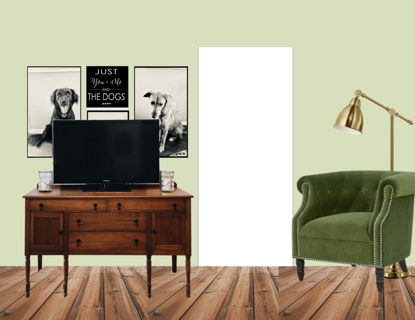
I’d search craigslist for a neat old buffet to use as a TV stand and for extra storage, and I’d get some neat black and white art to hang on the wall around the TV to complement the black frame of the TV and to create the feel of a cohesive gallery wall.
Here’s an example of Jessica of Garvin & Co doing that exact thing:
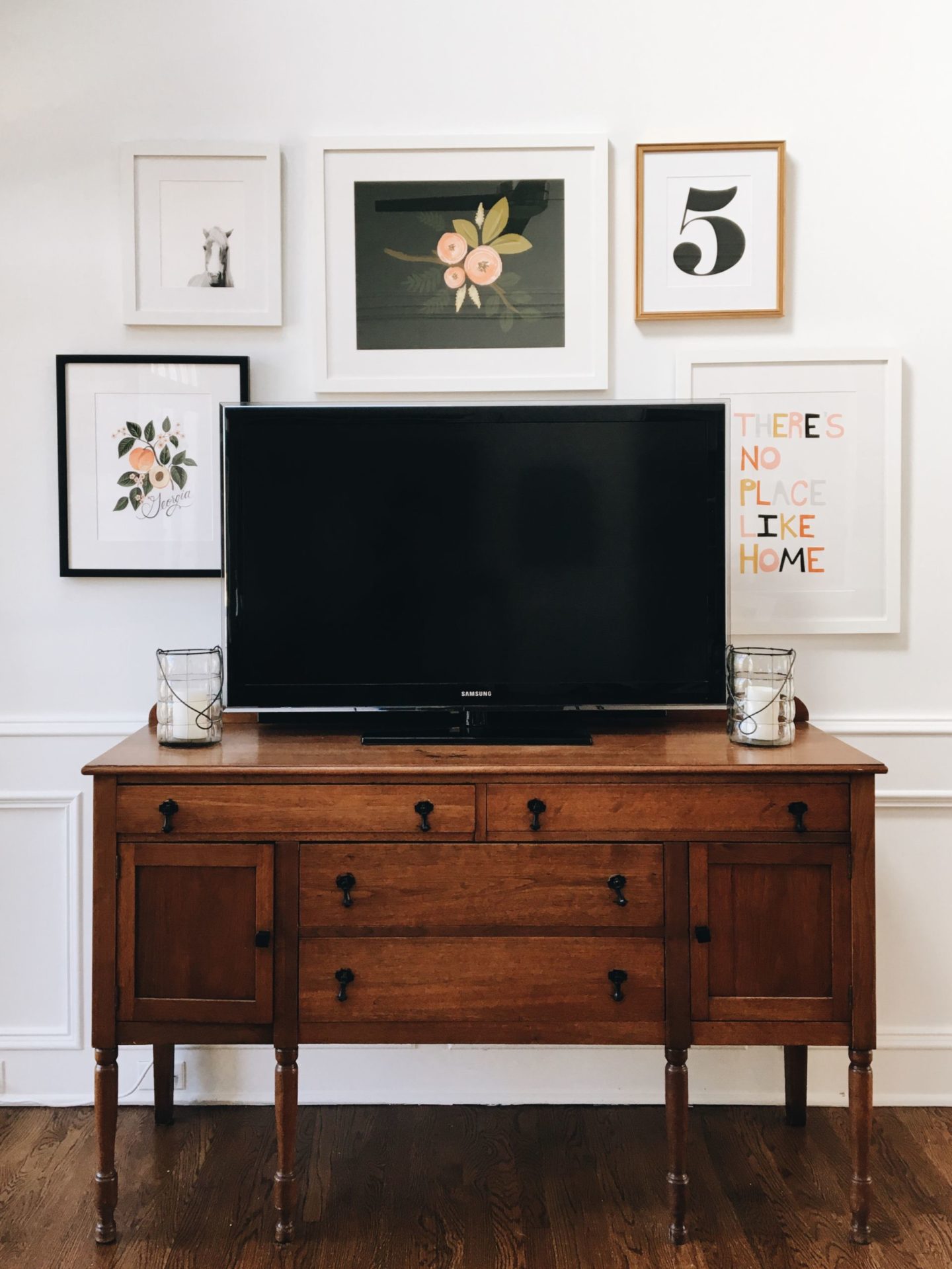
The dog pictures I used came from this inspiration from Etsy.

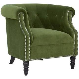
On the other side of the doorway I’d add a neat accent piece like this green chair from Wayfair. Not only does it add texture and color, but the functionality of having an extra chair to pull up is helpful in a family of 6, especially when guests are over!
The floor light I chose for behind the chair is the BAROMETER from IKEA.
As a reminder, here’s the other side of the room:

And here’s how I’d lay it out:
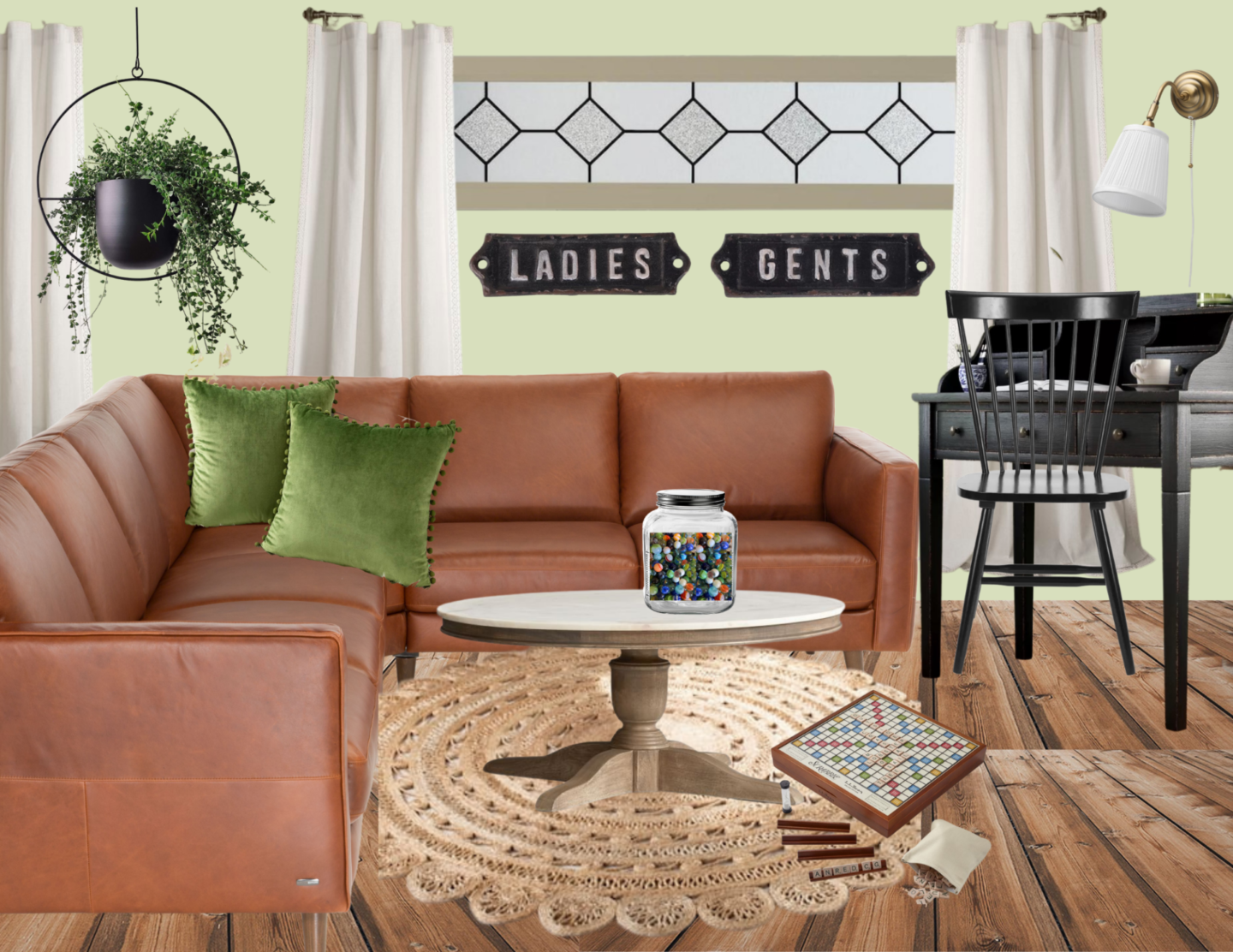
I would swap out the existing couches for a single leather sectional. Cognac is really popular right now, while still remaining a classic that would look nice for years!
I always recommend sectionals for people with larger families and seating needs. When you’re at a family of 6 or higher, you really want to be able to maximize your seating within an area, and sectionals are a great way to do it!
The one problem with cognac leather sectionals is that they’re so popular right now, it’s a bit trickier to find them second hand or for reduced prices.
But if you’re willing to look, I know you can find some options at places like Target or Wayfair that would have some options for less than $1000, even new at retail.
Shop This Look
[show_shopthepost_widget id=”4357601″]
Other Details on this side of the room:
Because the sectional has such strong straight lines, I always say to pair it with a round coffee table to add some curves!
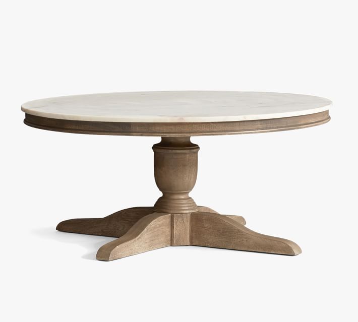
This one is a marble top table from Pottery Barn, but I’d say any round table in white or raw wood would look great! (Options should be pretty easy to find on craiglist!)
Under the table I’d pull in something like this feminine jute rug with beautiful lace-like detailing.
I noticed in Heidi’s inspiration pictures that she had a few with vintage signage, so I added a cute detail with the Ladies and Gents sign to fill out the space below the high window.
On the right side of the room where the clock is now, I’d add a black secretary desk with a black windsor desk chair for work space! I love the clock and think it’s working well there, so I’d leave it, and add some work lighting like a desk lamp or wall sconce if needed.
On the coffee table I added a fun vintage game feel with the marbles and the scrabble game.
To help balance out the left side of the room, I would add a hanging plant above the couch.
And lastly, some of my favorite pom pom pillows in green velvet as a final touch for the couch.
Completed: Living Room Makeover
And that’s what I have for Heidi’s living room makeover plans!
Heidi, I had such a good time learning more about you and your space, and I hope this plans give you a great direction and inspire you as you makeover your room!
Pin this for Later:
Until next time,