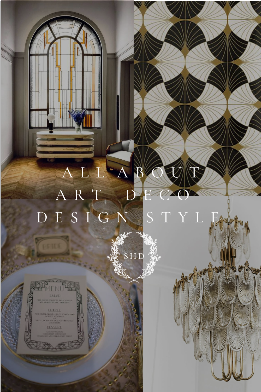
All About Art Deco Design Style
It’s been a little while since I did a deep dive into a design style, so today, let’s talk all about Art Deco Design Style!
There were predictions being made back in 2020 that this style was really going to be taking off again, and while it is still fully embraced by commercial settings (hotel lobbies & restaurants), I feel like it’s less popular in home design. But there is still a lot we can learn from this 100 year old design style!
*This post contains affiliate links to products I know &/or love.
A Summary | Art Deco Design Style
The overall summary of this era in design can be boiled down to a few key words: opulence & drama! There was such a distinctive streamlined elegance that hasn’t been done again since!
Even if you’re not ready to do a full home or room in Art Deco Style – you can still find a lot of beautiful pieces that can stand alone to be added to your space.
I find often that when I’m nearing the end of a design process and find myself looking for a final element to make the room pop – there’s a solution waiting for me in Art Deco. Sometimes it’s a great mirror or a beautiful dramatic item for the coffee table.
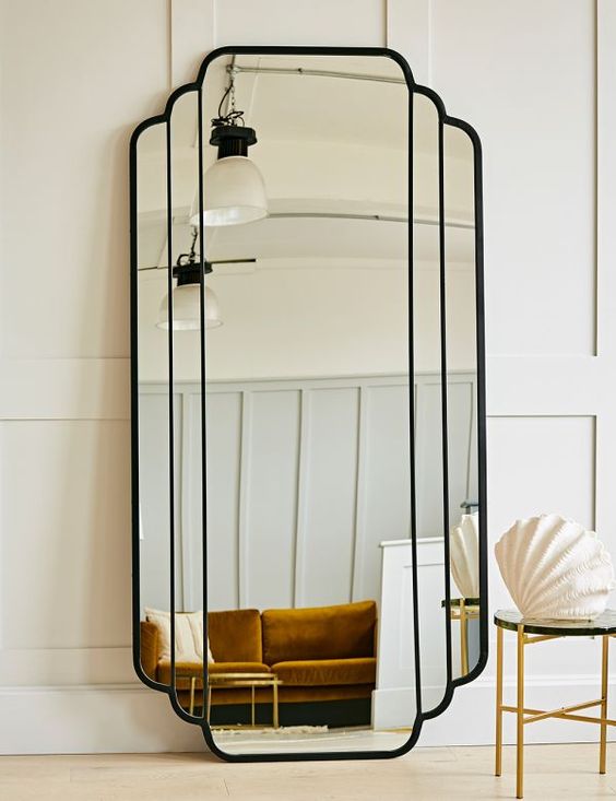
Photo Credit: Roxanna Jaye
Where & When did Art Deco Begin?
Art Deco began in Paris and infiltrated the interior design world starting in the 1910s. It carried all the way through the beginning of WW2, with the absolute height in the roaring 20’s!
There was so much optimism as the country celebrated the end of ‘The Great War” and the economy started to boom. Access to travel via aviation was at an all-time high for that day and age, and that suddenly meant there was much greater access to furniture pieces and styles from a wider variety of sources.
The style took off with man-made opulence and a celebration of all the advances in industry. They used rich materials and an over abundance of details and designs in each piece that was created.
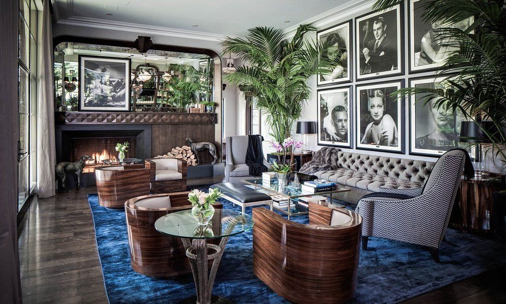
Photo Credit: The Reserve at Holmby Hills
If you’re looking for architectural inspiration – you’ll find some beautiful elements standing tall (literally) in New York!

Photo Credit: Posh Pennies
Individual Art Deco Design Style Elements
Now let’s get into some of the specifics!
One of the first things you’ll notice are the colors – there is a real infatuation with deep jewel tones. Everywhere you look there’s emerald green, sapphire blue & ruby red. Lots of moody black, and high contrast with gold elements & accents.
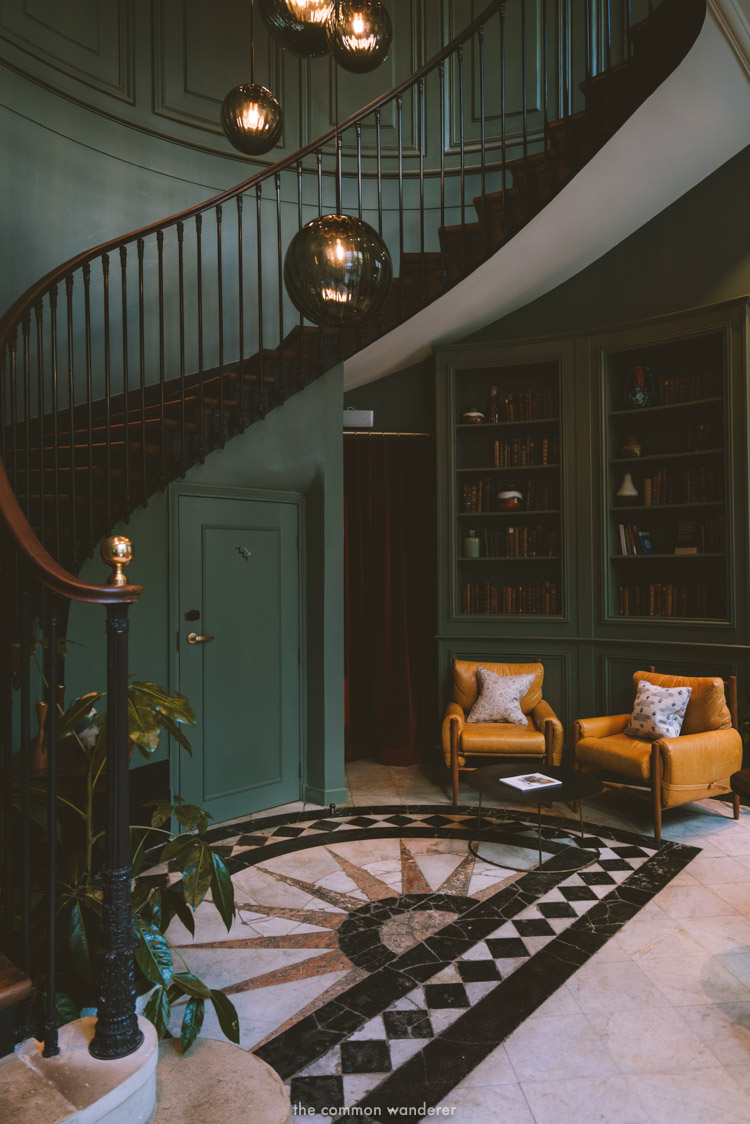
Photo Credit: The Common Wanderer
Geometrical designs, especially linear patterns are very prevalent in Art Deco and they show up in many different formats. Whether wall treatments, tile, furniture pieces or lighting. But more about those elements in a bit.
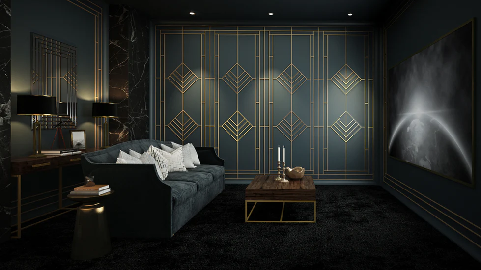
Photo Credit: OLS
The prevalence of rounded pieces was much more rare, except when it came to anything that was shell or fan shaped! Channel tufting (vertical lines across the back of a seat or couch) was one way they accomplished the shell look throughout their spaces.
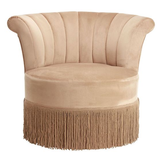
Photo Credit: Clanbay
Love Learning About Interior Design?
If this kind of historical & design deep-dive is something you enjoy – I think you’ll really love my Elite Decorating Academy! I’m accepting new students now to my self-paced online design school! You can learn what it takes to design your own home from top to bottom, and even gain the confidence to start taking on design clients of your own!
Click HERE To learn more or to get registered!
Love this Style…but in Smaller Doses?
If you love the look of this style, but you’re not ready to go full out, or even to incorporate it into your own space, I think it can be both a beautiful wedding theme, and a great new-years eve party theme (especially as we continue through our own resurgence of the “roaring 20s”.)
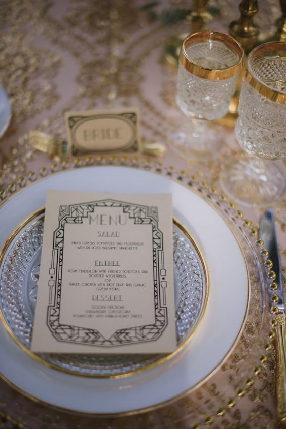
Photo Credit: Deco Weddings | Jenny V Photography
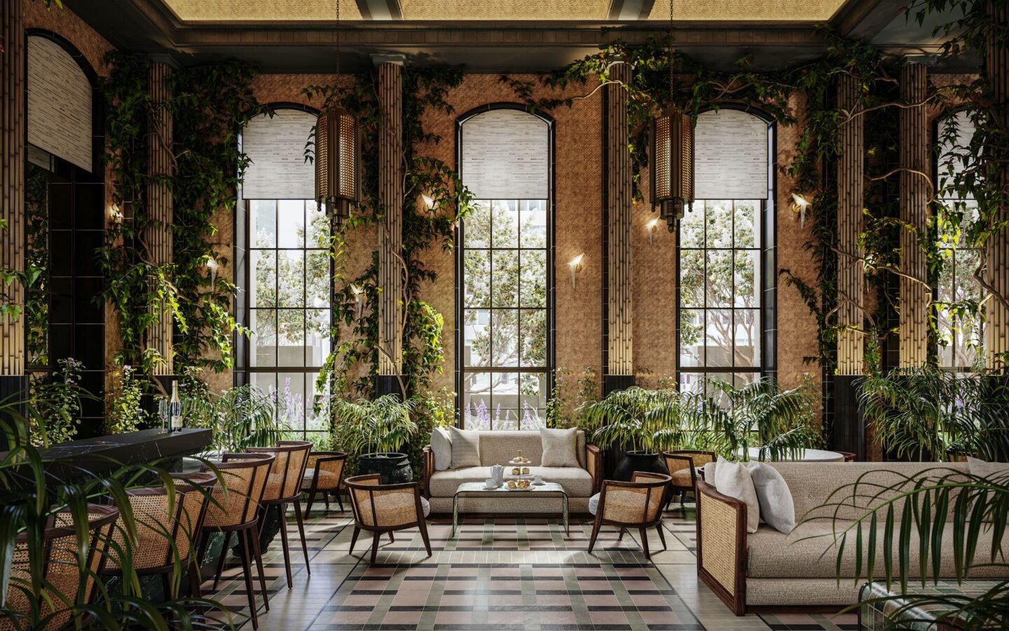
Photo Credit: Waldorf Astoria New York | Winter Garden
Here’s How to Incorporate Art Deco Style Into Your Home:
Flooring
You can use any of the beautiful previously mentioned shapes and patterns and translate them into flooring in a few main ways: Tile or Rugs.
I always suggest staying away from very trendy tile because it’s tricky (and expensive) to replace, but if it’s something you find you’ll LOVE and will enjoy still 10 years down the line – be bold and brave and go for it, risk taker!
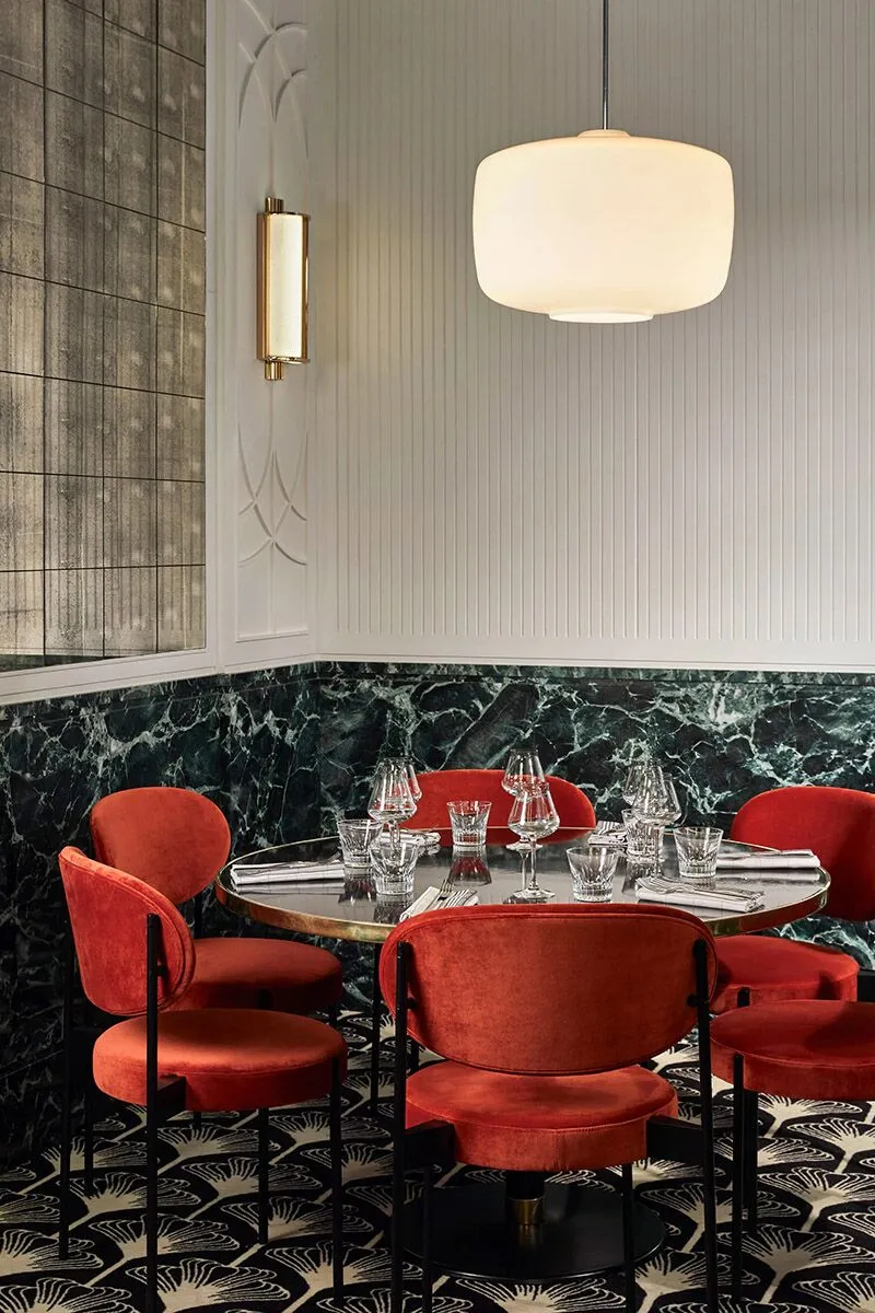
Photo Credit: Restaurant Interior Design | Beef Bar Paris
Fabrics
The main fabric of this era is velvet! Velvet everywhere! Remember what I said above and incorporate lots of tufting and shell/feather shapes!
Another element that is used often is bullion trim! This is the 6″ long tassel you’ll see on the edge of a lot of upholstered pieces. You can purchase the trim from craft stores, Etsy or Amazon and it’s easily installed with a hot glue gun!
Other notable fabrics for this period are faux fur, round throw pillows, and again, velvet – like pleated pillows.
For the Shell or “envelope” of the Room
There are some amazing wallpapers available, again in beautiful geometric designs.
I love the look of mirrors with a mercury glass aging around the edges and stained glass overlays for exterior windows.
Furniture
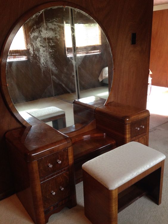
Many of the furniture pieces you’ll see will have these very rounded edges – they’re called “Waterfall” because of that feature.
Also very notable are the HUGE round mirrors like on this vanity.
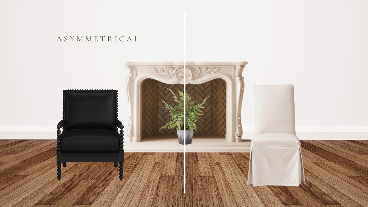
Art Deco was also a style that loved it’s symmetry. Just about everything could be divided down the middle and it would be mirrored images on either side.
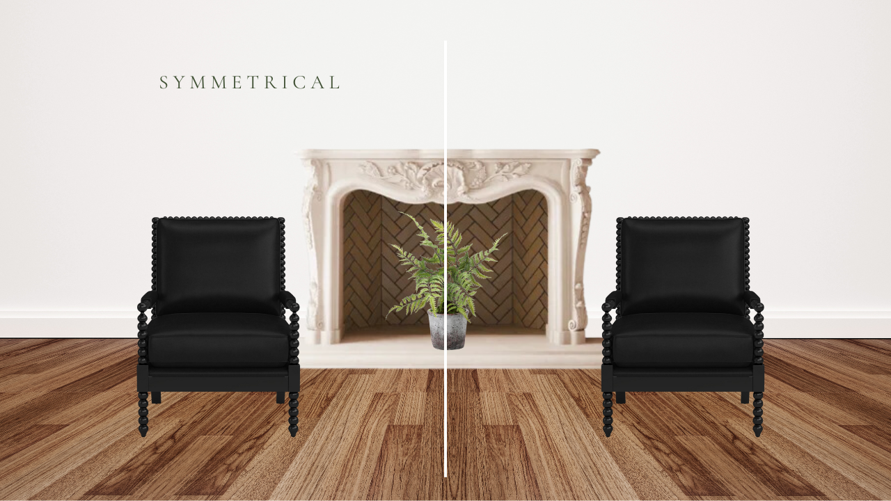
If you notice your look turning asymmetrical – you’ll want to at least bring in additional visual weight (in bulk or darker colors) to help create as much of a symmetrical look as possible.
Another popular furniture piece were large room dividers. I almost didn’t include this specific one because of the Victorian detailing along the very top – but the two things I do love that scream Art Deco are the stairstep cut out edges along the top of the frame, and the mercury glass finish on the mirror panels.
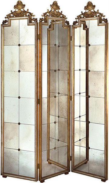
Photo Credit: Bradford Home
Another great item to look for are bar carts. Now, originally they would have been solely used for lots of extravagant parties – but now they can serve a number of different purposes.
I have one on the landing at the top of my stairs that I love to style with decor.
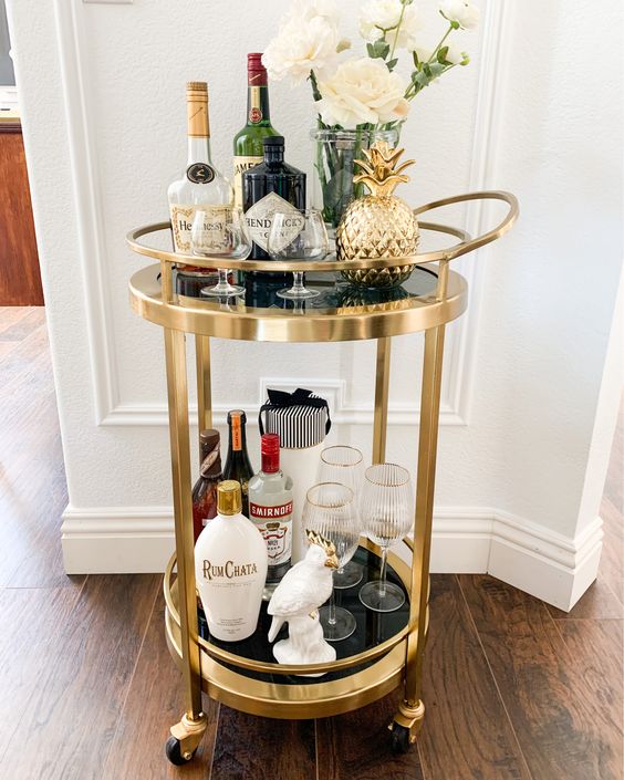
Photo Credit: Cart from World Market | Vonnie’s Home Decor
Lighting
The lighting in this era is hands down one of my favorite parts!
If you find a chandelier that looks like a flapper dress – you know you’re in the right place!
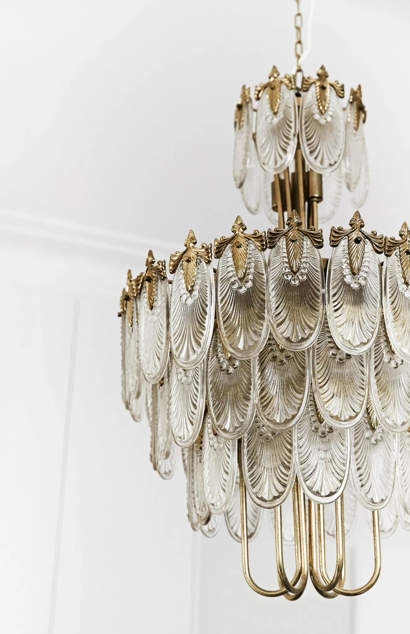
Photo Credit: Homes to Love
When they weren’t playing up the flapper dress angle, they swung completely the other direction and chose very architectural and industrial pieces like these sconces, which I also love.
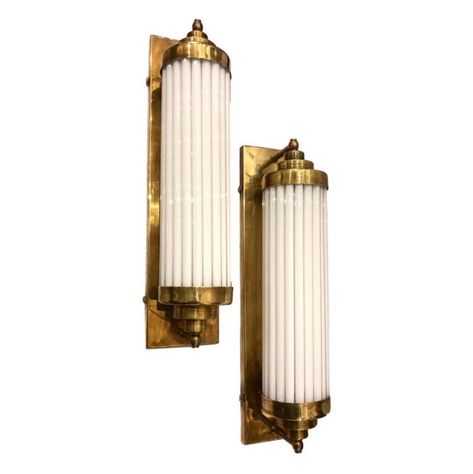
Photo Credit: Etsy
Another repetitive idea is the design with humans and animals holding a “globe” which is the lightbulb for the lamp.

Photo Credit: Amazon
Wall Decor
I just loved the geometric detailing on this old wooden medicine cabinet!

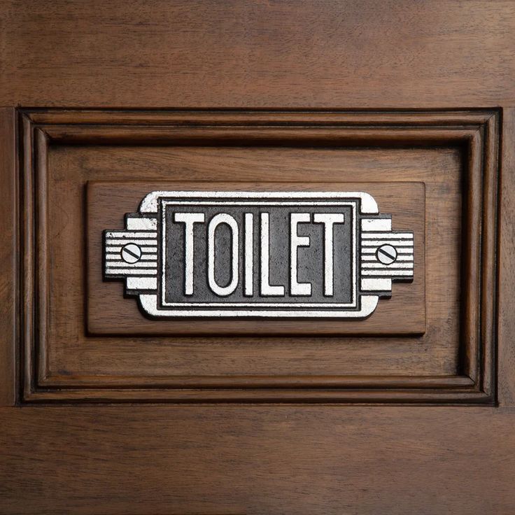
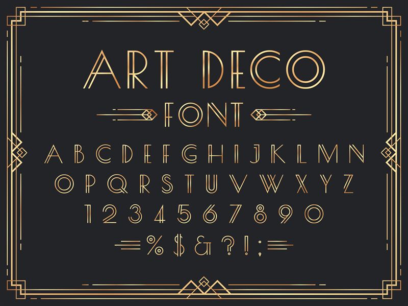
Another aspect of Art Deco that is nearly impossible to misalign is their love and usage of typefaces.
There’s just something about these examples that screams Art Deco and is unmistakable.
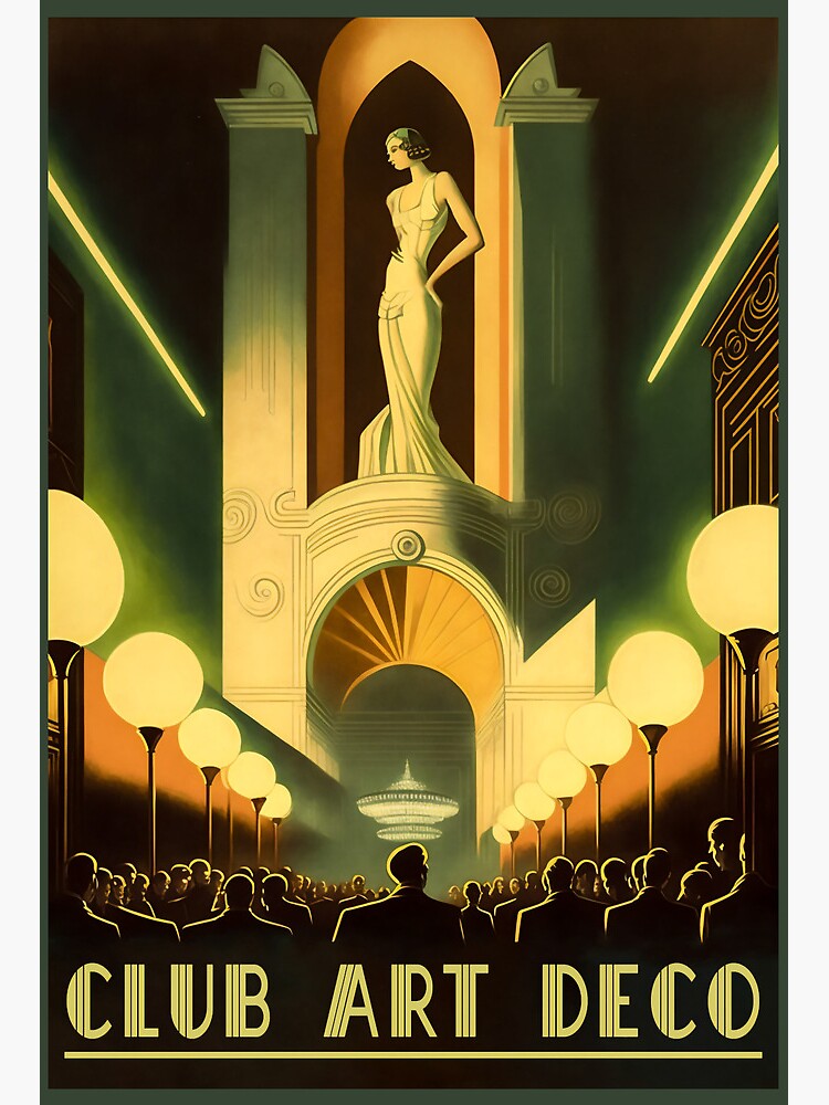
The art of that time was also fascinating! I’m sure those who love and have majored in art could talk on and on about the specifics in this medium to this era- but I couldn’t do it justice!
Last Finishing Touches
Lastly, a few final touches! Depending on your space and the depth of your love for Art Deco – I’d recommend using feathers if you’re wanting to completely dive in!
If you’re not quite sure you’re that ready, a great alternative would be something like pampas grass, a palm (faux is fine, as far as I’m concerned) or a banana plant.
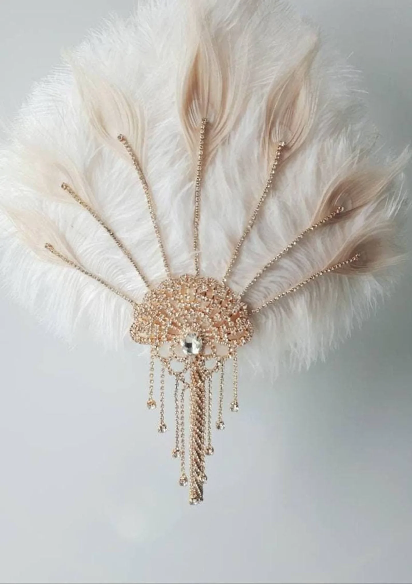
Photo Credit: Etsy

Photo Credit: Amazon
Looking for a more subtle way to bring in some of the patterns from this era? Try incorporating some of this look into your dishes!

Photo Credit: Wayfair
Or even more subtle, just look for fantastic glassware! If you can find true vintage pieces, count yourself lucky – but if not, I really love the champagne glasses that IKEA has in stock, SÄLLSKAPLIG.
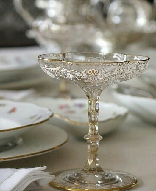
Photo Credit: Vermu Disidente
Last but never least, see about elevating the look of some of your personal items like your perfume!
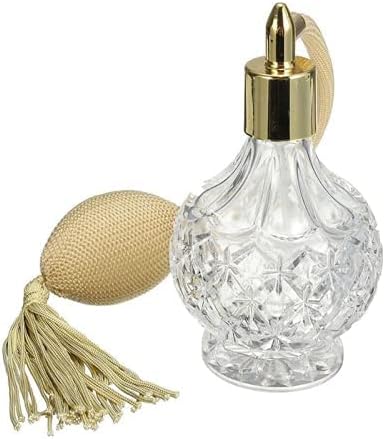
Photo Credit: Amazon
I also love using whiskey decanters for things like vanilla & lemon juice in my kitchen, and mouth wash in my bathroom!
Wondering Where to Find Art Deco Pieces?
I’ve had great luck searching “art deco” on Facebook marketplace! You can also check Anthropologie for a few fun options. You can also try Etsy, CB2, Wayfair & Amazon.
Enjoy!
Pin These Art Deco Design Style Tips for Later:
